If you are ordering signs for a warehouse, building site, office, shop or shared premises, guessing is expensive. The wrong wording, poor positioning or unsuitable material can leave you with signage that looks the part but does not meet the job. That is why health and safety signage regulations matter – not just for compliance, but for clear communication where people need it most.
For most buyers, the challenge is not finding a sign that says the right thing. It is knowing which signs are legally expected, when a symbol is enough, where signs should be fixed, and how durable they need to be for the environment. Those details affect what you order and how well it performs once it is up.
What health and safety signage regulations actually cover
In the UK, workplace safety signs are mainly governed by the Health and Safety (Safety Signs and Signals) Regulations 1996. These rules sit alongside wider health and safety duties, including the need to assess risk, control hazards and communicate important information clearly. A sign does not replace proper training, supervision or physical safety measures. It supports them.
That distinction matters. If a hazard can be removed or controlled in a better way, that should come first. Signage is used where there is a significant risk that cannot be avoided by other means, or where people need clear instruction, warning or location information. In practical terms, signs help people spot hazards, follow site rules, find emergency equipment and act quickly in an incident.
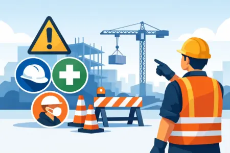
For many businesses, that means a mix of permanent and temporary signage. A construction site may need rigid warning signs at entry points, mandatory PPE signs around active work areas and temporary notices that change as the project moves on. An office may need fewer signs, but fire exit signage, first aid identification and certain prohibition notices can still be required.
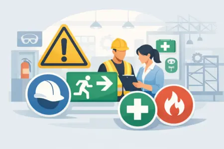
The main types of safety signs
Health and safety signage regulations use standard categories so people can recognise a message quickly, even at a distance. These categories are tied to shape and colour as well as wording.
Prohibition signs
These tell people what they must not do. They are usually circular, with a red border and diagonal bar. Common examples include no smoking, no unauthorised access and no pedestrian access.
Warning signs
These alert people to a hazard or danger. They are normally triangular with a yellow background and black symbol or text. You will often see these used for high voltage, forklift lorries, slippery surfaces or hazardous substances.
Mandatory signs
These show an action that must be taken. They are circular with a blue background and white symbol or text. Standard examples include wear eye protection, wear safety footwear and keep fire door shut.
Safe condition signs
These provide information about escape routes, emergency exits, first aid points or safety equipment. They are generally rectangular or square, using white symbols on a green background.
Fire safety signs
These identify fire-fighting equipment or fire alarm points. They are usually rectangular or square with white symbols on a red background.
The consistency is there for a reason. If you customise a sign too heavily, use unusual colours or reduce legibility with poor layout, you can weaken the message. Branding has its place, but safety communication should stay clear and standard first.
When signage is legally needed and when it is simply sensible
Not every workplace needs every type of sign. What you need depends on your risk assessment, your premises and the activities taking place. A retail unit will not have the same requirements as a fabrication workshop, and a school site will not be signed in the same way as a logistics yard.
The legal test is not about filling walls with notices. It is about whether a sign is needed to warn, instruct or guide people where a risk remains. If visitors could enter a restricted area, a prohibition sign may be appropriate. If hearing protection is compulsory in a machine area, a mandatory sign is usually expected. If emergency exits or first aid stations are not obvious, safe condition signage becomes necessary.
This is where buyers often over-order in one area and under-order in another. Too many signs can create clutter and reduce impact. Too few can leave key hazards unclear. The best approach is targeted, visible and relevant signage that matches the actual use of the space.
Health and safety signage regulations and sign design
A compliant message is not only about the words on the sign. Health and safety signage regulations also rely on visibility, clarity and standard presentation. If a sign cannot be seen, read or understood in time, it is not doing its job.
Symbols should be familiar and easy to recognise. Text should be plain, brief and large enough for the viewing distance. Contrast matters, especially in low-light or visually busy environments. If a sign is going outdoors, exposed to moisture or fixed in a dusty work area, the material and print method also matter.
This is where product choice becomes practical rather than cosmetic. A temporary internal notice may be fine on self-adhesive vinyl. A loading bay warning sign may be better on rigid plastic, aluminium composite or another durable board that can handle weather and daily wear. If a sign curls, fades or becomes unreadable too quickly, replacing it becomes an avoidable cost.
Placement matters as much as the sign itself
A well-made sign can still fail if it is badly positioned. Signs need to be placed where people will see them in time to act. That sounds obvious, but common mistakes include fixing signs too high, too low, behind doors, in poor lighting or among unrelated notices.
Entry points are one of the most important locations. If access restrictions, PPE requirements or hazard warnings apply before someone enters an area, the sign should be visible before they cross the threshold. The same goes for traffic routes, storage areas, plant rooms and external yards.
Viewing distance matters too. A small sign may be suitable on a pedestrian door, but not at a vehicle entrance or across an open warehouse. Where people are moving quickly, signage often needs to be larger and simpler. On busy sites, repeated signs can also help reinforce critical instructions.
Common mistakes businesses make
The most common issue is treating safety signage as a box-ticking exercise. That often leads to generic signs ordered in haste, with little thought about site conditions or who needs to read them.
Another frequent problem is mixing permanent messages with temporary hazards. If a notice changes every week, a fixed rigid sign may not be the best answer. In that case, a more flexible sign format or a designated notice area can work better.
There is also the problem of old signage staying in place after layouts, processes or access routes change. A sign pointing to a first aid station that has moved is worse than no sign at all. The same applies to outdated fire action notices or warnings for equipment that is no longer present.
Finally, buyers sometimes focus on wording and overlook durability. Internal and external environments place very different demands on a sign. Moisture, UV exposure, cleaning chemicals and accidental impact all affect lifespan.
Choosing the right signage for your site
If you are ordering new safety signs, start with the risk and the location rather than the product. Ask what hazard or instruction needs to be communicated, who needs to see it, how far away they will be, and what the environment will do to the sign over time.
For straightforward, standard messages, ready-made signs are often the quickest and most cost-effective option. For mixed-use sites or unusual layouts, custom signage may be the better fit, especially where you need specific wording, site rules, directional information or branded consistency across multiple areas.
It also helps to think about how you want to order. Some buyers already have artwork and sign schedules prepared. Others need a simpler route, such as choosing from set products, adjusting wording and approving artwork before print. A practical supplier should support both.
For businesses managing multiple sign types at once, from rigid health and safety boards to parking notices, directional signs and site information panels, keeping everything with one supplier usually saves time and reduces mismatch.
A practical approach to staying compliant
Compliance is rarely about one sign on one wall. It is about making sure the right information is in the right place, in a format people can understand quickly. That takes a bit of planning, but it does not need to be complicated.
Review your site regularly. Check that signs are current, visible and still relevant to the way the space is being used. Replace damaged or faded signs promptly. If you change a layout, process or access arrangement, review the signage at the same time rather than afterwards.
If you are unsure whether a sign is necessary, the answer often depends on the level of risk and whether other controls already do enough. That is where a practical, site-by-site approach works better than copying another business or ordering every possible sign just to be safe.
Good safety signage should be easy to spot, easy to understand and built for the environment it is going into. If your signs do that, they are doing more than filling a legal requirement – they are helping people move, work and respond more safely every day.