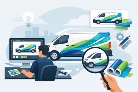
A van parked outside a job can win you work before you have said a word. It can also do the opposite if the graphics are cluttered, hard to read or poorly planned. If you are working out how to design van graphics, the aim is not to fill every panel. It is to make the vehicle easy to recognise, easy to read and worth remembering.
For most businesses, van graphics do two jobs at once. They identify the vehicle on site and they advertise the business while the van is on the road, parked outside customers’ premises or left in a busy town centre. Good design needs to support both. That means thinking about branding, reading distance, vehicle shape and fitting practicalities before you start choosing colours or adding logos.
Start with the job the van needs to do
Before you open any design tool, decide what matters most. A local tradesperson may need a bold company name and phone number that can be read in seconds from the pavement. A fleet operator may need stronger brand consistency across multiple vehicles. A catering business might want more emphasis on imagery and opening times if the van is regularly parked in public view.
This is where many designs go wrong. They try to answer every possible question at once. The result is often too much text, too many services and no clear focal point. If someone sees your van for three seconds in traffic, they will not read a paragraph. They might read your business name, your trade and one contact detail. Design around that reality.
How to design van graphics with a clear hierarchy
The most effective layouts guide the eye in the right order. Usually that starts with your business name or logo, followed by what you do, then your preferred contact method. If you offer five services, it is usually better to group them under a short trade description than list them all in full.
Think in layers. Your main message should still work from a distance. Secondary details should make sense when the van is parked closer up. This matters on side panels in particular, where you often have more room and more viewing time than on the rear doors.
A simple hierarchy might look like this in practical terms: company name first, trade second, mobile number third, website fourth. If your business depends on quick local calls, the phone number may deserve more prominence than the website. If most enquiries come through search, the website may be enough. It depends on how customers actually contact you.
Use the van shape, not just the flat space
A van is not a poster board. It has door handles, panel gaps, curves, fuel caps, mouldings and windows that can interrupt the layout. A design that looks balanced on a flat screen can break apart once placed on the vehicle.
Start by identifying the largest uninterrupted areas. On many vans, the side panels give you the strongest branding space, while the rear is best for short, direct information that a driver behind you can take in quickly. Avoid placing small text across door seams or body lines where it becomes awkward to read.
It is also worth checking how the design works across different vehicle sizes if you run more than one model. What fits neatly on a medium panel van can feel sparse on a Luton or cramped on a compact van. Consistency matters, but it should not come at the expense of legibility.
Keep the message short enough to read
The best van graphics are usually simpler than people expect. You do not need to include your full company story, every accreditation and a complete service list. Too much detail reduces the impact of the parts that matter.
Aim for wording people can absorb at a glance. Your business name, trade and one strong contact route are often enough. If you want to include areas covered or a strapline, make sure they earn their place. If removing a line makes everything clearer, remove it.
This is especially important on the rear of the van. Vehicles behind you may only have a few moments to read what is there. Large text, high contrast and a clear message will outperform a busy layout every time.
Choose colours for contrast first, branding second
Brand colours matter, but readability matters more. If your logo uses pale grey text, it may look smart on stationery and disappear on a white van. If your brand colour is dark blue, it may need white text or a contrasting panel behind it to stay legible.
High contrast combinations tend to work best outdoors and at distance. Dark lettering on a light vehicle or light lettering on a dark panel is usually safer than mid-tone combinations. If you want a more layered design, use contrast to separate the main message from supporting details rather than relying on decorative effects.
Printed graphics can handle gradients, photographs and more complex visuals, but that does not mean they always should. Busy backgrounds can reduce clarity, especially on working vehicles that pick up dirt and road grime. Clean colour blocks and solid text often last better visually in real use.
Fonts need to work at speed
Readability should drive your font choice. Sans serif fonts are often the easiest to read on vehicles, especially from a distance. Decorative typefaces may suit a logo, but they are rarely the best option for phone numbers, web addresses or service descriptions.
Watch the spacing as well. Text that is too tight becomes harder to read once it is scaled down or viewed on a curve. Upper and lower case is usually easier to read than all capitals for longer wording, although capitals can still work well for short, bold trade descriptions.
If you are using more than one font, keep it controlled. In most cases, one font family plus your logo is enough. More than that can start to look disjointed.
Images can help, but only when they add clarity
Some businesses benefit from imagery. Food businesses, cleaning companies and specialist installers may want visuals that quickly show what they do. Even then, the image needs to support the message rather than compete with it.
A common mistake is using low-quality photos or placing detailed images behind text. Both make the design look less professional. If you use images, they need to print cleanly at size and sit comfortably within the overall layout.
For many trades and service businesses, a strong logo, clear trade description and good use of colour will do the job better than a crowded visual treatment.
Think about fitting from the beginning
Designing for print is one thing. Designing for a real vehicle is another. Small details near recesses, trims and handles can be difficult to fit neatly, especially if the artwork has fine alignment points or narrow sections.
That does not mean you need to strip the design back to basics, but you should be realistic about application. Clean shapes, sensible spacing and layouts that respect body features will usually produce a better end result. If you want a straightforward install, easy-fit graphics and well-planned cut elements are often the practical choice.
This is also the stage to check your artwork setup. Logos should be supplied in suitable high-resolution or vector format where possible. Text should be spelled correctly, contact details double-checked and sizing reviewed against the actual van model. A typo on a business card is annoying. A typo on a van is expensive.
How to design van graphics for different business types
There is no single layout that suits every business. A sole trader electrician may need a direct, no-nonsense design with a mobile number doing most of the work. A larger business with several vehicles may be better served by a more standardised identity that keeps branding consistent across the fleet.
If your van regularly attends events, markets or public venues, you may want stronger visual appeal and more descriptive information. If it spends most of its time visiting private jobs, trust signals such as accreditations or years of experience might be useful, but only if they do not crowd the main message.
The right balance depends on where the van is seen, who sees it and what action you want them to take next.
Get a proof and test it properly
Always review the design on a van outline before production. Better still, look at it at realistic size on screen or in print. What looks large on a monitor can feel surprisingly small once placed on a full vehicle.
Check it from the distance people will actually view it. Stand back. Can you read the company name? Is the phone number still clear? Does the layout feel balanced across both sides and the rear? This stage often reveals unnecessary text or sizing issues that were easy to miss earlier.
If you are ordering online, use the design route that matches your confidence level. Design Online works well for straightforward layouts. Upload your own Design is the right option if you already have prepared artwork. Let us design for you is often the best route if you know what information you need but want help turning it into a practical, print-ready result.
Good van graphics are not about adding more. They are about making the right details work harder, so your vehicle looks professional on site and keeps promoting your business when you are busy getting on with the job.