A missing parking notice, an unreadable entrance sign or a van with no contact details can create more work than most businesses expect. The right business signs make a site easier to use, protect staff and visitors, and put your name in front of potential customers when it matters. The job is not simply to print a logo on a board. It is to choose a sign that can be seen, understood and relied on in the place where it will be used.
For a shop, this may mean clear window graphics and a pavement sign that promotes a current offer. For a tradesperson, it could be vehicle lettering that makes every journey visible to local customers. For a construction or industrial site, durable safety, access and directional signs may be the priority. Starting with the purpose helps you choose the right format, material and finish without paying for features you do not need.
Start with what the sign needs to do
Most signage falls into one or more practical jobs: identify a business, direct people, communicate a rule, promote an offer or meet a safety requirement. A single sign can do several of these, but trying to say everything at once often makes it harder to read.
Ask what somebody needs to know within a few seconds. At a vehicle entrance, that might be where visitors should report. On a gate, it may be a warning or access restriction. On a retail window, it may be your opening hours, key services and a simple way to get in touch. The more immediate the message, the fewer words it should contain.
Distance matters just as much. Text that is clear at arm’s length can disappear from across a car park. A large site board needs generous lettering, strong contrast and a simple layout. A small door plaque can carry more detail because people will stand close to it. Before ordering, consider where the viewer will be, whether they are walking or driving, and how long they will have to take in the information.
Choose business signs for the environment
Material selection should follow location and expected use. Indoor signs generally need a neat finish and suitable fixing options. Outdoor signs need to cope with rain, sunlight, wind and regular cleaning. Temporary event signage has different demands again: it should be quick to put up, easy to transport and clear from a distance.
Rigid boards are a practical choice for site notices, property signs, parking instructions and directional information. The right board depends on the location, size and how long it needs to remain in place. Lightweight options can suit short-term displays, while more durable materials are better for permanent outdoor use. If a sign will be fixed to fencing, walls or posts, make sure the material and fixing method are appropriate for that surface.
Banners work well when visibility is the main requirement. They are useful for promotions, events, building work, sports clubs and temporary messages. A banner should be designed with its viewing distance in mind, with a clear headline and limited supporting text. If it is going outdoors, allow for secure fixing points and avoid placing it where strong wind will cause unnecessary strain.
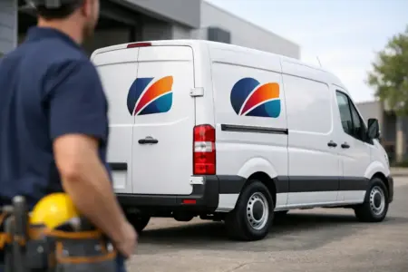
Vinyl lettering and printed stickers are often the most efficient option for windows, doors, equipment and vehicles. They can provide a professional finish without the need for a large rigid sign. Window graphics can display opening times, contact details and service information, while vehicle graphics can turn a car, van or lorry into a recognisable mobile advert. For vehicles that need a removable option, magnetic signs offer flexibility, although they need a clean, flat metal surface and regular checks to keep them secure and in good condition.
Freestanding signs are useful where the message needs to move with the day. Hospitality venues, showrooms, schools and event spaces can use them to direct visitors, announce offers or manage temporary access routes. Their main advantage is flexibility, but placement is critical. Keep entrances, walkways and emergency routes clear, and bring them in when conditions make them unsafe.
Safety and compliance need clarity first
Safety signage should never be treated as an afterthought. A clear warning, mandatory instruction or emergency notice supports safer working practices and helps visitors understand what is expected of them. Site managers may need signs for personal protective equipment, restricted areas, fire points, first aid, speed limits, hazardous materials, CCTV and parking controls.
The exact signs needed depend on your premises, activities and risk assessment. A ready-made sign can cover common requirements quickly, while a custom version may be needed for site-specific instructions, contact numbers or locations. Do not reduce text size just to fit more information on the board. If a message is essential, give it the space to be read.
Design for recognition, not decoration
A well-designed sign makes a business look organised because it is organised. Use a small number of brand colours, a clear typeface and a layout that puts the main message first. Your logo is valuable, but it should not compete with the information people are looking for.
Strong contrast is one of the simplest improvements you can make. Dark lettering on a light background, or light lettering on a dark background, is usually easier to read than colours with a similar tone. Avoid placing fine text over busy photographs or patterns. If you use an image, keep the words away from detailed areas and check that the message still works at the intended viewing size.
For promotional signs, lead with the offer or service rather than a long introduction. “Same-day repairs”, “Now open” or “Trade counter this way” is more useful than a paragraph about your business. Follow it with only the next action you want the customer to take, such as visiting, calling or asking for a quote.
Artwork quality also affects the finished result. A high-resolution logo, correctly sized images and clean vector files will usually produce sharper print than screenshots or images copied from social media. If you have finished artwork, uploading it can be the quickest route. If you do not, using an online design tool or requesting design support can prevent common problems with sizing, spacing and print readiness.
Plan placement before production
The best sign in the wrong place is still easy to miss. Walk through the customer or visitor journey before you order. Start at the road, car park or site entrance, then follow the route to reception, the counter, the collection point or the relevant work area. Each point where someone may hesitate is a possible place for a directional sign.
Think about obstructions too. Trees, parked vehicles, open doors, stacked stock and seasonal displays can all block a sign that looked well positioned on paper. Check the lighting at different times of day, particularly for entrances used early in the morning or after dark. A sign facing into direct sunlight may also be harder to read than expected.
For multi-site businesses and fleets, consistency saves time later. Keep the same logo files, colours, typefaces and key messages available for repeat orders. Standard sizes for common signs can make replacement and expansion simpler, whether you are adding new parking notices, fitting out another unit or applying matching vehicle lettering to additional vans.
Order the right way for your timescale
A straightforward sign can often be ordered quickly when the design and dimensions are clear. Measure the available space before selecting a size, and check whether you need holes, eyelets, adhesive backing or another fixing method. It is easier to specify these details before production than to adapt the sign on site.
For a larger project, group products by location and purpose. For example, list external identification, car park instructions, entrance notices, internal wayfinding, health and safety signs, window graphics and vehicle graphics separately. This makes it easier to see gaps, compare quantities and keep the visual style consistent.
If you are uncertain, provide as much practical detail as possible when requesting a quote: where the sign will go, approximate size, surface type, outdoor or indoor use, number of copies and required deadline. A clear brief helps ensure the product is suited to the job rather than merely close to it.
The SignBuilder supports simple ordering routes for different levels of confidence: design online when you need a quick solution, upload your own design when artwork is ready, or ask for help when the requirement is more specific. That flexibility is useful when a business needs anything from one replacement notice to a coordinated set of signs across a site.
Good signage earns its keep through daily use. Review it whenever your layout, services, access arrangements or branding changes, and replace faded, damaged or outdated messages before they cause confusion. Clear signs show people where to go, what to do and who you are – without needing someone to explain it.