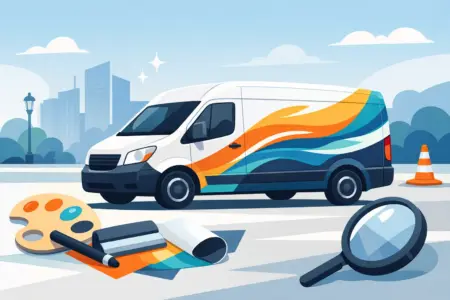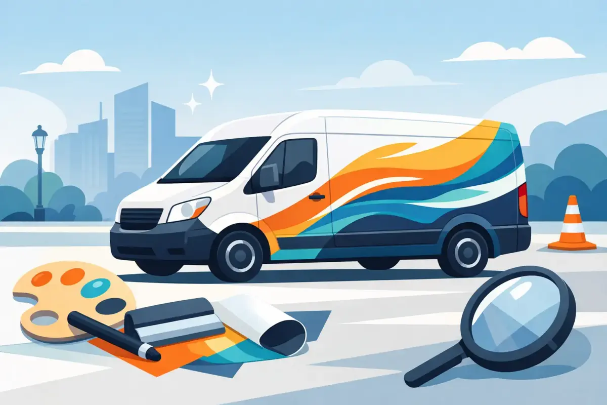
A plain van parked outside a job can make you easy to miss. A well-lettered van tells people who you are, what you do and how to contact you before you even step out of the cab. That is why van lettering for business remains one of the most practical ways to build visibility, especially for trades, local services, delivery firms and mobile teams.
Unlike short-term adverts, vehicle graphics keep working on the road, on site and at the kerb. The value is simple. You pay once, fit it properly and your branding starts earning its place every day. For many small and medium-sized businesses, that makes van lettering one of the most cost-effective forms of promotion available.
Why van lettering for business still works
Most local buying decisions start with recognition. People notice the same name on the same route, outside neighbouring properties or near commercial sites. Repetition builds familiarity, and familiarity makes your business feel established.
That matters whether you are a sole trader with one van or an operations manager overseeing a small fleet. A signwritten vehicle helps customers remember your name, reassures them they are dealing with a legitimate business and gives your team a more professional presence on arrival.
There is also a practical benefit beyond marketing. Clear company identification can help on busy sites, at shared premises and in service yards where several contractors may be working at once. In some cases, visible business details on a vehicle can support access control and make your drivers easier to identify.
What to include on a business van
The best layouts are usually simpler than people expect. Trying to fill every panel often weakens the overall result. A van moving through traffic is not a brochure. People have a few seconds at most to take in the important information.
Start with your business name or logo. That should be the most prominent element, placed where it can be read quickly from the side and rear. Then add the service description if your business name does not make it obvious what you do. A company called Oakmere Services means very little on its own. Oakmere Plumbing and Heating is much clearer.
Contact details should come next. A phone number is often the strongest choice for local service businesses because it can be read and remembered quickly. A website can work well too, especially if the name is short and easy to spell. If you use both, keep the layout tidy and give each enough space.
Depending on your trade, it may also make sense to include your service area, accreditation marks or a short line on the type of work you handle. The key word is restraint. If every spare corner is filled with text, nothing stands out.
Choosing the right lettering style
Readability matters more than decoration. Clean fonts, strong contrast and sensible sizing usually outperform overly styled graphics. What looks impressive on a computer screen can become hard to read at distance or in poor weather.
Black or dark lettering on a white van is a dependable option because contrast is high and visibility tends to be strong. On darker vehicles, white or light-coloured vinyl often gives the clearest result. If your brand colours are central to recognition, use them, but check that they still read well against the paintwork.
Cut vinyl lettering suits many businesses because it gives a crisp, professional finish without unnecessary complexity. It works especially well for company names, phone numbers, web addresses and straightforward branding elements. For firms that need logos or more detailed visual components, printed graphics may be the better fit. It depends on how much detail your artwork contains and how prominent you want the branding to be.
Side panels, rear doors and bonnet considerations
Different parts of the van do different jobs. The side panels usually give you the largest visible area, which makes them ideal for your main branding. This is often the first view people get when the van is parked outside a property or building.
Rear doors matter because they are seen in traffic and at junctions. If someone is behind your vehicle for even half a minute, that is a valuable opportunity to show your company name and contact details. Rear layouts often work best when they are bold and uncluttered.
Bonnet lettering is less common and not always necessary. On some vehicles it can be useful, particularly if the van spends time parked facing pedestrian routes or site entrances. On others it adds little. The right choice depends on the vehicle type, how it is used and whether the extra space improves the message or just repeats it.
Getting the design right before production
Good van lettering starts with a realistic view of the vehicle. Panel shapes, door handles, recesses, mouldings and windows all affect what can be fitted and what will read well. A design that ignores those details can look awkward once applied.
That is why artwork preparation matters. Measurements, panel placement and scaling should be checked against the van model rather than guessed from a generic layout. If you are supplying your own design, make sure files are clear, sized correctly and suitable for production. If you are not confident with artwork, using a design support option can save time and avoid costly revisions.
There is also a decision to make between consistency and flexibility. If you run multiple vans, keeping layouts standard across the fleet usually gives the strongest brand presence. If your vehicles vary in size, a flexible version of the same design may be the better route so that each one looks balanced rather than forced.
What businesses often get wrong
The most common mistake is trying to say too much. Long lists of services, multiple phone numbers and dense blocks of text reduce legibility. If someone cannot understand your business in a glance, the van is not doing its job.
Another issue is poor hierarchy. Your company name, main service and contact method should not all compete at the same size. One element should lead, the next should support it and the rest should sit in the background.
Cheap-looking results also tend to come from weak alignment and inconsistent spacing. Professional van lettering is not just about the material. It is about layout discipline. Straight lines, balanced positioning and sensible margins make a noticeable difference.
Finally, businesses sometimes forget the day-to-day reality of use. Vans get dirty, work in poor weather and spend time under mixed lighting. Fine detail and low-contrast text may disappear quickly in those conditions. Designs need to perform in real life, not just in a mock-up.
Ordering van lettering without making it complicated
For most buyers, the easiest route depends on how ready the artwork is. If you already have print-ready files and know what you need on each panel, uploading your design can be the fastest option. If you have branding but no finished layout, a quote or assisted design route is often more practical.
This is where a production-focused supplier adds value. The process should make it easy to either design online, upload your own design or ask for help preparing the artwork properly. That flexibility matters because not every customer is ordering the same way. A one-van start-up and a repeat trade buyer managing several vehicles usually need different levels of support.
It also helps to choose products suited to straightforward fitting and daily commercial use. Easy-fit options reduce delays, and clear production checks lower the risk of errors before anything is cut or printed. For businesses that need consistency across signage, clothing and vehicles, working with one supplier can simplify re-orders and keep branding aligned.
When van lettering is enough and when you may need more
Not every business needs large-format vehicle graphics. For many tradespeople and local service providers, well-planned lettering is enough to look established and stay visible. If your main goal is clear branding, contact information and a tidy professional appearance, simple can be the stronger choice.
Larger or more detailed graphics may make sense if brand recognition is central to your growth, or if your logo and visual identity rely on imagery that plain text cannot carry well. The decision comes down to budget, vehicle use and how much visual impact you actually need.
For buyers across the UK and Ireland, the sensible approach is usually the same. Keep the message clear, choose durable materials, and match the design to the vehicle rather than forcing a standard idea onto every panel.
A business van is already out on the road, already visiting customers and already being seen. Letter it properly, and it starts doing another job for you without asking for extra time from the working day.