A car park only needs one unclear sign to create a steady stream of avoidable problems. Staff park in visitor bays, delivery drivers stop in loading areas, customers miss reserved spaces, and enforcement becomes harder than it should be. Custom parking signs solve that by giving people clear instructions in the right place, in the right format, before confusion turns into complaints.
For businesses, venues and site managers, parking signage is usually doing more than one job at once. It may need to direct traffic, mark ownership, support site rules, protect access routes and present the site professionally. That is why off-the-shelf wording is not always enough. If your parking area has specific bays, time limits, permit rules or branding requirements, a custom sign is often the cleaner and more effective option.
When custom parking signs make more sense
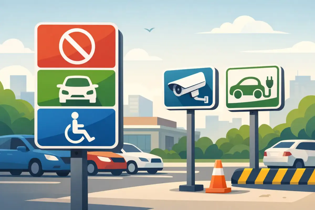
Standard signs work for common messages such as No Parking or Disabled Parking, but many sites have more specific needs. You might need to reserve bays for staff, contractors, residents, electric vehicle charging, deliveries or management. You may also need to show opening hours, terms of use or contact details for permit enquiries.
In those cases, custom parking signs give you control over the exact wording. That matters because vague signs tend to be ignored or argued with. A sign that states Permit Holders Only, Mon-Fri, 8am-6pm is much harder to misunderstand than a generic Private Parking notice with no further detail.
There is also a branding question. Retail parks, hospitality venues, schools and managed premises often want signs that look consistent with the rest of the site. A professional-looking parking sign supports the impression that the space is organised and well managed. It is a small detail, but people notice when signage looks improvised.
What good custom parking signs need to include
The best parking signs are direct. They do not try to explain everything at once, and they do not rely on tiny text that nobody can read from a vehicle. The main instruction should be immediately obvious, with supporting details only where needed.
Clear wording comes first
Think about the action you want the driver to take. Do you want them to stop, keep out, park in a designated bay, display a permit or observe a time restriction? Lead with that instruction. If extra detail matters, place it beneath the main message in smaller text.
For example, Staff Parking Only is stronger than Authorised Vehicles. Likewise, Loading Bay – Maximum 20 Minutes is clearer than Restricted Area. Specific wording tends to reduce disputes because it leaves less room for interpretation.
Visibility matters as much as wording
A well-written sign still fails if it cannot be seen. Size, contrast and placement all affect whether drivers notice the message in time. If the sign needs to be read from a moving vehicle, smaller formats may not be enough. If it is mounted in a dim area or under trees, the colour contrast needs to work harder.
Black text on yellow or white backgrounds is common because it reads well at a distance. Red is useful where prohibition or warning is the main point. Blue often works for informational or designated parking messages. The best choice depends on the setting, but clarity should always beat decoration.
Include only the details that help
Some parking signs need bay numbers, permit references, company names or contact information. Others do not. Adding too much text can weaken the main message, especially in busy areas where drivers make quick decisions. It is usually better to keep the roadside or bay sign short, then place fuller terms on a separate notice board if required.
Choosing the right material for the location
Parking signs are exposed to hard use. Rain, UV, dirt and accidental knocks all affect lifespan, so material choice is not just about budget. It affects how long the sign stays readable and presentable.
Aluminium composite is a strong choice for long-term outdoor parking signs because it is durable, lightweight and suited to regular weather exposure. Rigid plastic can work well for lower-cost or shorter-term use, especially in sheltered areas. Self-adhesive vinyl is useful where the message needs to be applied directly to a smooth surface such as a gate, barrier or existing board, but it depends on the condition of the surface underneath.
There is no single best option for every site. A permanent staff car park will usually justify a more durable panel, while temporary event parking may only need signage for a short period. Matching the sign material to the expected use avoids overbuying in some cases and under-specifying in others.
Where custom parking signs are commonly used
Parking signage is not only for large commercial sites. Smaller businesses often benefit just as much because they have less room for error. If a few bays are blocked, operations can quickly be affected.
Offices and industrial units often use custom signs to reserve spaces for staff, visitors, directors or loading. Retailers may need signs for customer parking limits or click and collect bays. Pubs, hotels and restaurants frequently use them to protect customer spaces from nearby overspill parking. Schools, surgeries and community buildings often need a mix of directional and reserved parking messages to keep access clear and traffic moving.
For landlords and property managers, custom parking signs are especially useful where multiple users share the same site. Flat numbering, permit instructions and bay identification can all be built into the sign, which is cleaner than trying to manage the space with handwritten notices or inconsistent labels.
Design choices that affect results
A sign does not need to look complicated to feel bespoke. Often the most effective custom parking signs are built from a simple layout with the right wording, colours and symbol use.
Symbols can speed up understanding
A wheelchair symbol, electric vehicle icon or directional arrow can communicate faster than text alone. That is useful in busy car parks where drivers need to react quickly. Symbols also help where different users may not read every line of text in the same way.
That said, symbols should support the message, not replace it entirely. If a reserved bay matters operationally or commercially, backing the symbol up with plain wording is usually the safer option.
Branding should stay practical
Adding a logo can help signs feel consistent with the rest of your site, particularly for customer-facing businesses. But parking signage is still a functional product. If branding makes the sign harder to read, it is the wrong trade-off. Keep logos modest, and let the instruction stay dominant.
Consistency across the site helps
If one sign says Visitors Only, another says Guest Parking and a third uses different colours altogether, the site can feel disjointed. A coordinated set of signs is easier to follow and looks more professionally managed. This is particularly useful for larger premises or multi-entrance sites where drivers may see several messages in sequence.
Ordering custom parking signs without slowing the job down
For most buyers, speed matters nearly as much as specification. You need the sign to fit the job, but you also need a straightforward route to order it. That is why flexible ordering options make a difference.
If you already have artwork, uploading a print-ready file can be the fastest route. If you know the wording but not the layout, an online design tool or design support is usually more practical. For repeat requirements across multiple bays or locations, it helps to keep the format consistent so future reorders are simple.
This is where a production-led supplier earns its place. The process should make it easy to choose a product, set the size, define the wording and move forward without unnecessary back and forth. For many businesses, that matters more than fancy presentation.
Getting the sign right before it is made
A few checks before ordering can save time and replacement cost. Make sure the wording reflects how the parking area actually operates. Confirm whether the sign needs fixing holes, adhesive backing or a separate mounting method. Check that the size is suitable for the viewing distance, and think about whether one sign is enough or several are needed across the site.
It is also worth considering how the sign fits with any existing notices. If the site already has health and safety signs, directional boards or branded panels, matching the style where possible can improve overall legibility.
Custom parking signs are at their best when they remove doubt. They tell drivers where they can park, where they cannot, and what the site expects without creating extra questions. If a sign can do that clearly, last outdoors and arrive ready for the job, it has already done most of the hard work for you.
When parking spaces affect customers, staff and day-to-day operations, clear signage is not a finishing touch. It is part of how the site runs.