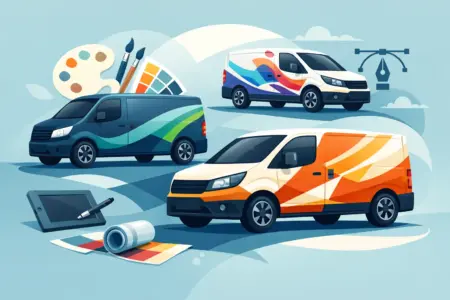
A van parked outside a job can either look like part of the business or like an afterthought. That gap matters. Good van livery design examples show how to turn everyday mileage into clear, credible advertising without making the vehicle look cluttered or hard to read.
For most trades and local businesses, the job is simple: get noticed, say what you do, and make it easy for someone to remember you. The best results are rarely the busiest. They are usually the ones that make sensible use of space, keep the message short and stay legible from a distance.
What good van livery design examples have in common
If you look across strong van livery design examples, a few patterns show up straight away. The business name is easy to spot. The main service is obvious. Contact details are placed where people can actually read them, whether the van is moving in traffic or parked on a street.
There is also a clear understanding of the vehicle shape. Side panels, sliding doors, rear doors and windows all affect the layout. A design that looks balanced on paper can fall apart once it is fitted across handles, trims and panel gaps. That is why practical design matters just as much as branding.
Colour choice does a lot of the heavy lifting. High contrast tends to work best, especially for vans used on the road all day. Dark text on a light vehicle or light text on a dark vehicle usually gives the strongest readability. More decorative colour schemes can work, but only if they do not reduce clarity.
11 van livery design examples for different businesses
1. The straightforward local trades van
This is the classic format for plumbers, electricians, joiners and heating engineers. The company name sits large on the side panel, the trade is written underneath, and a phone number appears on both the side and rear.
It works because it answers the basic questions quickly. Who are you? What do you do? How do I contact you? For one-person businesses and small teams, this is often the most effective route because it looks professional without overcomplicating the design.
2. The logo-led service van
Some businesses already have a strong logo that people know locally. In that case, the logo can take the lead, with supporting text kept smaller and tighter.
This works well for repeat-visit sectors such as cleaning firms, maintenance companies and property services. The trade-off is that a logo-led approach only works if the logo is clear and the rest of the message still explains the service. Brand recognition helps, but it cannot do all the work on its own.
3. The photo-supported van for specialist services
A carefully chosen printed image can help explain a service that is harder to describe at a glance. Kitchen fitters, garden designers or catering businesses sometimes benefit from this approach.
The key word is carefully. If the image is too detailed, it becomes visual noise from more than a few metres away. The best examples use one strong image and keep the text simple. If both the picture and the wording are competing for attention, neither will land properly.
4. The fleet-standard layout
For businesses running several vehicles, consistency matters more than novelty. A fleet-standard design usually places the logo in the same position on every van, keeps colours fixed and uses a repeatable layout across different vehicle sizes.
This is less about one van looking clever and more about the whole fleet looking organised. It also makes future ordering easier. Once the design system is established, new vehicles can be added without starting again each time.
5. The high-contrast emergency call-out van
Some sectors need instant recognition. Locksmiths, drainage companies, breakdown support and emergency repair services often use bold colours, large text and minimal wording.
This type of livery needs to be read fast, often in poor weather or low light. Simplicity is the advantage. The risk is looking too aggressive or cheap if the colours are badly matched, so balance still matters.
6. The premium understated design
Not every business wants a loud finish. Surveyors, architects, specialist installers and higher-end trades often prefer a cleaner, quieter look with limited colours and more restrained branding.
Done well, this can look sharp and credible. Done badly, it can disappear into the background. If the approach is understated, the lettering needs to be especially well placed and well sized. A premium look should still function as signage.
7. The rear-door focused layout
Many vans are seen from behind in traffic far more often than from the side. Good examples make use of this by treating the rear as a key message area rather than an afterthought.
That usually means a clear business name, one main service line and a phone number or web address that can be read at a sensible stopping distance. Rear doors often have awkward splits, hinges and handles, so the design needs to account for them from the start.
8. The diagonal or panel-led design
Some modern van liveries use angled shapes, stripes or blocks of colour to give the vehicle more movement. This can work well for telecoms, delivery firms and technical services where a more contemporary look suits the brand.
The useful part of this style is that it can guide the eye towards the name or contact details. The weak version is when the graphic treatment becomes the main event and the business information gets lost. Style should support the message, not bury it.
9. The text-only no-nonsense design
There are cases where plain text is enough. Window cleaners, gardeners, waste clearance firms and local repair services can do very well with little more than a strong typeface, a clear trade description and contact details.
This is often one of the most cost-effective options, and it can look very smart when spacing and sizing are handled properly. It also ages well. There is less chance of the design looking dated in a year or two.
10. The multi-service van
Some businesses need to show more than one service, such as building firms that cover extensions, roofing, plastering and paving. This can be useful, but it needs restraint.
The stronger examples group services under a simple heading or limit the list to the most commercially useful terms. Trying to fit every service onto the van usually leads to tiny text and a confused layout. If a customer remembers the brand and one or two key services, that is usually enough.
11. The local trust-builder
This approach is common with businesses that rely on reputation in a specific area, such as family-run firms, domestic services and community-facing organisations. The design may include a short line about experience, accreditation or local coverage.
That extra layer can help, especially where trust matters before price. The caution is not to overload the vehicle with claims and badges. One or two proof points are enough if they are genuine and easy to read.
How to choose the right direction for your van
The best option depends on how the van is used. If it spends most of the day driving between sites, clear branding and a readable phone number will do more than detailed service descriptions. If it is usually parked outside jobs for hours, there is more value in including a wider range of information.
Audience matters as well. A domestic customer may respond better to a friendly, straightforward design that clearly states the trade. A commercial buyer may be more interested in a polished, capable look that suggests reliability and scale. Neither is automatically better. It depends on who you want to attract.
Vehicle type also changes the design choice. A small car-derived van has less room and needs tighter messaging. A larger panel van gives more scope, but that extra space should not be filled just because it is there. Empty space often improves legibility.
Common mistakes these examples help avoid
The biggest mistake is trying to say too much. A van is not a brochure. People usually see it briefly, at an angle, or from a distance. If the main message cannot be understood in seconds, the design is doing too much.
Another common problem is weak contrast. Mid-tone text on a mid-tone vehicle body may look subtle on screen, but it often disappears outside. The same goes for typefaces that are too decorative, too narrow or too small.
Poor placement is another issue. Door handles, fuel caps, recesses and window lines can break up words and numbers. A well-prepared layout works with the vehicle shape rather than pretending those interruptions are not there.
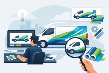
Turning examples into an order-ready design
Looking at examples is useful because it shows what fits your trade, your vehicle and your budget. The next step is making practical choices. Start with the essentials: your business name, your main service, and the contact detail people are most likely to use. Then decide whether your logo, colours and any supporting graphics strengthen the message or just add clutter.
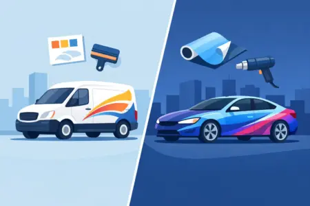
It also helps to be realistic about what you already have. If you have print-ready artwork, the process is usually more direct. If not, a simpler layout often produces a better result than trying to force a complex design into shape. Design Online, Upload your own Design, or Let us design for you can all be workable routes depending on how ready your branding is.
A good van livery should do its job every day with very little effort from you. If it looks professional, stays readable and gives people a reason to remember the business, it is earning its place long after the vehicle leaves the yard.