A worker approaches a noisy cutting area, a delivery driver enters a loading bay, or a visitor walks into a workshop. They should be able to see what action is required before they reach the risk. That is the purpose of a blue safety sign. If you are asking, what is a blue health and safety sign, the short answer is that it usually gives a mandatory instruction: something people must do to work safely.
For site managers, business owners and tradespeople, the colour is only part of the message. The sign must use the right symbol, be visible in the right place and remain legible in the conditions where people work.
What is a blue health and safety sign?
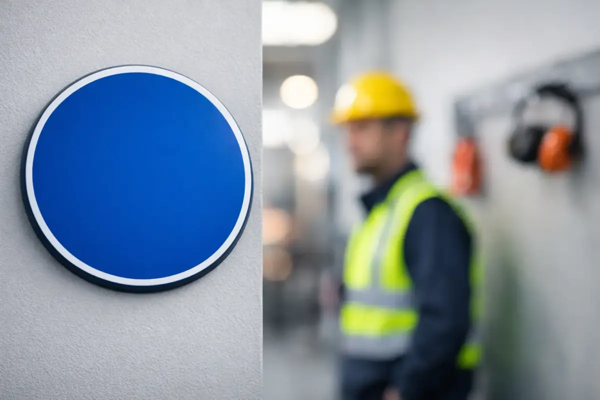
In UK workplace safety signage, a blue health and safety sign is generally a mandatory sign. It tells people about an action they are required to take, rather than simply drawing attention to a hazard.
The usual format is a blue circle containing a white pictogram. The circle is significant: it identifies the instruction as mandatory. A sign showing white ear defenders on a blue circular background means hearing protection must be worn. A white boot symbol means safety footwear must be worn.
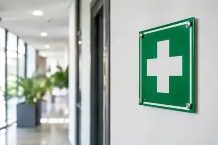
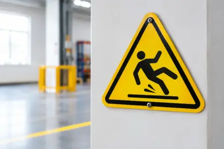
This differs from other standard safety colours. Yellow and black warn of hazards or caution. Red identifies prohibitions, such as no smoking, and is also used for fire equipment signs. Green indicates safe conditions, including first aid, escape routes and emergency exits. Blue is used when the message is: take this action.
That distinction matters because a sign is not just decoration or a general reminder. It forms part of the practical controls used to communicate site rules and reduce avoidable risks.
Common blue mandatory safety signs
Blue signs are used across construction sites, warehouses, factories, kitchens, schools, garages, retail back-of-house areas and many other workplaces. The exact requirement depends on the task, the risk assessment and the protective equipment or procedure in place.
Common examples include:
- Wear eye protection
- Wear hearing protection
- Wear head protection
- Wear protective gloves
- Wear safety footwear
- Wear high-visibility clothing
- Wear a face mask or respiratory protection
- Keep this door closed
- Use the handrail
- Wash hands
The pictogram should do most of the work. Someone should be able to understand the required action quickly, including visitors, contractors and staff who may not read English fluently. Short supporting text can add useful detail, particularly where a specific local instruction applies, but it should not make the sign crowded or difficult to scan.
Mandatory does not mean optional advice
A blue circular sign should only be displayed where the instruction is genuinely required. For example, placing a “Wear Eye Protection” sign at the entrance to a machine area makes sense if eye protection is required throughout that area. Displaying it in an office corridor where there is no relevant risk can weaken the meaning of the sign.
Over-signing is a common problem. When every wall carries a mixture of notices, people stop noticing the ones that matter. Use mandatory signs at the point where an action becomes necessary, and keep the message relevant to the work being carried out.
Where should blue safety signs be placed?
The best location depends on when a person needs to act. A PPE requirement should normally be displayed before someone enters the relevant area or starts the task. Instructions such as “Keep Door Closed” belong on, or immediately beside, the door concerned. Handwashing signs work best above or close to wash stations, rather than at the far end of the room.
Think about sightlines in real working conditions. A sign may look clear from a desk but disappear behind racking, an open roller shutter, parked plant or stored materials. In workshops and loading areas, signs may need to be mounted higher to stay visible. In pedestrian areas, they need to be readable at normal eye level without creating an obstruction.
Lighting also changes the choice. Indoor signs in well-lit corridors have different demands from signs in a dim plant room, an outdoor yard or a temporary site entrance. Where conditions are poor, larger formats, suitable positioning and, where necessary, photoluminescent or illuminated solutions may be appropriate.
Choosing the right size and material
A safety sign only works when people can recognise it in time. There is no one standard size for every application. The right size depends on viewing distance, speed of movement, available light and how busy the area is.
A small sign can be suitable on a piece of equipment, a cupboard or a single internal door. A larger rigid sign is more practical at a warehouse entrance, factory floor access point or site gate. If people are passing in vehicles or moving through a large yard, the sign needs to be large enough to register quickly from further away.
Material should match the environment. Self-adhesive vinyl can be useful for smooth indoor surfaces and short-to-medium-term applications. Rigid plastic boards are a practical choice for many indoor and outdoor locations. Aluminium composite materials can suit more exposed settings where a durable, professional finish is needed. The fixings matter too: a well-printed sign will not help if it curls, falls away or is fitted where it cannot be seen.
For temporary work, such as maintenance projects, events or short-term site changes, temporary signage can be the sensible option. For permanent rules, invest in durable signs that can withstand cleaning, weather and regular workplace activity.
Use recognised symbols and clear wording
Safety symbols should be familiar and consistent. Many workplaces use signs based on BS EN ISO 7010 pictograms, which provide widely recognised graphical symbols for safety messages. Consistency helps staff and visitors understand the instruction without having to decode a new design each time.
Avoid creating a custom blue sign that relies on clever wording, tiny type or an unclear image. Branding can sit alongside site signage where appropriate, but it must not compete with the safety instruction. The mandatory symbol should remain the most prominent element.
There are cases where a standard symbol alone is not enough. A chemical area, for example, may need a specific instruction about the type of gloves required. In this situation, use the recognised mandatory symbol and add concise supplementary wording, such as “Chemical Resistant Gloves Must Be Worn”. Keep the wording direct and make sure it reflects the actual controls set out in the risk assessment.
Blue signs and your wider safety system
A blue health and safety sign is one control within a wider system. It does not replace training, supervision, safe working procedures, PPE provision or physical measures such as guards and barriers. A “Wear Ear Protection” sign does not make a noisy process safe on its own. It supports a requirement that workers have been told about, given the right equipment for and can realistically follow.
This is particularly relevant when site layouts or work activities change. New machinery, revised traffic routes, refurbishment work, different contractors or seasonal operations can all alter the signage needed. Review signs after changes, not only when a sign becomes damaged or faded.
It is also worth checking that instructions do not conflict. If one entrance says safety footwear is mandatory and another route into the same work area has no sign, visitors may receive mixed messages. Standardising sign designs, sizes and placement across a site makes rules easier to follow and simpler to maintain.
Ordering signs that fit the job
Before ordering, identify the required action, the location, viewing distance, surface and expected lifespan. This prevents the familiar problem of buying a suitable design in an unsuitable format. A sticker may be right for a machine guard; a larger rigid sign may be needed for the entrance to the same area.
For straightforward requirements, ready-made mandatory safety sign designs are often the fastest option. Where you need a local instruction, company wording, a particular size or a sign to match existing site formats, a custom version gives more control. The SignBuilder can prepare practical safety signage from supplied artwork or help produce a clear, print-ready layout for the intended application.
A blue sign is a simple instruction with a serious job: it tells people what they must do before risk becomes harm. Choose a recognised symbol, put it where the decision is made and keep it clear enough to be acted on without hesitation.