A yellow sign by a loading bay, plant room or workshop entrance is there to make someone pause before they enter a hazard area. But what is a yellow health and safety sign in practical terms? It is a warning sign. It highlights a risk that could cause injury or harm and tells people to take care, assess the situation and follow the controls already in place.
For businesses, the value is simple: a clear warning sign helps employees, visitors, contractors and delivery drivers recognise hazards before they are exposed to them. It supports a safer, more organised site, but it does not replace proper risk controls, training or safe working procedures.
What is a yellow health and safety sign used for?
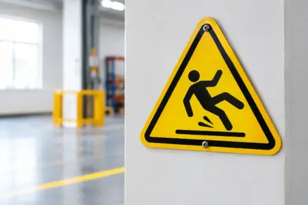
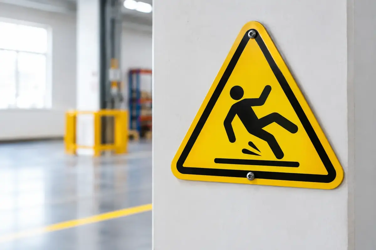
A yellow health and safety sign warns people about a specific danger. Under recognised safety sign conventions, including BS EN ISO 7010, warning signs are generally triangular, with a yellow background, black border and black pictogram.
The shape and colour allow the message to be understood quickly, often before somebody is close enough to read detailed text. A black lightning bolt warns of electrical danger, for example, while a slipping figure warns of a slippery surface. The pictogram should identify the nature of the hazard without relying on lengthy wording.
Yellow is used because it stands out clearly and is associated with caution. It is not a general-purpose colour for every safety instruction. A yellow sign warns of a hazard; it does not tell somebody what protective action they must take. Where a specific action is required, such as wearing eye protection, a separate blue mandatory sign may also be needed.
Common yellow warning signs on UK premises
The right sign depends on the risks identified in your workplace assessment. A building site, warehouse and commercial kitchen can all need warning signage, but the hazards will be different.
Common examples include warnings for high voltage, forklift lorries, overhead loads, moving machinery, hot surfaces, uneven ground, deep water, corrosive substances and flammable materials. You may also see yellow signs used near automatic doors, low ceilings, steps, fragile roofs or areas with restricted headroom.
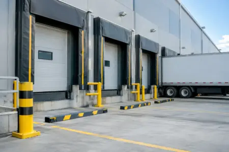
In many settings, more than one message is required at the point of risk. A warehouse door leading to a vehicle route might need a warning for forklift traffic, a mandatory sign requiring high-visibility clothing and a site traffic instruction. Trying to fit every message into one overcrowded sign can make it less effective. Use separate, clearly positioned signs where each message needs to be seen.
Warning signs are not the same as temporary notices
A printed yellow notice can still communicate a warning, but it is not automatically a compliant safety sign. For a permanent or recurring hazard, use a recognisable warning symbol and a suitably durable sign material.
Temporary warnings have their place. A cleaning team may use a portable wet floor sign while an entrance is being mopped, for example. However, if the floor is repeatedly slippery because of a leak, poor drainage or an unsuitable surface, the underlying issue needs to be dealt with. Signage should support risk control, not become the only response to a known problem.
Yellow, red, blue and green safety signs
Safety sign colours work as a visual language. Using the wrong colour can cause confusion, particularly where people move quickly through busy work areas.
Yellow and black signs warn of hazards. Blue and white signs give mandatory instructions, such as “Wear hearing protection”. Red signs usually prohibit an action, such as “No smoking”, or identify fire-fighting equipment. Green signs identify safe conditions, including emergency exits, first aid points and escape routes.
There can be exceptions in branded environments and on general information boards, but safety colours should not be used casually where they may be mistaken for a formal instruction. Keep warning signs distinct from promotional graphics, directional signs and everyday notices. On a busy site, visual clarity is part of the job.
Where should yellow warning signs be displayed?
Place a warning sign where it can be seen before a person reaches the danger. A sign positioned behind a gate, around a blind corner or above eye level may technically be present but fail when it matters.
At entrances, position the sign so that people see it before entering the affected area. For hazards within a room or work zone, place it close to the hazard while allowing enough distance for someone to react safely. A warning for overhead crane operations, for instance, should be visible at access points to the lifting area, not only directly beneath the crane route.
Consider who needs to see it. Signs intended for pedestrians may need to be mounted at a different height from signs for vehicle operators. In shared yards, loading areas and retail stock rooms, it can be necessary to provide signs from more than one approach.
Lighting also affects performance. A sign in a dim plant room or outside working hours may need reflective material, additional lighting or a different position. Check for obstructions such as stored stock, open doors, seasonal displays and parked vehicles. A sign hidden by the very activity it is meant to manage is not doing its job.
Choosing the right size and material
A safety sign needs to be readable at the distance from which people first need to act. Small self-adhesive signs can be suitable for machinery, cupboards and internal doors. Larger rigid signs are more appropriate for site entrances, warehouse walls, external gates and vehicle routes.
Material choice depends on the environment. Self-adhesive vinyl works well on clean, smooth internal surfaces. Rigid plastic signs are a practical option for many indoor and outdoor applications. Aluminium composite can be a better choice for exposed locations where a more durable, rigid finish is needed. The fixing method matters too: a sign should remain secure in wind, rain, vibration and regular cleaning.
Avoid selecting a sign only by the available wall space. If the message needs to be read from several metres away, choose a larger format or improve its position. A smaller sign may cost less at the point of purchase, but it is poor value if it cannot be seen in time.
Add text only when it improves the message
A recognised warning pictogram should remain the main feature. Short supporting text can be useful where the hazard needs more context, such as “Beware of Forklift Lorries” or “Caution: Hot Surface”. Keep wording direct and avoid paragraphs of instructions.
Custom wording can be particularly useful for site-specific hazards, temporary work areas or access restrictions. If you add your own text, maintain strong contrast and leave enough clear space around the warning symbol. A crowded design is harder to read at a glance.
Meeting your duties without relying on signs alone
In the UK, safety signs are generally used where a significant risk remains after other suitable control measures have been considered. This reflects a sensible order of control: remove the hazard where possible, reduce the risk through equipment or procedures, and use signs to communicate the remaining danger.
For example, a warning sign beside an electrical panel is useful, but it does not make damaged wiring safe. A forklift warning sign helps alert pedestrians, but it should sit alongside marked routes, speed controls, operator training and good visibility. The sign is one part of a working safety system.
Review signs when layouts, machinery, access routes or processes change. Old signs can be misleading, especially after equipment has been removed or a warehouse route has been altered. Faded, cracked or outdated signs should be replaced promptly so staff do not become used to ignoring them.
Ordering warning signs for your workplace
Start with the hazard, the viewing distance and the surface where the sign will be fitted. Then decide whether a standard warning sign covers the requirement or whether a custom sign would make the message clearer. Standardised symbols are often the best choice for familiar hazards, while tailored wording can help address a specific local risk.
The SignBuilder can produce standard and personalised health and safety signage in formats suited to doors, walls, gates, work areas and external premises. For repeat requirements across several locations, keeping the same symbol, wording, size and material helps staff and visitors recognise the message wherever they work.
A yellow warning sign earns its place when it is visible, relevant and backed by proper controls. Put it where people can act on it, keep it in good condition, and let the hazard assessment guide the message rather than choosing a sign simply because there is a blank space on the wall.