A sign above your premises only works while customers are nearby. Vehicle lettering works while you are travelling to site, parked outside a customer’s property or loading materials at a supplier. For tradespeople, local businesses and fleet operators, it is one of the most practical ways to put a professional name, service and contact route in front of the right people.
The best results are rarely the busiest. Clear information, sensible sizing and the right material do more for a vehicle than a crowded design full of small text. Whether you run one van or manage several vehicles, a planned approach helps your branding stay visible, legible and consistent on the road.
What vehicle lettering should achieve
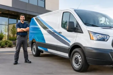
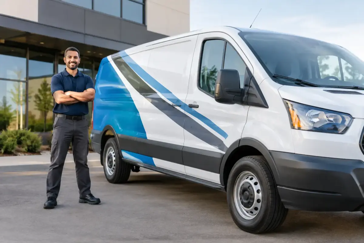
Vehicle lettering is cut vinyl text and simple graphic elements applied directly to a vehicle. It can include your business name, telephone number, website address, service description, logo and key messages. It is a flexible option for cars, vans, lorries and trailers, particularly where a clean, direct finish is more suitable than a full-colour printed design.
Its first job is identification. A customer expecting an electrician, decorator, cleaning team or delivery service should be able to recognise the right vehicle straight away. Its second job is marketing. When people repeatedly see the same name in their area, familiarity builds before they need your service.
It can also support day-to-day operations. Clearly marked fleet vehicles look more accountable on site and at the kerbside. Consistent names and contact details make it easier for enquiries to reach the right business, rather than being lost to a vague online search.
Start with the message, not the available space
A van side may offer a large panel, but that does not mean every part needs filling. Decide what someone needs to understand in a few seconds as the vehicle passes or sits in traffic. In most cases, that means your company name, what you do and one clear way to get in touch.
For a sole trader, a business name and mobile number may be enough. For an established firm with a recognisable logo, the name, service area and website can be more useful. A fleet company may need a standard layout that includes a vehicle number, branch detail or regulated information alongside its core branding.
Try to rank the information before creating artwork. Your business name should normally be the most prominent item. Your main service should come next, especially if the name alone does not explain what you do. Contact details need to be large enough to read when parked, but they should not compete with the main message.
A common mistake is trying to list every service. “Plumbing, heating, bathrooms, boilers, kitchens, drainage and repairs” may be accurate, but it becomes difficult to read at a distance. A stronger option is a short, useful category such as “Plumbing and Heating”, followed by a website or phone number for fuller detail.
Choose text that can be read at a glance
Lettering size matters more than clever wording. Small text might look acceptable on a screen or close-up proof, then disappear completely from the other side of a road. Bold, simple typefaces generally perform better than decorative fonts, particularly for vehicle names and phone numbers.
Contrast is equally important. Dark lettering on a light vehicle, or light lettering on a dark vehicle, gives the clearest result. If your brand colours are close to the paint colour, consider using a contrasting outline, a separate panel or an alternative approved colour for the lettering.
Avoid placing vital text across door handles, fuel caps, deep panel lines, sliding-door tracks or heavily curved sections. These areas can interrupt words and make application more difficult. A good layout works with the shape of the vehicle rather than fighting it.
Plan each vehicle area for how it is seen
Different parts of a vehicle serve different purposes. The sides usually provide the largest and most useful viewing area, making them suitable for the company name, service description and contact details. Rear doors are valuable in slow traffic, where drivers may have longer to read a website or phone number.
Bonnet lettering can help with recognition when a vehicle is parked facing customers, although it should remain simple. Cab doors suit logos and business names well, while rear quarter panels can be useful for a short service line. On smaller cars, restraint is especially important. One well-positioned message is more effective than several cramped ones.
If you operate a mixed fleet, do not assume the same artwork can simply be enlarged or reduced for every vehicle. A layout that works on a long-wheelbase van may not suit a compact car or a pickup. Keep the same hierarchy, colours and type style, then adapt the position and scale to each vehicle’s panel shapes.
Select materials for the job they need to do
Vehicle lettering needs to cope with rain, road dirt, washing and regular use. Quality exterior vinyl is designed for this environment, but the best choice depends on the vehicle, the design and how long you expect the graphics to remain in place.
Cut vinyl is particularly effective for solid-colour text, logos and simple shapes. It produces a crisp result and is well suited to business names, phone numbers, social handles and short promotional messages. More detailed logos or colour fades may require a different graphics approach, so it is worth supplying the original artwork early for checking.
The condition of the vehicle also matters. Fresh paint, damaged panels, rust, wax treatments and poor previous sign removal can all affect adhesion or the final appearance. A clean, sound surface gives the best starting point. If a vehicle has recently been painted or repaired, check that the paintwork has fully cured before booking application.
Magnetic signs can be useful where a vehicle is shared, leased or used for both business and personal journeys. They offer flexibility, but they need flat metal panels and regular cleaning behind the sign to prevent trapped dirt affecting the paintwork. They are not a direct substitute for fixed lettering in every situation, especially on frequently used commercial vehicles.
Prepare artwork that prints clearly
Good artwork speeds up production and avoids unnecessary changes. Vector files are usually preferred for logos and lettering because they can be resized without losing sharpness. Common suitable formats include PDF, EPS, AI and SVG. High-resolution image files may also be usable for some designs, provided they are supplied at the right size and quality.
If you do not have finished artwork, begin with the information that matters: your business name, preferred colours, logo if available, vehicle make and model, and the areas you want to use. This gives a designer a clear brief and reduces back-and-forth later.
Before approving a proof, check every detail as if you were a customer seeing the vehicle for the first time. Confirm spelling, telephone numbers, web addresses, spacing and colour choices. Ask whether the key text is readable from several metres away, not just when viewed on a computer screen.
Think beyond the first vehicle
Vehicle lettering is most effective when it forms part of a consistent business presentation. A customer who sees the same logo on a van, a site sign, staff clothing and a banner is more likely to remember the name. That consistency does not require every item to look identical, but the core colours, wording and logo treatment should stay recognisable.
For growing businesses, keeping approved artwork and layout notes saves time when another vehicle is added. It also prevents gradual changes between jobs, such as slightly different blues, alternate phone numbers or an outdated logo appearing on one van. The SignBuilder can support this practical ordering process with design-ready options, uploaded artwork and repeat production where required.
Budget should be considered over the useful life of the vehicle, not only at the point of purchase. A clear, durable design that represents your business properly for years can offer better value than a cheap, overcomplicated option that quickly looks dated or becomes hard to read.
Keep lettering looking professional
Once applied, regular washing helps keep vehicle lettering visible and presentable. Use normal vehicle-cleaning methods with care, and avoid directing high-pressure water too closely at vinyl edges. If a section starts to lift or becomes damaged, deal with it promptly before dirt and moisture work underneath.
When a vehicle changes role, address or branding, update the lettering rather than leaving incorrect details in public view. Old contact information is not merely untidy – it can send potential work elsewhere or create confusion for existing customers.
The strongest vehicle lettering is not the one with the most information. It is the one that makes your business easy to recognise, easy to understand and easy to contact wherever the working day takes you.