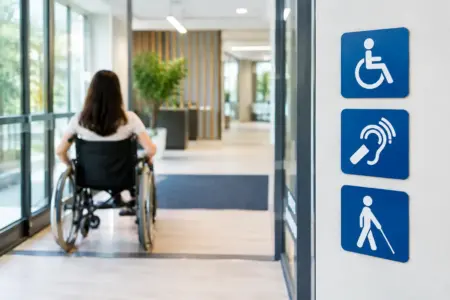
A customer arriving at your premises should not have to guess which entrance to use, where the accessible toilet is or how to reach the reception desk. Clear signs remove that uncertainty. This accessibility signage guide sets out the practical choices that help businesses, venues and organisations make their sites easier to use, while keeping wayfinding consistent and professional.
Good accessibility signage is not a separate finishing touch added after a site is complete. It is part of how people move through a building, car park, shop floor, reception area or event space. It needs to work for visitors with visual, hearing, mobility and cognitive impairments, as well as staff, delivery drivers and first-time customers who simply need clear directions.
Start with the visitor journey
Walk the route as someone unfamiliar with the site. Start at the pavement, car park or drop-off point, then follow the journey to the entrance, reception, facilities and exit. At each decision point, ask what information a visitor needs before they reach it.
For many premises, the route will need signs for accessible parking bays, step-free access, entrances, reception, lifts, toilets, changing facilities, fire exits and designated waiting areas. Larger buildings may also need clear directional signs at junctions, floor changes and long corridors. A sign positioned after the turning point is not useful, however well designed it may be.
Think about temporary situations too. Building work, a moved entrance, a closed lift or an event layout can quickly make permanent signs misleading. Temporary correx boards, freestanding signs or banners can provide a clear alternative route when conditions change.
Accessibility signage guide: make information easy to read
The most effective signs are simple. They state the destination or instruction in plain language, use recognised symbols where appropriate, and give the reader enough time to take in the message. Long explanations, cramped layouts and decorative typefaces create problems even when the wording is technically correct.
Choose contrast before branding
Text and symbols should stand out clearly against the sign background. Dark lettering on a light background, or light lettering on a dark background, is usually easier to read than colours of a similar tone. Contrast matters more than choosing brand colours alone.
Branding can still sit comfortably within an accessible sign scheme. Use your brand colour as an accent, border or header where it does not reduce legibility. For essential directions, safety notices and facility identification, clarity should take priority.
Avoid reflective glare where signs sit under strong lighting or face windows. Matte-finish printed panels are often a sensible option indoors, while durable rigid signs with a suitable finish are better for outdoor routes, entrance points and car parks.
Use type, symbols and spacing carefully
Use a clear sans-serif typeface with enough weight to remain readable at a distance. The right text size depends on viewing distance, sign position and the amount of information required. A toilet door sign can be concise and close to the user; a car park direction sign needs larger wording and symbols because it is read from farther away.
Recognised pictograms are useful because they communicate quickly across language barriers. Pairing a familiar symbol with short text is often the strongest choice. For example, an accessible toilet sign should use the recognised wheelchair symbol alongside a clear facility label rather than relying on a symbol alone.
Leave space around text, arrows and pictograms. A crowded sign forces people to stop and study it, which can obstruct corridors, entrances and busy event routes. One sign should normally answer one immediate question.
Select signs for the right location
Material choice affects both lifespan and visibility. Indoor signs may need a clean, professional appearance and easy fixing, while outdoor signs must cope with rain, UV exposure, wind and regular cleaning. The cheapest material is not always the most cost-effective if it fades, cracks or becomes difficult to read after one season.
For fixed exterior information, rigid plastic, aluminium composite or other weather-resistant sign materials are generally suitable choices. Wall-mounted panels work well at entrances and alongside routes. Post-mounted signs are useful for parking areas and larger grounds, provided they are placed where they can be seen without creating an obstruction.
Inside, printed panels, vinyl lettering and door signs can create a consistent system across reception areas, corridors and facilities. Vinyl lettering is particularly useful for glass doors and internal surfaces, but it needs enough contrast with the background to be seen clearly. On glazed doors, visibility markings may also be needed to make the glass apparent.
Freestanding signs are practical for temporary directions, queue management, service changes and events. Their limitation is that they can be moved, knocked over or become an obstacle in a narrow route. Use a stable base, keep the message large, and check that the sign does not reduce the clear width of a walkway.
Cover the facilities people need to find
An accessible route is only useful if the key facilities are easy to identify. Review both the route and the sign at the destination. A visitor should not reach a door and still be unsure whether it is the correct room or whether assistance is required.
The following locations commonly need clear, consistent identification:
- Accessible parking bays, drop-off points and step-free entrance routes.
- Reception desks, visitor check-in points, lifts and alternative access routes.
- Accessible toilets, changing places facilities, seating areas and hearing assistance points where provided.
- Emergency exits, refuge areas, evacuation instructions and assembly points.
- Service counters, collection points, event registration desks and accessible viewing areas.
The exact requirement depends on the building, its use and the services available. A small retail unit has different needs from a warehouse, school, hotel or public event site. Do not display symbols for facilities that are unavailable or inaccessible in practice. Misleading signs create frustration and may direct someone to a route they cannot use.
Keep wayfinding consistent across the site
A sign system works best when the same destination is described the same way everywhere. If one sign says “Reception”, another says “Main Office” and a third says “Visitor Desk”, people will hesitate even if all three point to the same place.
Set a small number of rules before ordering: the approved wording for each area, arrow style, colours, pictograms, sign sizes and fixing positions. This is especially useful for multi-site businesses, managed properties and venues that regularly add rooms, departments or event areas.
Mount signs at a sensible height for the people using them. Door and wall signs should be reachable and readable by standing visitors and wheelchair users, without being hidden by an open door, furniture, displays or seasonal decorations. Suspended signs can work well in larger spaces, but should support rather than replace information at eye level.
Tactile lettering and Braille may be appropriate for certain settings, particularly permanent public-facing facilities. Whether they are needed will depend on the building type, existing arrangements and relevant accessibility advice. Where tactile signs are used, positioning matters as much as the raised detail itself: users need to be able to locate them consistently.
Balance compliance, safety and everyday use
In the UK, duties under the Equality Act 2010 require service providers and employers to consider reasonable adjustments for disabled people. Signage is one practical part of that wider responsibility. Building standards and recognised guidance can also influence what is suitable for a particular project, especially during new builds, refurbishments or public-sector work.
There is no one-size-fits-all sign pack that guarantees every site is covered. A listed building, a busy distribution yard and a community hall all have different routes, hazards and user needs. If a project has formal compliance requirements, consult the relevant building professional, accessibility adviser or local authority guidance before finalising a scheme.
For routine operational signage, focus on the real question: can a person find, understand and use the service without avoidable barriers? That approach often highlights issues missed by a quick visual check, such as a poorly lit entrance sign, a confusing route around a loading area or a toilet sign placed behind a propped-open door.
Check signs after installation
Ordering the right signs is only half the job. Once fitted, inspect them in normal conditions – during busy periods, in low light and from the approach direction. Ask someone unfamiliar with the premises to find reception or an accessible facility without being guided. Their pauses and wrong turns will reveal where extra information is needed.
Include signage in routine site checks. Replace faded outdoor panels, clean marks from vinyl lettering, remove outdated temporary notices and update directions when layouts change. This keeps the site safer, more welcoming and easier to manage for everyone.
When you are ready to order, prepare a simple schedule showing each sign’s wording, size, material, quantity and intended location. You can then design online, upload finished artwork or request help preparing a consistent set. A clear sign at the right point in the journey is a small detail that makes a practical difference every day.