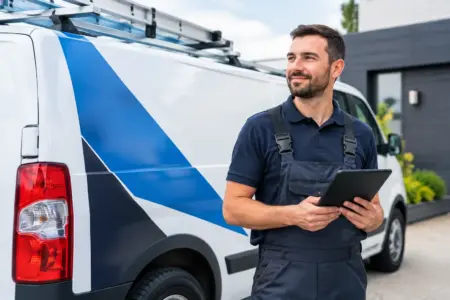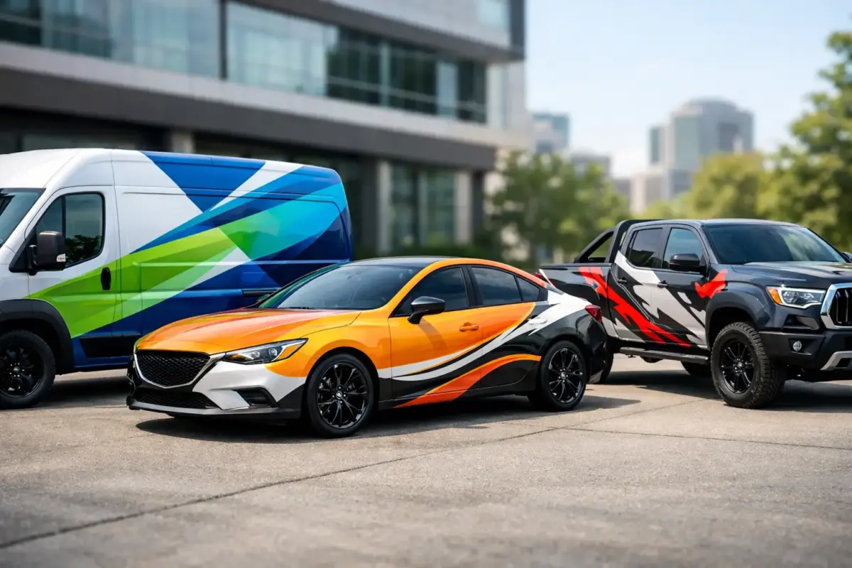
A signwritten van parked outside a customer’s property is often the first proof that a business is established, local and ready to work. The best vehicle branding ideas do more than place a logo on a door. They make it clear who you are, what you do and how a potential customer can contact you in the few seconds they have to look.
For tradespeople, mobile services, delivery businesses and fleet operators, the aim is not to cover every panel with information. It is to create clear, durable vehicle graphics that work in traffic, at the roadside and on site.
What makes vehicle branding effective?
A good design starts with the viewing distance. A vehicle may be seen from across a car park, while driving past at 30 mph or from a pavement several metres away. Your business name, main service and contact route need to be readable before smaller details such as accreditations, social media handles or a full list of services.
Think about the vehicle itself, too. A long-wheelbase van gives you substantial side-panel space, while a small hatchback needs a more restrained layout. Curves, handles, windows, fuel caps and panel joins all affect where graphics can sit. A layout that looks balanced on screen can become difficult to read once it is fitted to a real vehicle.
12 best vehicle branding ideas to consider
1. Make your business name the largest element
Your business name or logo should be the first thing people notice. Position it on the side panels, where it has the greatest exposure when parked or travelling through town. Use a typeface that remains legible at distance and allow enough clear space around it.
A complicated logo can still be used, but it may need a simplified version for smaller areas such as rear doors or a bonnet. Fine lines and small lettering lose impact quickly when viewed from the road.
2. State one clear service
Below the business name, add a short description that answers the main question: what do you do? “Electrical Contractors”, “Garden Maintenance” or “Commercial Cleaning” is more useful at a glance than a broad marketing slogan.
If your business provides several services, lead with the one that brings in the right enquiries. You can add two or three supporting services in smaller text, but avoid turning the vehicle into a full brochure.
3. Use a strong colour contrast
Contrast is what makes lettering readable. Dark graphics on a pale vehicle, or pale graphics on a dark vehicle, generally offer the clearest result. Brand colours matter, but they need to work against the paint colour rather than disappear into it.
For example, dark blue lettering can look professional on a white or silver van, while bright yellow may need a dark backing colour to remain clear. Printed vinyl gives more freedom with colour, gradients and imagery, but the design should still read well in poor weather and low light.
4. Put contact details where people expect them
A mobile number and website are usually the most practical contact details for vehicle graphics. Keep the number large enough to read, particularly on rear doors where motorists may be following behind you.
Do not rely on a lengthy email address as the main call to action. It is difficult to read and impossible for most people to use safely while on the move. A short web address or memorable phone number is usually more effective.
5. Use the rear of the vehicle properly
Rear doors are valuable advertising space because they face stationary traffic. They suit a compact version of the side-panel message: logo, service, phone number and website. Keep text away from door edges, handles, lights and number plates.
This is also a sensible place for a simple call to action, such as “Call for a free quote” or “Book online”. The message must stay brief. A driver behind you should understand it without having to study it.
6. Add professional credentials selectively
Trade memberships, qualifications, insurance statements and approval marks can build confidence, especially for regulated or technical services. They work best as supporting proof, not the main feature of the design.
Choose the credentials customers genuinely recognise and value. A row of tiny badges may look busy without adding reassurance. If space is limited, use the most relevant accreditation and keep it readable.
7. Create a recognisable fleet layout
For a fleet, consistency is as valuable as visibility. Use the same logo placement, colours, typefaces and service line across every van, car or lorry. Different vehicle sizes will require adjustments, but the overall appearance should remain familiar.
A consistent fleet helps customers identify your team at multi-site jobs and makes a growing business look organised. It also simplifies re-orders when a vehicle is replaced or a new team member joins.
8. Use cut vinyl lettering for direct, durable messaging
Cut vinyl lettering is a practical choice for names, phone numbers, web addresses and straightforward service descriptions. It produces clean edges and works well for bold, high-contrast designs.
It is particularly useful when your branding uses one or two solid colours rather than photographic images. For many trades and local service businesses, this direct approach is easier to read and often gives the best value for everyday use.
9. Use printed graphics where detail earns its place
Printed vehicle graphics are useful when you need multiple colours, a detailed logo, product images or a bespoke pattern. A florist may use a floral illustration, while a catering company might benefit from clear food photography. The image must support the service rather than compete with the contact details.
There is a trade-off. More visual detail can make a vehicle memorable, but it can also make the important message harder to find. Check the design at thumbnail size or from several metres away before approving it.
10. Make magnetic signs work for flexible use
Magnetic vehicle signs suit businesses that use personal vehicles for work only at certain times, or organisations that need removable identification. They can also be useful for temporary campaigns, event teams and short-term contracts.
Because the available area is smaller, keep the design focused on a logo, service and phone number. Magnetic signs should be fitted to clean, dry, flat metal panels and removed regularly for cleaning. They are not suitable for every vehicle panel, particularly those made from non-magnetic materials.
11. Use window graphics carefully
Window graphics can extend your branding, but they should never reduce safe visibility for the driver. Rear window graphics may be appropriate when produced for that application, while side and front windows need particular care.
Treat windows as an optional branding area, not the place for essential information. The body panels should carry your core message even when the vehicle is viewed from an angle.
12. Plan for everyday wear before fitting
Vehicle graphics face rain, road grime, repeated washing and regular use. Position key elements away from areas likely to receive heavy scuffing where possible, and choose materials suited to external vehicle use.
Before fitting, make sure the paintwork is clean, dry and in good condition. Fresh paint may need time to cure, and damaged lacquer can affect adhesion. Measure the vehicle model carefully, especially if you are ordering graphics for more than one make or wheelbase.
A simple layout that works for most businesses
For many vans, the most reliable arrangement is a large logo and service description on both sides, with a phone number and website beneath. Repeat a simplified version on the rear doors. Add a small logo or business name to the bonnet only if it improves the overall look rather than making the design feel crowded.
Cars and smaller vans usually need fewer elements. Prioritise the business name and one contact method, then use a concise service line if space allows. A clean, well-spaced design will generally appear more professional than one that tries to use every available panel.
Choose the ordering route that suits your artwork
If you have an established logo and print-ready design, uploading artwork can be the quickest route. If you only have a logo, colour preferences and the wording you need, using an online design tool or requesting design support can help turn those details into a workable layout.
Check spelling, phone numbers and web addresses before production. It sounds basic, but correcting a single digit after graphics have been made costs more time and money than checking the artwork carefully at the start. The SignBuilder can help businesses move from a straightforward idea to practical vehicle lettering, printed graphics or magnetic signs without making the process harder than it needs to be.
Your vehicle is already travelling to jobs, suppliers and customer locations. Give it a clear message, fit graphics that suit the vehicle and keep the information focused, and every journey can reinforce the business you want people to remember.