A busy site does not leave much time for reading. Health and safety signage colours give staff, visitors and contractors an immediate visual cue: stop, take care, wear protection, or head towards safety. When the colour, shape, symbol and placement are right, a sign can communicate its message in seconds.
For business premises, construction sites, warehouses, workshops, schools and public venues, colour-coded signage is a practical part of managing risk. It supports training and site rules, but it does not replace either. The aim is simple: put a clear instruction or warning where people need it, in a format they can recognise quickly.
What health and safety signage colours mean
UK safety signs commonly follow the colour and symbol conventions set out in BS EN ISO 7010. Using recognised designs helps create consistency between sites, which matters when agency staff, delivery drivers or visitors may be unfamiliar with a building or work area.
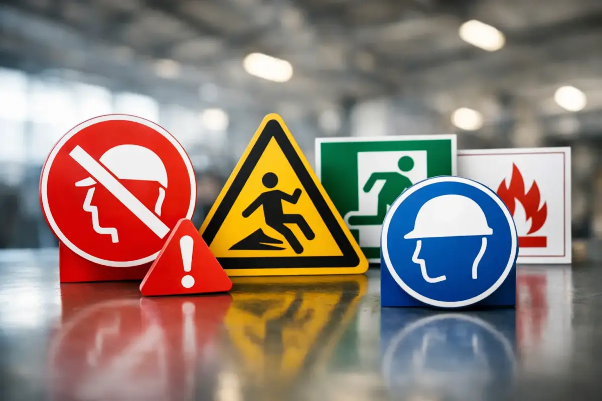
The four main safety sign colour groups are red, yellow, blue and green. Each carries a different type of message. A good sign uses the correct colour alongside the correct shape and pictogram, rather than relying on colour alone.
Red: prohibition and fire equipment
Red is used where an action is prohibited or where fire-fighting equipment is located. A prohibition sign normally has a red circular band and diagonal bar over a black symbol on a white background. Examples include No Smoking, No Entry and No Unauthorised Persons.
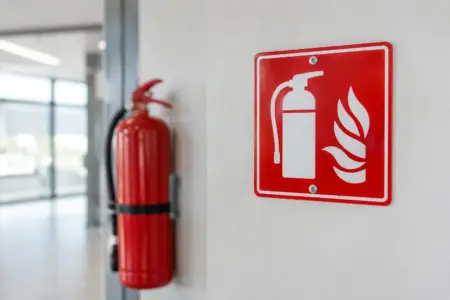
Fire equipment signs are generally red with a white pictogram. They identify items such as fire extinguishers, fire hose reels, fire alarm call points and fire blankets. These signs should be fitted where the equipment is visible from a distance or could be obscured by shelving, machinery, stock or an open door.
The distinction matters. A red circle with a bar tells someone not to do something. A red rectangular fire equipment sign tells them where to find essential equipment. Do not use a general red notice as a substitute for either recognised sign type.
Yellow: warning and caution
Yellow, or amber, is the warning colour. It alerts people to a hazard that may cause injury or requires extra care. Warning signs are normally triangular, with a black border and black pictogram on a yellow background.
Typical examples include warnings for fork-lift lorries, slippery surfaces, electricity, overhead loads, hazardous chemicals and uneven ground. A warning sign should identify a real and relevant risk. Filling a wall with generic caution notices can have the opposite effect, as people stop noticing them.
Use yellow signs close enough to the hazard to be useful, while giving people enough time to change their behaviour. For example, a warning about moving vehicles is more effective at the entrance to a loading area than beside the vehicle itself.
Blue: mandatory actions
Blue safety signs tell people what they must do. They are usually circular, with a white symbol on a blue background. These signs are commonly used for personal protective equipment and site procedures.
You may need blue mandatory signs at a workshop entrance, by machinery, in a chemical handling area or near a specific task. Messages include Wear Eye Protection, Safety Footwear Must Be Worn, Keep Guard in Place and Use Handrail.
A mandatory sign works best when the requirement is enforceable and the necessary equipment is available. If visitors are required to wear high-visibility clothing, make sure it is issued or clearly state where it can be collected. Signage is more credible when the practical arrangement behind it is in place.
Green: safe conditions and emergency information
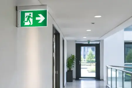
Green signs show safe conditions, escape routes and first-aid provision. They are normally rectangular or square, using a white symbol on a green background. Common examples include Fire Exit, Emergency Exit, First Aid, Emergency Shower and Assembly Point.
Escape route signs need particular care. They should lead people continuously from their current location towards a place of safety, including at turns, changes in level and intersections. A single exit sign at the final door is not enough for a large or complex building.
Where emergency lighting is required, check that the sign remains visible if normal lighting fails. Positioning, viewing distance and any obstruction from racking, displays or temporary stock all affect whether the route can be understood in an emergency.
Colour is only one part of an effective sign
Health and safety signage colours carry meaning quickly, but a colour alone is not a complete instruction. Standard symbols are useful because they can be understood at a glance by people with different reading abilities or first languages. Supplementary text can add site-specific detail, such as “Hard hats must be worn beyond this point”, but it should not make the sign difficult to scan.
Shape also reinforces the message. Circular signs indicate prohibition or mandatory action, triangles indicate warnings, and rectangular or square signs identify emergency conditions, equipment or information. This combination makes signs easier to recognise from a distance.
Contrast is equally important. A faded yellow warning sign against pale cladding, or a green first-aid sign hidden among green décor, may not do its job. Choose a size suited to the viewing distance and make sure the sign is not lost in visual clutter. In practical terms, a sign seen across a warehouse aisle needs to be larger than one mounted beside a doorway.
Choosing the right material and format
The best material depends on where the sign will be used, how long it needs to last and what it will be fixed to. Indoor signs in offices, corridors and staff areas may only need lightweight rigid plastic or self-adhesive vinyl. Warehouse, workshop and outdoor locations often need a tougher option that can cope with knocks, moisture, UV exposure and regular cleaning.
Rigid plastic signs are a straightforward choice for walls, gates and internal site areas. Aluminium composite signs suit longer-term external use, including car parks, yards and building entrances. Self-adhesive vinyl can work well on smooth doors, equipment and glazed surfaces, provided the surface is clean, dry and suitable for adhesion.
For temporary risks, such as wet floors or short-term maintenance work, freestanding signs can be moved into position quickly. They should still be stable, easy to see and removed once the hazard no longer exists. Leaving old temporary signs in place creates confusion and reduces the impact of genuine warnings.
Think about fixing before ordering. Holes, adhesive backing, cable ties or a sign frame may all be appropriate, but the surface and environment will decide. A sign that comes loose in a busy access route is not a safety solution.
Where businesses commonly get signage wrong
The most frequent issue is using the wrong message for the situation. A blue “Wear Hearing Protection” sign does not replace a warning sign where there is a risk of high noise levels, and it does not remove the need for a proper assessment of noise control measures. In some areas, both warning and mandatory signs may be needed because they communicate different things.
Another common problem is poor placement. Signs mounted too high, behind stored goods, on the wrong side of a door or after the point where a decision must be made are easy to miss. Walk the route as a visitor or new employee would. Can they see the required instruction before entering the hazard area? Can they follow the emergency route without guessing?
Out-of-date signs also cause avoidable problems. A changed layout, relocated first-aid kit or revised traffic route should trigger a check of associated signage. This is especially relevant after a refurbishment, a warehouse reorganisation or changes to site access.
Finally, avoid overloading a single signboard with every possible rule. Group related information where it helps, such as at a site entrance, but use individual signs at the point of risk. People need the relevant message at the moment they can act on it.
A practical way to review your signs
Start with a walk-round of the premises and compare signs against current risks, procedures and emergency arrangements. Check entrances, pedestrian routes, vehicle areas, machinery, chemical storage, welfare facilities, fire points, first-aid locations and evacuation routes. Include areas used by visitors and contractors, not only regular employees.
Record signs that are missing, damaged, faded, obscured or no longer accurate. Then decide whether you need a standard recognised safety sign, a custom sign with an additional site instruction, or both. Custom wording is useful for local rules, but recognised symbols should remain prominent where the message relates to a standard safety action.
For multi-site businesses, keeping the same designs, colours and terminology across locations makes inductions simpler and reordering quicker. The SignBuilder can produce standard safety signs alongside custom site notices, helping businesses keep practical information consistent across their premises.
The right sign is not necessarily the largest or the most detailed one. It is the one people can see, understand and follow before a small risk becomes an incident.