A busy event site can become confusing within minutes. Cars arrive before the gates open, suppliers need the right entrance, visitors look for parking and staff are asked the same questions repeatedly. A good guide to temporary event signage starts with one principle: put the right message where people need to make a decision, not where there happens to be spare space.
Temporary signs do more than display a logo. They manage movement, reduce pressure on staff and help an event look organised from the first arrival to the final pack-down. Whether you are running a trade day, community festival, hospitality event, open day or temporary site operation, the most effective signage is planned around the visitor journey.
Start with the route people will actually take
Before choosing materials or sizes, walk through the event as a first-time visitor would. Consider the approach road, car park, entrance, registration point, main activity areas, toilets, catering, exits and collection points. Each stage creates a different question, and signage should answer it quickly.
At the roadside, a large event banner or directional sign may need to reassure drivers they have found the correct place. In the car park, clear arrows and zone markers help prevent bottlenecks. At the entrance, a welcome sign, timetable or registration instruction sets expectations. Once people are inside, freestanding signs and rigid boards can guide them without turning every member of staff into a directions desk.
Keep each sign focused on one action. “Event entrance”, “Blue car park”, “Register here” and “Toilets” are easier to understand at a glance than a paragraph of explanation. If visitors need more detail, place it at the point where they have stopped and have time to read it.
Choose temporary event signage by job, not just price
The cheapest sign is not always the most economical choice if it is too small to read, unsuitable for the weather or difficult to position safely. Select each product according to where it will be used, how long it needs to last and whether it may need to move during the day.
For many events, a combination of the following gives better coverage than relying on one format:
- Banners for prominent branding, entrance messaging, sponsor displays and perimeter information.
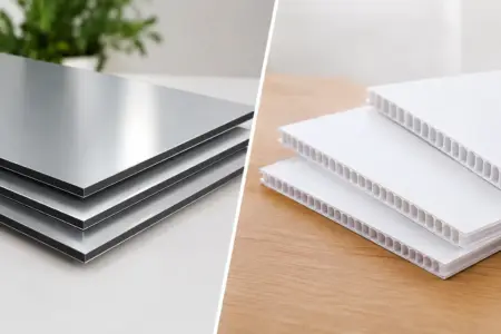
- Rigid signs for directional arrows, parking zones, safety notices and information that needs a firm, professional presentation.
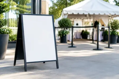
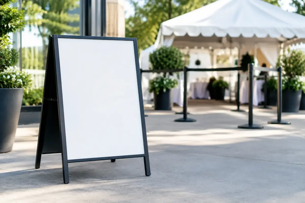
- Freestanding signs for reception areas, queues, menus, schedules and indoor wayfinding.
- Vinyl lettering or stickers for short-term messages on counters, doors, floors, equipment or display panels.
- Magnetic signs for event vehicles where suitable, helping organisers, marshals or delivery teams identify themselves.
Indoor and outdoor conditions matter. An indoor registration sign may only need to be lightweight and easy to move. A car park sign has to remain readable at distance and cope with wind, rain and vehicle movement. If it will be used outside, think about fixing points, ballast, visibility and whether the sign needs to be removed overnight.
There is also a balance between reusability and event-specific messaging. Generic signs such as “First Aid”, “Information”, “Toilets” and “Staff Only” can be kept for future events. Date-specific schedules, special offers and sponsor artwork may be better produced as separate inserts, stickers or banners. This approach can reduce the cost of future events without making the current one feel generic.
Guide to temporary event signage: build a clear hierarchy
People rarely read event signs in order. They scan for the detail that matters to them at that moment. Your design needs to make the most important information visible first.
Use a clear hierarchy: a short heading, a simple instruction or direction, then any supporting detail. For example, “Registration” should be the largest wording on a sign, followed by “Have your booking reference ready” in smaller type. If the sign includes an arrow, make it large enough to be noticed before someone reaches the decision point.
Strong contrast is more useful than decorative design. Dark text on a light background, or light text on a dark background, generally works well when viewed from a distance. Avoid placing key wording over busy photographs, patterned backgrounds or low-contrast brand colours. Your brand can still be present through a logo, border or colour block, but the instruction must remain the priority.
Font size depends on viewing distance. A sign read from a few steps away can carry more detail than one aimed at drivers or people approaching across a crowded field. If you are unsure, print a scaled test and view it from the expected distance. This simple check often reveals text that looked large enough on screen but is too small in real conditions.
Keep arrows consistent
Arrows are a common source of avoidable confusion. Decide early whether arrows point left, right, ahead or back to the entrance, then use the same style and wording throughout the site. Do not direct visitors to “Main Hall” on one sign and “Exhibition Area” on the next if they mean the same place.
Place directional signs before a turn, not at it. At busy events, visitors may be following other people, carrying bags or watching traffic. Giving them a few seconds to react makes the route safer and smoother.
Plan for queues and changing information
Queues change quickly, particularly around registration, food service, ticket collection and popular activities. Freestanding signs are useful because they can be repositioned as layouts change. Have spare signs ready for “Queue starts here”, “Please use other entrance”, “Sold out” or “Next session at 2pm”.
Where timings may change, avoid printing a full programme onto every sign unless it is confirmed. A main timetable board combined with smaller directional signage is often easier to update. For a multi-day event, removable vinyl stickers can help you change times, room names or instructions without replacing the whole display.
Do not treat safety signage as an afterthought
Temporary event signage has a practical safety role. Visitors should be able to identify emergency exits, first aid, restricted areas, pedestrian routes and any location-specific hazards without having to ask. Site managers should review signs alongside barriers, lighting, stewarding and access arrangements rather than adding them late in the set-up.
Safety messages should be positioned where the hazard or instruction applies. A “No unauthorised access” sign belongs at the access point, not on an information board fifty metres away. Likewise, parking and pedestrian signs should help separate vehicles and people before they reach a conflict point.
For public-facing events, check that essential messages remain visible when the site is busy. A sign hidden behind a queue, catering unit or open door will not do its job. It is worth walking the site again shortly before opening, then making small adjustments while there is still time.
Make branding work without blocking the message
Temporary event signage is often one of the first physical impressions people have of an organiser, venue or business. Consistent colours, logos and terminology make the event feel considered, especially where banners, staff workwear, vehicle signs and information boards use the same identity.
That said, branding should support wayfinding rather than compete with it. A large logo is appropriate for a welcome banner or sponsor backdrop. On a parking arrow or fire exit instruction, the message comes first. Use the same logo position, colour palette and type style where possible, but leave enough clear space for directions to be read quickly.
Sponsors may require visibility, and event signage can give them it without overwhelming visitors. Reserve specific banner positions, photo areas or programme boards for sponsor branding. This keeps essential navigational signs clear and gives partners a more deliberate, valuable placement.
Order with installation and timing in mind
A well-designed sign can still fail if there is no practical plan for fitting it. Confirm where each item will go, what it will attach to and who is responsible for putting it in place. Measure gates, railings, walls, counters and existing frames before ordering. Photographing locations can also help when preparing artwork or deciding on sizes.
Create a simple sign schedule with the wording, location, product type and person responsible for installation. Numbering signs on the back or packing them by zone makes set-up quicker, particularly when volunteers or different teams are involved. Keep spare fixings, tape and a small number of blank or adaptable signs available for last-minute changes.
If you have finished artwork, uploading your own design can speed up the order process. If not, start with the key messages, sizes and locations before asking for design support. Clear source information reduces revisions and helps ensure the finished signs suit the job.
The best temporary event signage is rarely the most elaborate. It is the signage that quietly gets people to the right place, gives staff fewer problems to solve and still looks professional when the first guests arrive.