A blocked fire exit, an unmarked first aid point or a hard-to-find assembly area can cost valuable time when people need to act quickly. So, what is a green health and safety sign? It is a sign used to show a safe condition, safe route or safety facility – most commonly an emergency exit, first aid point, eyewash station or assembly point.
For business owners, site managers and facilities teams, the purpose is straightforward: green safety signs help people find the right place or take the right action without needing lengthy instructions. They are a core part of clear workplace safety communication, whether the premises are a shop, warehouse, school, office, building site or hospitality venue.
What is a green health and safety sign?
A green health and safety sign identifies something that supports safety rather than warns of danger or prohibits an action. It normally has a green background with a white symbol, wording or directional arrow. The symbol should be clear enough to understand at a glance, including for visitors, contractors and staff who may not know the layout of the premises.
In UK workplaces, green is associated with emergency escape, first aid and safe-condition information. The familiar running-man symbol and directional arrow used for emergency exits are perhaps the best-known example. However, green signs cover more than fire escape routes. They can also show the location of first aid kits, automated external defibrillators, emergency showers, emergency telephones and designated assembly points.
The colour is not simply decorative. Safety sign colours and pictograms give people a consistent visual language. In an emergency, that consistency makes information quicker to recognise than a paragraph of text.
What green safety signs are used for
Green health and safety signs usually fall into two practical groups: emergency escape information and safety equipment or facilities. Both need to be visible, correctly positioned and relevant to the risks on site.
Emergency escape routes and exits
Emergency exit signs indicate the direction people should travel to reach a place of safety. They may be fitted above an exit door, along a corridor, at a change of direction or where a route could otherwise be unclear. A directional arrow is only useful when it points towards the next part of the escape route, so it is worth checking the route from the viewpoint of someone unfamiliar with the building.
An exit sign on its own does not make an escape route safe. Doors must be usable, routes need to be kept clear, and signs should remain visible if normal lighting fails. Depending on the building and its fire risk assessment, illuminated or photoluminescent signs may be appropriate. A standard printed sign can be highly effective in good lighting, but it may not be suitable where it cannot be seen during a power cut or smoke condition.
First aid and emergency facilities
Green signs also identify safety resources that staff or visitors may need following an incident. Typical examples include first aid signs, AED signs, emergency shower signs, eyewash station signs and emergency telephone signs.
The sign should mark the actual facility, not merely the general area. If a first aid kit is inside a cupboard, place the sign on or directly above the cupboard. If the kit is stored in a first aider’s office, consider whether people can access it whenever it is needed. Where a facility is out of sight, a directional sign at a decision point can help guide people to it.
Assembly points and places of safety
An assembly point sign shows where people should gather after evacuating a building. It is often installed in a car park, yard or open area away from the building. The chosen location needs to keep people clear of emergency vehicle access, delivery movements and any likely hazards from the premises.
A sign alone cannot solve a poor assembly-point location. Review it alongside your evacuation procedure, site traffic and the number of people likely to use it. A small office may need one clearly marked point; a larger industrial site may require separate areas for different buildings or departments.
How green signs differ from other safety sign colours
Using the right colour helps avoid mixed messages. A green sign gives a positive instruction about safety, such as where to go or where safety equipment is located. It is not a warning sign and should not be used to identify a hazard.
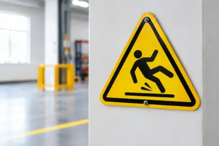
Red is generally used for prohibition signs, such as No Smoking, and for fire-fighting equipment signs. Blue signs provide mandatory instructions, for example Wear Eye Protection. Yellow or amber signs warn of hazards, such as Fork Lift Trucks Operating or Caution Wet Floor.
There can be exceptions in complex premises where a site uses additional wayfinding or brand colours. Even then, official health and safety signs should remain recognisable. Avoid placing a green emergency exit sign beside unrelated green promotional graphics or using a green background for general notices that may be mistaken for safety information.
Choosing a suitable green safety sign
The best sign depends on the setting, viewing distance, lighting and whether the information needs to remain in place permanently. Start with the purpose of the sign, then choose the format and material that fits the location.
For indoor walls, doors and corridors, rigid plastic signs are a practical choice. They are easy to fit, wipe clean and available in standard safety formats. Self-adhesive vinyl can suit smooth internal surfaces, equipment cabinets and glass, provided the surface is properly cleaned before application. For outdoor assembly points, use a durable rigid sign fixed securely where it will stay visible in changing weather.
Size matters. A small sign may be suitable directly above a first aid box, but it will not work at the end of a long warehouse aisle. The further away a sign needs to be read, the larger the pictogram and lettering should be. Do not rely on a sign being technically present if it is obscured by racking, open doors, stock, displays or temporary event materials.
Where wording is needed, keep it short. A recognised pictogram supported by clear wording such as “First Aid”, “Emergency Exit” or “Assembly Point” is usually more effective than an over-explained notice. In premises with regular visitors or a varied workforce, straightforward symbols are particularly useful.
Positioning signs where people will actually see them
Safety signage works as a system. A well-made sign in the wrong position can still leave people uncertain about what to do. Walk the route yourself, starting from work areas, customer spaces, washrooms, storage rooms and any isolated parts of the building. Ask whether a new starter or visitor could find the exit, first aid point or assembly area without being told.
Fit emergency route signs at points where a person has a choice to make. That may be a corridor junction, stairwell, doorway or change of level. Position first aid signs close to the equipment, with additional directional signs where the equipment is not immediately visible. Keep signs at a sensible height and avoid cluttering them with posters, notices or displays.
On busy sites, signs may need checking more often. Warehouse racking is moved, retail displays change, temporary partitions appear and parked vehicles can hide external signs. Include a visual signage check within routine site inspections, especially after a refurbishment, layout change or fire-risk review.
Compliance: use signs as part of a wider safety plan
In the UK, the Health and Safety (Safety Signs and Signals) Regulations 1996 set requirements around the provision and use of safety signs where risks cannot be adequately controlled by other means. In practice, signs should support your risk assessments, fire procedures and staff training – not replace them.
For example, an Emergency Exit sign does not remove the need for a clear escape route, maintained fire doors and an evacuation plan. A First Aid sign does not replace suitable first aid provision or trained personnel where required. The right approach is to identify the safety need first, then select signage that communicates it clearly.
Many businesses use ISO 7010-style pictograms because they provide familiar, standardised symbols. This is especially useful in workplaces with contractors, agency staff, customers or visitors who may not understand site-specific instructions. If you are replacing older signs, check that the symbols, arrows and route directions still match the current layout rather than copying what was there before.
Common mistakes to avoid
The most frequent problem is treating all green signs as interchangeable. An assembly point sign is not an exit sign, and a first aid symbol should not be used to indicate a general welfare room unless the first aid facilities are actually there.
Another issue is relying on text-only signs. Text can be useful, but a recognised pictogram is faster to identify and more accessible to a wider audience. Finally, do not install a sign and forget it. Faded print, damaged corners, poor fixings and changed routes can all reduce its value.
When ordering green health and safety signs, match the message to the exact location and use. Choose a durable format, confirm the symbol and arrow direction, and check it from the distance where people will need to read it. A clear sign in the right place is a small, practical measure that makes a safer workplace easier to run.