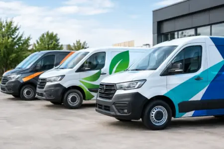
A van parked outside a customer’s property can be seen by neighbours, passing traffic and other local businesses before a member of staff has even knocked on the door. That is why vehicle branding trends matter to trades, service firms, delivery teams and fleet operators. The most effective graphics are not simply decorative. They make a business recognisable, explain what it does and give customers confidence that the vehicle belongs on site.
The direction of travel is clear: businesses are moving away from overcrowded designs and towards practical, consistent graphics that work at a glance. The right approach still depends on the vehicle, operating area and type of work, but clarity and durability are becoming non-negotiable.
Vehicle Branding Trends Shaping Business Fleets
Clear branding beats a crowded layout
A vehicle only has a few seconds to communicate while it is moving or parked at the roadside. This is pushing businesses towards simpler layouts with a strong logo, one clear service description and direct contact details. A long list of every service offered may feel comprehensive, but it is rarely easy to read from a distance.
For many small businesses, the most useful information is the company name, a short statement of what they do, a telephone number and a website address. A plumber, landscaper or electrical contractor does not need to explain every job they undertake on the side of a van. “Plumbing and heating”, “Grounds maintenance” or “Electrical services” is often enough to create recognition and prompt an enquiry.
This does not mean every design should be minimal. A business with several divisions, a regional fleet or a strong established identity may need more detail. The practical test is whether a person can understand the main message quickly from a sensible viewing distance.
Consistent graphics across every vehicle
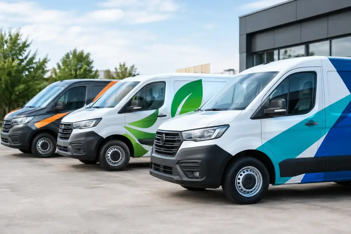
Fleet consistency is increasingly important, including for businesses with only two or three vehicles. A matching set of vans, cars or lorries presents the company as organised and established. It also ensures that customers recognise the business whether they see a small car used by an estimator or a larger vehicle used by an installation team.
Consistency does not require every vehicle to have identical panel shapes or the same amount of available space. It means using the same logo treatment, colours, typefaces and core wording, then adjusting the layout to suit each vehicle. Side panels, rear doors and bonnets all need different design decisions.
This trend also connects directly with branded workwear, site signs and printed materials. When the same visual identity appears on a vehicle, a staff jacket and a site board, the business looks more credible at the point customers are making decisions.
High-contrast colour choices
Strong contrast remains one of the most reliable ways to improve readability. Light lettering on a dark vehicle can work well, as can dark graphics on white bodywork. The key is to avoid combinations that blur together in poor weather, low light or road grime.
Colour choice should take account of the vehicle’s base colour, not just the company logo. A design created on a white artboard can look very different once it is fitted to a silver, red or black van. This is particularly relevant for companies adding graphics to leased vehicles or replacing vehicles at different times, where body colours may vary across the fleet.
Brand colours still matter, but visibility comes first. A small adjustment to background colour, outline or lettering can make contact details much easier to read without changing the business identity.
Rear-door messaging is doing more work
The rear of a vehicle is often viewed in traffic, at junctions and in car parks. It is valuable advertising space, particularly for vans that spend much of the day on the road. Businesses are increasingly giving rear doors the same attention as side panels instead of treating them as an afterthought.
The best rear designs are usually brief. A prominent logo, primary service and one contact route are normally more effective than a dense block of text. If a driver is behind the vehicle, they may only have a moment to take in the message. Large, clear details are more useful than small print that cannot be read safely.
Rear graphics should also work around handles, lights, number plates and door splits. A layout that looks balanced on screen may need revising once these practical interruptions are taken into account.
Local recognition still has real value
Digital advertising can target a postcode, but vehicle graphics build repeated recognition in the real places where a business operates. This is especially useful for tradespeople, care providers, local delivery services, cleaning firms, property maintenance companies and event suppliers.
Some businesses are adding a service area or local identifier where it supports trust. This can be useful when the company name alone does not explain where it operates. However, it should not crowd out the essentials. A clear brand and service description will often deliver more value than trying to name every town covered.
For firms working across the UK and Ireland, the design should remain usable beyond one area. A flexible layout allows a business to add local phone numbers, depot information or accreditation details where they genuinely help, without redesigning the whole vehicle.
Practical Vehicle Branding Trends for Better Results
Designs are being planned by panel, not by template
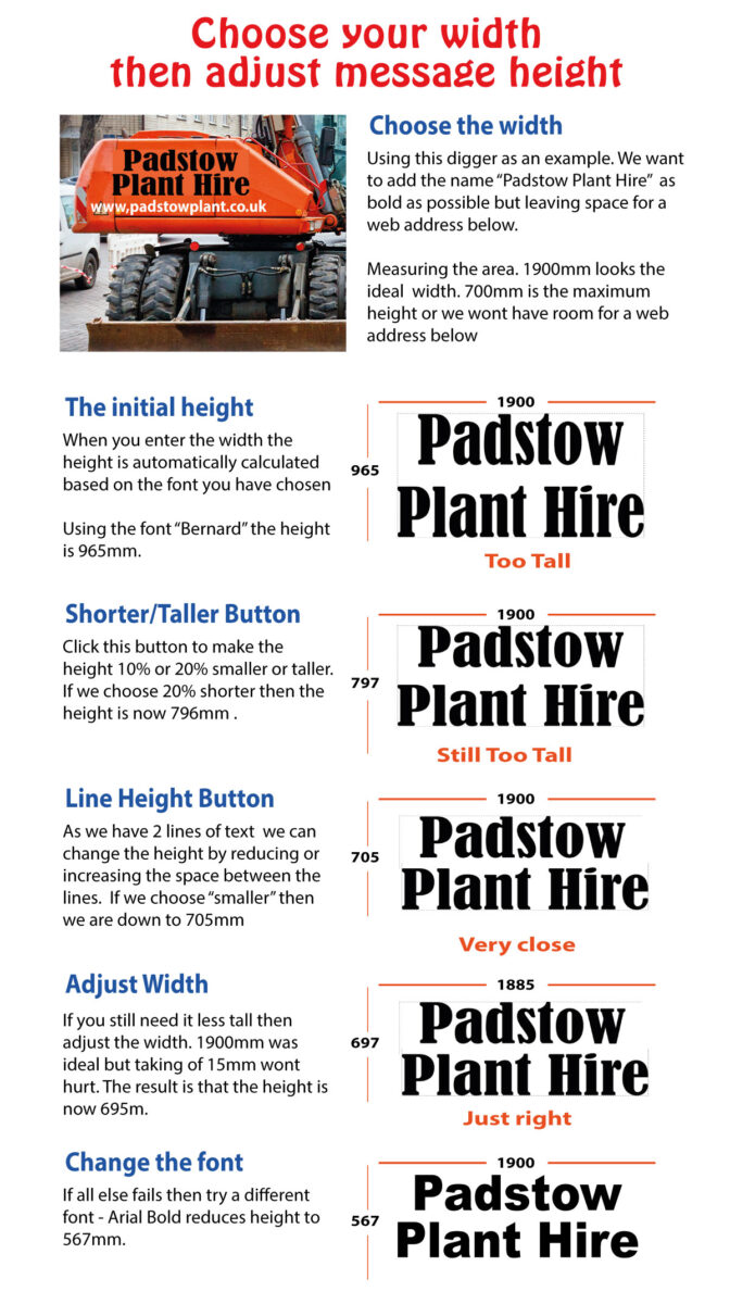
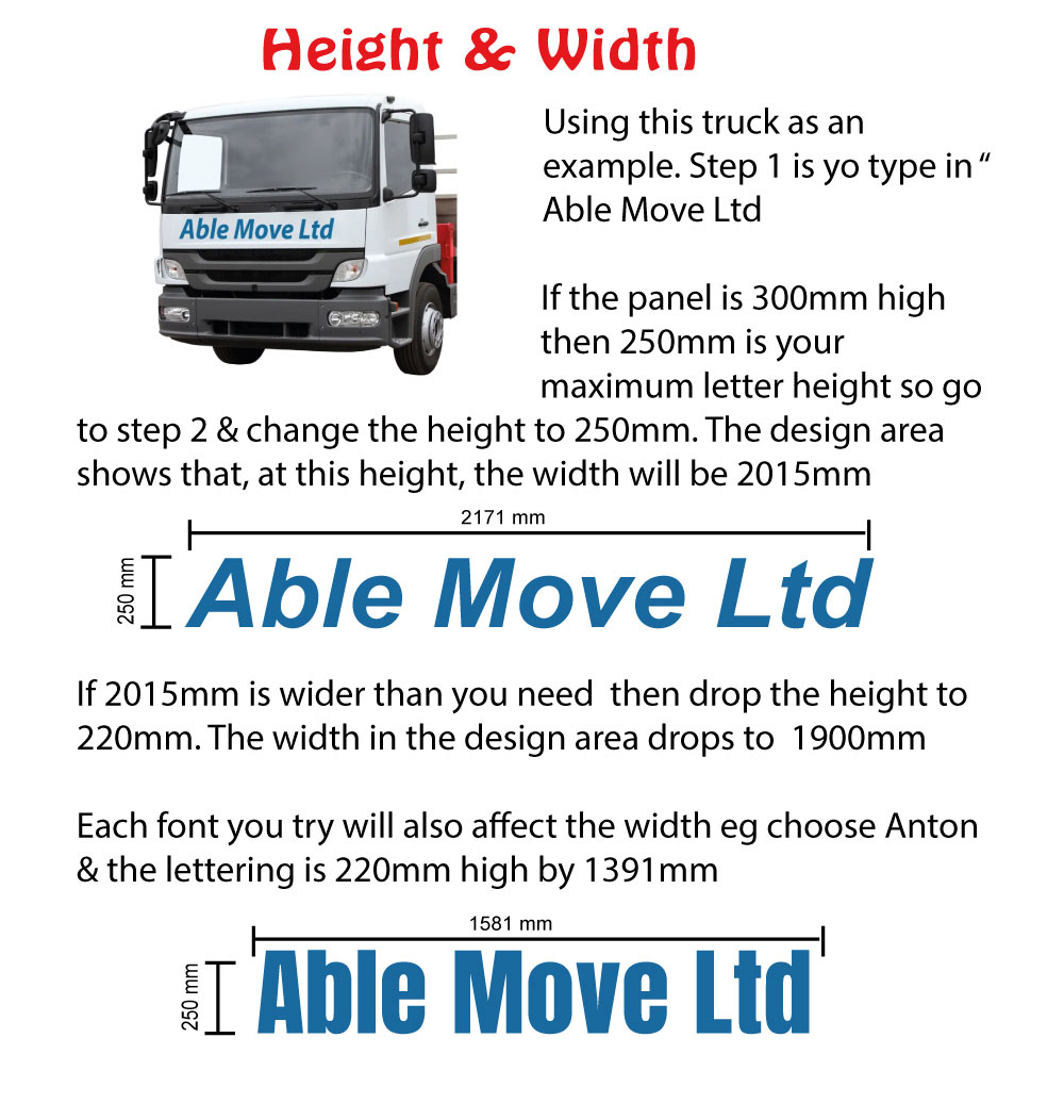
One of the most useful changes is the move away from a single graphic forced onto every vehicle. Professional-looking vehicle branding starts with the actual make, model and body style. A short-wheelbase van has different proportions from a long-wheelbase van. A pickup, car or lorry has different panels again.
Planning each panel separately helps avoid common problems: logos cut by door gaps, text hidden by handles, details too low to be seen over parked cars, or contact information placed where dirt gathers most quickly. It also makes the graphics easier to reproduce when new vehicles join the fleet.
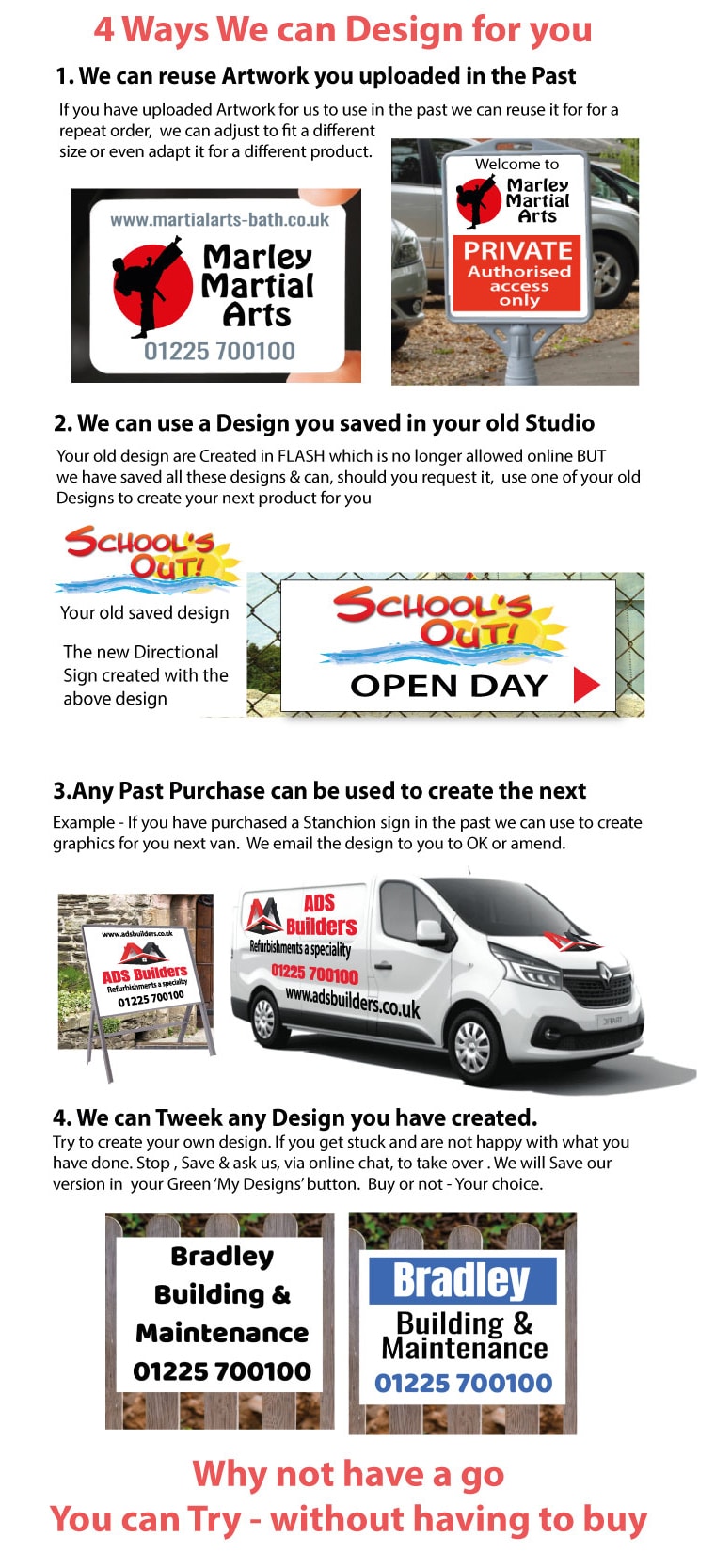
If you are supplying artwork, provide the logo in a high-quality format and include the exact wording, colours and contact details required. If you are unsure about positioning, asking for artwork assistance before production can prevent costly changes later.
Durable, serviceable choices are preferred
A business vehicle has to cope with rain, road spray, regular cleaning and daily use. The best material choice depends on how long the graphics are expected to remain in place, where they will be fitted and how the vehicle is used.
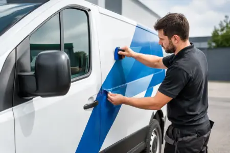
For example, simple cut vinyl lettering can be an efficient choice for company names, contact details and straightforward service descriptions. Printed graphics allow more detailed branding, imagery and colour effects. Magnetic signs can suit temporary use, shared vehicles or a business owner who wants branding that can be removed when needed. They must be fitted to clean, dry, flat metal surfaces and checked regularly to protect both the sign and the vehicle finish.
The lowest upfront price is not always the most economical option. Graphics that are difficult to read, poorly suited to the vehicle surface or unable to withstand normal use can need replacing sooner than expected.
QR codes are useful, but not the main message
QR codes are appearing more often on fleet graphics, particularly where a business wants people to view a portfolio, request a quotation or save contact details. They can be effective on a parked vehicle or rear doors, but they should never replace the basic information customers need.
A person cannot safely scan a code from a moving vehicle. Keep the company name, core service and contact number visible without requiring an extra action. Use a QR code as a supporting route, with enough clear space around it and a size that remains scannable when the vehicle is stationary.
Compliance information needs a separate check
Branding and legal markings can sit alongside each other, but they are not the same thing. Depending on the sector, a vehicle may require operator details, safety markings, licence information, hazard notices or other identification. These requirements should be confirmed separately before a design is approved.
Site managers and fleet operators should also consider whether vehicle graphics need to align with existing health and safety signs, construction site boards or staff identification. A coordinated look supports professionalism, while clear mandatory information helps people act safely around vehicles and work areas.
Choosing the Right Direction for Your Business
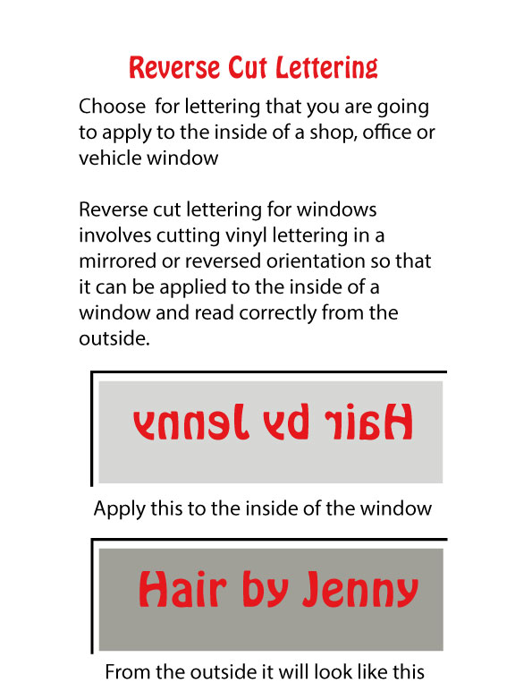
Before ordering, decide what the vehicle needs to achieve. A sole trader may need quick local recognition and a reliable phone number. A growing contractor may need a repeatable system for several vans. A national operator may need graphics that remain consistent across different vehicle types and depots.
Start with the message customers must understand first, then build the design around it. Keep the logo prominent, use readable colours, and give the contact details enough space to do their job. Review the artwork on the actual vehicle outline rather than judging it only as a flat design.
Good vehicle branding earns its place every time the vehicle is parked outside a job, passes through a busy town or arrives at a customer site. Choose graphics that are clear, practical and easy to repeat, and they will keep working long after the vehicle has left the workshop.