Learning how to design van signs yourself is easier than you might think. You do not need to be a graphic designer or own expensive software. With the right approach and a free online tool, you can create professional-looking van graphics in an afternoon.
At The Sign Builder, we believe every tradesperson and small business owner should be able to design your own van signs without stress. Our [Link to: /design-studio/] online design studio is built for people with zero design experience.
Why Design Your Own Van Signs?
There are plenty of reasons to take control of your van sign design.
Cost savings: Hiring a designer can add £100–£300 to your project. Doing it yourself keeps that money in your business.
Creative control: You know your brand better than anyone. Designing your own signs means you choose the colours, fonts, layout, and message.
Easy updates: When your phone number, services, or logo changes, you can update the design yourself instead of paying for another design round.
For most UK tradespeople, DIY van graphics are the smartest place to start. You can always upgrade to a professional wrap later as your business grows.
What You Need Before You Start
Before you open the design tool, gather a few basics.
- Your logo file — ideally a vector file (SVG, EPS, AI, or PDF) or a high-resolution PNG.
- Your brand colours — hex codes or a clear reference such as your website.
- Contact details — the phone number, email, website, and social media handles you want to display.
- Services or tagline — a short list of what you do, or a tagline that sums up your business.
- A rough idea of layout — logo at the top with text underneath, or text on one side and logo on the other.
If you do not have a logo yet, keep the design text-only for now. A clean, well-typeset sign with your business name and phone number can still look professional.
Step-by-Step: Designing Your Van Signs
Here is the exact process for creating your van sign design using The Sign Builder’s online design studio.
Step 1 — Choose Your Product Type
Most people begin with [Link to: /custom-van-magnetic-signs/] magnetic van signs because they are affordable, removable, and easy to fit. For permanent branding, choose [Link to: /custom-van-vinyl-graphics/] vinyl lettering or printed graphics.
Step 2 — Select Size and Material
Pick the size that fits your van door or panel. The design studio shows popular sizes, and you can enter custom dimensions if needed.
Step 3 — Add Your Logo and Text
Upload your logo and add your business name, phone number, and any services you want to list. The studio lets you drag elements into place.
Step 4 — Choose Colours and Fonts
Use your brand colours for text and backgrounds. Stick to one or two fonts. Avoid fancy scripts that are hard to read from a distance.
Step 5 — Position and Arrange Elements
Most people read top to bottom and left to right. Put your logo or business name at the top, services in the middle, and contact details at the bottom. Keep everything balanced.
Step 6 — Preview Your Design
Use the live preview to see how your sign will look. Zoom out to check readability. Imagine the van driving past at 30 miles per hour. Can you still read the phone number?
Step 7 — Place Your Order
Once you are happy, add the sign to your basket and checkout. The Sign Builder team checks every order before printing. If there is a problem with resolution, bleed, or layout, they will let you know.
Van Sign Design Tips for Beginners
Good van lettering design is not about being clever. It is about being clear. Here are ten practical tips to help your sign work harder.
- Keep it simple. One logo, one business name, one phone number, and a short service list is plenty.
- Use high-contrast colours. Dark text on a light van, or light text on a dark van, is easiest to read.
- Make the phone number large. It should be readable from at least 10 metres away. If you cannot read it from across the street, it is too small.
- Use a maximum of two fonts. One bold font for your name, one clean font for details. More than two fonts looks messy.
- Do not crowd the space. White space helps each element stand out. A sign packed with text is hard to read.
- Include your website. Many people prefer to look up a business online before calling. Make it easy for them.
- Consider both sides of the van. Design for the side that gets the most visibility, but make sure the other side matches.
- Leave white space around your logo. Do not squash your logo into a corner. Give it room to breathe.
- Use your logo at a good size. A tiny logo looks unprofessional. A huge logo can overwhelm the rest of the design.
- Test readability by squinting. Step back from your screen and squint. If you can still read the key information, your design is on the right track.
Common Van Sign Design Mistakes to Avoid
Even simple designs can go wrong. Here are the most common mistakes we see.
Too Much Text
A van sign is not a brochure. If you try to list every service, qualification, and accreditation, the sign becomes unreadable. Stick to the essentials.
Tiny Phone Numbers
Your phone number is one of the most important parts of the sign. If it is too small to read from a distance, you are missing enquiries.
Low-Resolution Logos
A blurry or pixelated logo ruins an otherwise great design. Use vector files or high-resolution PNGs. If your logo is low resolution, The Sign Builder can often help vectorise it.
Clashing Colours
Bright pink text on a yellow van might get attention, but not the right kind. Use colours that match your brand and offer strong contrast.
Forgetting the Rear of the Van
The back of your van is visible to drivers behind you in traffic. A sign on the rear doors can generate enquiries every time you stop at lights.
Hard-to-Read Fonts
Decorative fonts can look nice on a business card but terrible on a moving van. Stick to clean, bold fonts that are easy to read at speed.
Van Sign Layout Ideas by Trade
Different trades need different information on their vans. Here are layout suggestions for some of the most common businesses.
Builder or Roofer
Logo and business name at the top. Below it, list three or four core services such as “Extensions, Roofing, Renovations.” Add your phone number in large text at the bottom.
Plumber or Heating Engineer
A boiler or tap icon next to your name works well. List “Plumbing, Heating, Boiler Repairs” and include a 24-hour number if you offer emergency call-outs.
Electrician
Use a bold, modern font. List “Domestic & Commercial Electrician” and highlight certifications such as NICEIC if relevant. Make your phone number prominent.
Landscaper or Gardener
Green and earthy colours suit this trade. Add “Garden Design, Maintenance, Landscaping” and include your local areas if you cover specific towns.
Delivery or Courier
Keep it minimal. Your company name, “Local Deliveries,” website, and contact number are enough.
Mobile Beauty or Hair
Use elegant fonts and soft brand colours. Include “Mobile Service” and the areas you cover.
Dog Groomer
Friendly fonts and pet-related imagery suit this trade. List “Mobile Dog Grooming” and your phone number.
Cleaning Company
Blue, green, or white colour schemes work well. List “Domestic & Commercial Cleaning” and highlight any insured or eco-friendly status.
Before and After: What a Difference Good Design Makes
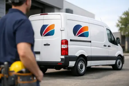
Picture a plain white Ford Transit parked on a suburban street. There is nothing to tell you who owns it or what they do. It blends into the background.
Now picture the same van with two smart magnetic signs. On each door, the company logo sits at the top in navy and orange. Below it, “Bristol Building Services” is printed in a bold, clean font. Underneath, three services are listed: “Extensions, Loft Conversions, Renovations.” At the bottom, the phone number is large enough to read from the pavement.
The van has not changed. But suddenly it looks established, trustworthy, and easy to contact. That is the power of good van sign design.
File Formats and Logo Tips
Getting your logo file right is one of the most important parts of the process.
Vector vs Raster
Vector files (SVG, EPS, AI, PDF) are made of mathematical paths, not pixels. They can be scaled to any size without losing quality. Raster files (JPG, PNG) are made of pixels. They can look blurry if enlarged too much.
PNG with Transparent Background
If you do not have a vector logo, a high-resolution PNG with a transparent background is the next best thing. It lets the sign background show through around your logo.
Low-Resolution Logos
If your only logo file is small or blurry, do not panic. The Sign Builder’s team can often vectorise it for you. This is much better than printing a fuzzy logo.
Logo Placement
Place your logo where it is easy to see. Top left or top centre is usually best. Make sure it is large enough to recognise, but not so large that it pushes other information off the sign.
How The Sign Builder’s Design Studio Works
The Sign Builder’s [Link to: /design-studio/] online design studio is the easiest way to create custom van signs design without hiring a designer.
Free to use. You can design, preview, and save your artwork without paying anything. You only pay when you place an order.
No design experience needed. The studio uses simple drag-and-drop controls. If you can use a website, you can use the studio.
Templates available. If you are not sure where to start, choose from professionally designed templates and customise them with your details.
Upload your own artwork. If you already have a design, upload it directly and adjust the size and placement.
Live preview. See exactly how your sign will look before you order. You can zoom, rotate, and check it from different angles.
Save and come back later. You are not rushed. Save your design and return whenever you are ready.
Order check. Every design is reviewed by The Sign Builder team before printing. If anything looks wrong, they will contact you to fix it.
Order Your Custom Van Signs Today
You now have everything you need to design your own van signs. The process is simple: gather your assets, use the online design studio, follow the tips in this guide, and place your order.
A well-designed van sign turns every journey into a marketing opportunity. Whether you are parked outside a job, driving through town, or stuck in traffic, your van is working for you.
Visit The Sign Builder’s [Link to: /design-studio/] design studio today and create your first design for free. If you need help fitting your signs, our [Link to: /video-guides/] video guides walk you through the process step by step.
Frequently Asked Questions
Is the design studio really free to use?
Yes. You can design and preview your signs without any charge. You only pay when you are ready to order.
Can I save my design and come back later?
Yes. The design studio lets you save your progress so you can return and finish whenever you like.
What if my logo is not high resolution?
The Sign Builder team can often vectorise low-resolution logos so they print clearly. Contact us if you need help.
How do I know what size sign to order?
Measure the flat area on your van door or panel where you want the sign to go. The design studio shows standard sizes, or you can enter custom dimensions.
Will someone check my design before it is printed?
Yes. Every order is reviewed before printing. If there is an issue with resolution, bleed, or layout, we will let you know.
Can I design signs for both sides and the rear of my van?
Yes. You can create separate designs for different panels, or use the same design across all sides.