A missing warning sign can hold up a site inspection. A poorly positioned one can be just as ineffective. Knowing how to order safety signs means matching the message, format and material to the hazard, then making sure the finished sign can be read where people actually need it.
For a small workshop, retail stockroom, construction site or hospitality venue, the quickest route is not always to buy the first standard sign that appears in a search. Start with the area you are trying to make safer, who uses it and the conditions the sign will face. That gives you a clear brief before you select a product or prepare artwork.
Start with the hazard and required action
Safety signs work best when they communicate one clear instruction. Before ordering, walk through the location and identify what people need to know at that point. Is there a compulsory action, such as wearing eye protection? Is access prohibited? Does an emergency exit need marking? Or are you warning people about a temporary or permanent risk?
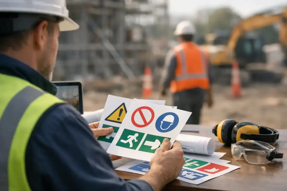
The familiar colour and shape conventions make a message easier to recognise at a glance. Red prohibition signs tell people what they must not do. Blue mandatory signs set out an action they must take. Yellow warning signs draw attention to hazards, while green signs identify safe conditions, first aid and escape routes. Fire safety signs commonly use red with white symbols and text.
Use recognised safety symbols where possible, particularly for standard instructions and emergency information. They reduce reliance on wording and are easier to understand in busy, noisy or shared workplaces. If you need a site-specific instruction, keep the wording short and direct. “Authorised personnel only” is clearer at a gate than a long explanation of site rules.
Signage supports your wider safety arrangements. It does not replace a risk assessment, staff training, suitable barriers or safe working procedures. Where there is a serious hazard, make sure the sign is one visible part of a properly managed control measure.
Choose the right type of safety sign
Once the message is clear, choose the sign format around the location. A wall-mounted rigid sign suits fixed instructions on doors, machinery areas, corridors and external boundaries. A freestanding sign is more useful where the hazard moves or only exists for part of the day, such as cleaning in progress or a temporary delivery area.
For large sites, consider the viewing distance before selecting a size. A sign that is easy to read from one metre away may be missed at a warehouse entrance, vehicle gate or car park. Larger signs are often worth the modest additional cost when they prevent repeated questions, missed instructions or unsafe access.
You may need several types of sign for the same area. A fire exit route, for example, may require directional signs along the route as well as a clearly marked final exit. A controlled yard may need a speed limit notice at entry, pedestrian guidance near walkways and warning signs around loading activity.
When you are ordering a set, list every location first. This avoids ordering one sign at a time and later finding that directions are inconsistent, an arrow points the wrong way or a key door has been overlooked.
Select a material that suits the environment
Material choice affects both lifespan and appearance. Indoor office, retail and hospitality signs often need a clean, professional finish and may not face heavy wear. Industrial units, farms, building sites and external access points need materials that can cope with weather, dirt, regular cleaning and accidental knocks.
Rigid plastic is a practical option for many indoor and outdoor applications. Aluminium composite is commonly chosen where greater durability and a more substantial finish are needed, especially for external signs. Self-adhesive vinyl can work well on clean, smooth surfaces such as doors, equipment and internal panels, but it is not the right choice for every textured, damp or frequently handled surface.
Think about how the sign will be fixed before you order. A board with pre-drilled holes may be suitable for fencing, walls or posts. Adhesive-backed products need a sound, prepared surface. If a sign needs to be moved between areas, a lightweight freestanding option may save time and avoid repeated fixing work.
It also pays to consider lighting. Glossy finishes can create glare under bright lighting or low winter sun. In a poorly lit corridor, loading area or external route, a larger sign, improved positioning or a reflective option may be more effective than simply using more text.
Decide whether standard or custom signs are best
Standard safety signs are the straightforward choice for common instructions such as “No Smoking”, “Fire Exit”, “Caution Wet Floor” and “Wear PPE”. They are quick to specify and help maintain consistent visual language across your premises.
Custom signs are useful when you need to include a site name, a specific local instruction, directional information, a contact number or a combination of messages. They are also useful for creating a safety board that brings together several rules at one entrance point.
Do not overload a custom sign. If people must stop and read a paragraph, the key message may be missed. Split complex information across a main sign and supporting notices, or use a simple header with a small number of clearly separated instructions. A site induction document can carry the detail; the sign should guide immediate behaviour.
Prepare artwork or use an online design option
Most orders begin in one of three ways: choose a ready-made design, create a sign using an online design tool, or upload finished artwork. The best route depends on how much control you need and whether you already have approved branding or safety layouts.
For a standard sign, check the wording, orientation, size and quantity before adding it to the basket. For an online design, use a clear hierarchy: safety symbol first, instruction second, supporting detail last. Keep the background and text colours aligned with the sign category so the purpose is understood quickly.
If you upload artwork, supply the clearest, highest-quality file available. Vector artwork is generally preferred for logos, symbols and lettering because it can be scaled without losing definition. If you are working from an image file, make sure it is large enough for the final print size. A small image copied from a website or mobile phone screenshot can look sharp on screen but print poorly on a large board.
Check the final proof for simple but costly errors: spelling, phone numbers, arrows, opening hours, symbol choice and the direction of travel. Ask someone who has not created the sign to read it. They are more likely to spot an unclear instruction or an arrow that makes sense only if you already know the site.
Check size, placement and visibility before checkout
A well-made sign only works if it is installed in the right place. Measure the available area and check for obstructions such as open doors, shelving, machinery, parked vehicles or vegetation. Place the sign at the decision point, not after it. A “Keep Out” notice belongs at the entrance to a restricted area, while a PPE reminder should appear before people reach the point where protection is needed.
Mount signs at a consistent, sensible height for the people using the area. Consider drivers separately from pedestrians. A notice intended for a delivery driver in a lorry needs to be visible from the approach and large enough to read before they commit to a turn or gate.
For emergency signs, ensure the direction shown matches the route in practice. Changes to layouts, temporary storage or building works can make an otherwise correct sign misleading. Review signs after site changes, not only when they become damaged.
Place the order with a complete specification
Before submitting your order, confirm the product, dimensions, material, design route, quantity and fixing requirements. If you are buying multiple signs, group them by location or use a simple schedule. It makes installation quicker when the delivery arrives and gives you a useful record for future replacements.
For repeat orders, retain the approved artwork and note the product specification. Consistency matters on multi-site estates, fleets, schools and local organisations. Using the same sizes, materials and layout helps people recognise instructions quickly and keeps purchasing simple.
If you are unsure whether your artwork is ready, whether a material is suitable or whether a sign needs to be larger, ask before production. The SignBuilder can support straightforward ready-made purchases as well as custom signage requirements, helping you choose a practical route without complicating the job.
A final walk-around after fitting is the best test. Stand where a visitor, contractor or new member of staff would stand, then ask one question: can they understand what they need to do before the hazard is in front of them? If the answer is yes, your safety signs are doing their job.