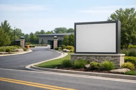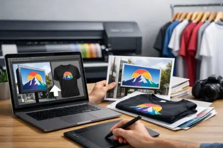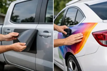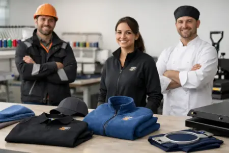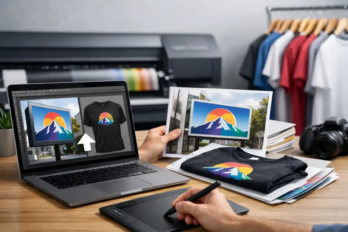
A logo can look sharp on a mobile phone screen and still print poorly on a large site board, van graphic or staff garment. Knowing how to upload print artwork properly gives the production team the right starting point, reduces avoidable delays and helps ensure the finished item looks as intended.
Whether you are ordering a one-off banner, a set of safety signs, vehicle lettering or branded workwear, the process starts before you click upload. Your file needs to match the product, the required print size and the way the artwork will be viewed in use.
Choose the right way to order
Most custom products can be ordered in one of three ways: design online, upload your own design, or ask for a design to be prepared for you. Uploading artwork is usually the quickest option when you already have a finished logo, advert, sign layout or garment graphic created by a designer.
Use the upload route when your artwork is ready to print and you are confident it contains the correct wording, colours and images. If you only have a low-resolution logo, a rough sketch, a screenshot or an idea for the layout, requesting design help is often the better choice. Starting with the right route avoids building an order around a file that cannot produce the result you need.
It also helps to consider the product before preparing the file. A logo for a polo shirt may need a different size and placement from the same logo on a rigid sign. A banner designed to be read from the roadside needs larger text than a sticker viewed close up. One artwork file is not automatically right for every application.
How to upload print artwork correctly
Start by selecting the product, size, material and quantity required. Where the product page provides an upload option, choose your finished artwork file from your device and allow it to upload fully before adding the item to your basket. Check that the filename shown is the file you intended to send, particularly if you have several versions saved.
Use a clear filename that identifies the job and version, such as `Oakfield-Builders-Van-Side-v3.pdf`. Names such as `final-final-new.pdf` are easy to confuse when several people are involved in approving an order. If the artwork has a front and back, or separate left and right vehicle graphics, label each file clearly.
Before placing the order, review every product option alongside the uploaded artwork. Confirm the quantity, dimensions, orientation and any selected finishing options. A portrait file uploaded against a landscape sign size may still be usable, but it can require changes to the layout or leave unwanted space around the design.
If there is a notes box, use it for practical instructions that are not obvious from the file. For example, state that a supplied logo must remain at a particular size, confirm which artwork applies to each side of a vehicle, or explain that several products are part of one matching set. Keep notes specific and concise. The artwork itself should contain the final visible text.
Supply a file that is ready for print
A high-quality PDF is normally the most dependable format for print artwork because it can retain vector graphics, fonts and layout settings. Vector-based files such as AI, EPS or SVG can also be useful where accepted, especially for logos, lettering and simple graphic shapes. These files can scale up without becoming soft or pixelated.
Image files such as JPEG, PNG and TIFF can be suitable, but their quality depends on the original image size. A small web image may look acceptable online yet become blurred when enlarged for a banner or sign. Do not rely on the displayed size of an image on screen. What matters is the pixel resolution at the final printed dimensions.
For photographic artwork, aim for 300 dpi at the size it will print. Large-format products can sometimes work at lower resolutions because they are viewed from further away, but that depends on the product, artwork and viewing distance. A roadside banner does not need the same detail as a small promotional sticker, although a poor-quality source image will still show its limits.
Avoid sending screenshots, images copied from social media or logos saved from a website where possible. These are commonly compressed and may not provide enough detail for professional output. Ask your original designer for a print-ready PDF or vector logo file instead.
Check fonts, logos and images
If you are supplying a PDF, convert fonts to outlines where possible or embed the fonts when exporting. This prevents a font being substituted if it is not available during artwork preparation. Check that logos are not stretched, text is readable and images are not enlarged beyond their original quality.
Pay particular attention to small details. Fine lines, very small text and closely packed lettering can become difficult to read depending on the material and print size. A mobile phone number that is clear on an A4 proof may not be visible from the pavement on a large board. If a sign needs to be read at distance, simplify the message and make the key information larger.
Set artwork to the finished size
Build the artwork to the final product dimensions wherever practical. For a 600 mm x 450 mm sign, create a file at 600 mm x 450 mm, not an A4 page with the design placed in the middle. This makes it easier to confirm scale and prevents unexpected cropping or enlargement.
Include bleed when your design has a background colour, photograph or graphic that runs to the edge. Bleed gives a small extra area beyond the trim edge, allowing the finished product to be cut cleanly without a narrow white line. The amount required can vary by product, so follow any size guidance provided during ordering.
Keep important text, phone numbers, logos and borders away from the edge. This safe area matters on signs, banners, stickers and printed garments alike. Even where the production process is accurate, placing essential information too close to an edge gives little tolerance for trimming, hems, eyelets or product contours.
Do not add crop marks, registration marks or colour bars unless they have specifically been requested. These are normally production marks and can appear on the finished product if included in an artwork file at the wrong size.
Use suitable colours for print
Screen colours are created with light, while printed colours are produced with ink. This means a bright colour shown on a monitor can look different on a finished sign, garment or sticker. Where colour accuracy is particularly important, prepare artwork in CMYK rather than RGB and provide any recognised colour references available for your brand.
Colour can also vary by material. White vinyl, coloured garments, reflective surfaces and fabric textures do not all reproduce ink in exactly the same way. A pale graphic may need stronger contrast on a dark background, while a dark logo may lose impact on certain materials. Consider where the item will be used, including indoor lighting, daylight and wet-weather visibility for external signs.
If you have a strict brand colour requirement across signs, workwear and vehicle graphics, use the same approved logo files and colour references for every order. This is especially useful for businesses building a consistent look across multiple sites, vehicles and staff clothing.
Review the proof before production
Artwork checking helps identify common technical issues, but it does not replace checking your own content. You remain best placed to confirm spelling, contact details, prices, dates, legal wording and the correct version of your logo. Read the artwork slowly, including small text that may have been copied from an earlier sign or advert.
When reviewing a proof, check the actual proportions as well as the design. Ask whether the main message is visible at the distance it will be read. For a construction site sign, the company name, safety instruction or contact number may matter more than decorative graphics. For workwear, check the logo position and scale against the garment area rather than judging it only as a flat image.
Changes made after approval can affect production times, particularly where several items are being produced together. It is worth taking a few extra minutes at this stage to ensure the file and order details match.
Common upload problems and what to do
The most frequent issue is artwork that is too small or low resolution. If the source image cannot be improved, use it at a smaller printed size or replace it with an original logo file. Enlarging a poor image rarely creates a professional result.
Another common problem is an incorrect product size. If your artwork is designed for a 3 m banner but the order is for 2 m, decide whether the layout should be resized, cropped or redesigned. Do not assume the design will adapt without affecting text size and spacing.
Customers also sometimes upload the right file but select the wrong orientation, material or product variant. Check these details as carefully as the artwork itself. The best print file cannot correct an order for the wrong size of board or a graphic intended for the opposite side of a vehicle.
A print-ready file is simply one that gives clear instructions: the right design, at the right size, with enough quality to reproduce it well. Prepare it with the finished product in mind, upload the correct version and take a final moment to check the order. That small check can save time and help your signs, graphics and workwear arrive ready to do their job.