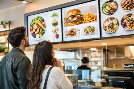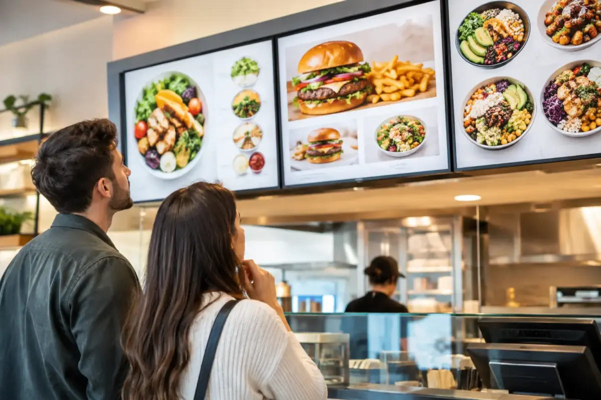
A customer standing at the counter should be able to read your menu boards, make a decision and order without holding up the queue. When prices are hard to find, text is too small or the layout feels crowded, the board stops doing its job. A well-planned menu gives customers confidence, helps staff take orders faster and presents your business as organised from the first visit.
For cafés, takeaways, food vans, pubs, bakeries and workplace canteens, the right board is not simply a display of products. It is a working part of the service counter. It needs to suit the available wall space, the lighting, the pace of trade and how often your offer changes.
What a Good Menu Board Needs to Do
The best menu boards make the next step obvious. Customers should quickly understand what you sell, what their main choices are and what each item costs. That sounds simple, but it requires clear hierarchy.
Start with your most-used categories. A coffee shop may lead with hot drinks, cold drinks, breakfast and food. A takeaway may need meal deals, mains, sides, children’s options and drinks. Put the sections in the same order customers usually think about them. Do not make people scan from one side of the board to the other to find a basic price.
Your best-selling or highest-value items deserve a prominent position, but the board should not become a wall of promotional messages. Too many highlighted products create the same problem as no emphasis at all. Keep the main message practical: item, short description where needed, and price.
Legibility comes before decoration. Use a typeface that can be read from the point where customers join the queue. Leave enough space between lines and sections, and use strong contrast between text and background. Pale text on a light background may match a brand palette, but it can be difficult to read under spotlights or through a shop window.
Choosing the Right Type of Menu Board
The right material depends on where the board will be used and how often the menu changes. There is no single best option for every food business.
Printed rigid boards for stable menus
Printed rigid menu boards are a practical choice when your core offer and prices stay the same for long periods. They provide a clean, consistent finish and can be produced to fit a specific wall area, counter front or serving hatch. They work particularly well for cafés, bakeries, restaurants and canteens with a settled menu.
A rigid board also gives you more scope for brand colours, product images and clear sectioning. However, it is worth allowing for likely changes before printing. If you expect seasonal pricing, regular meal deal changes or frequent stock substitutions, printing every item permanently can create unnecessary replacement costs.
Chalkboard-style displays for frequent updates
For daily specials, changing soups, limited bakes or market-led dishes, a chalkboard-style display can be more flexible. It gives staff the ability to update a small part of the offer quickly without replacing the full board.
This approach works best when the writing remains neat and readable. A handwritten specials board can feel personal and appropriate in the right setting, but it should still be structured. Keep prices aligned, avoid overfilling the space and use the same style across each panel where possible.
Changeable panels for mixed menus
Many businesses need a combination. Your permanent menu can sit on printed panels while separate changeable signs show specials, sold-out items, seasonal drinks or limited-time offers. This avoids putting temporary information into the core layout and keeps the main board easier to read.
For busy counters, separate panels are also useful when one product category changes more often than another. A breakfast section may be fixed, while lunch deals rotate each week. Planning for that difference at the start can save time later.
Plan the Layout Before You Start Designing
A menu board is easier to get right when the content is organised before any artwork is created. Begin with a complete list of what customers can order, then remove anything that does not need to appear on the main board. Some details are better handled on a countertop notice, printed leaflet or at the till.
Group products into clear sections and keep those headings short. Customers recognise familiar labels quickly, such as Breakfast, Sandwiches, Hot Drinks or Extras. Clever names may suit a brand, but they should not slow down ordering.
Use a consistent format for prices. If one section has prices aligned on the right, maintain that approach across the board. If sizes are offered, show them in the same order every time. For example, regular then large, rather than changing the order from one drink to the next.
Photographs can help when the product is visual or unfamiliar, but they are not always necessary. A few strong images are generally more effective than a small photograph beside every item. On a board viewed at a distance, large text and clean spacing usually do more work than detailed graphics.
Before finalising the design, stand back and test it at realistic viewing distance. Can a customer read the category headings from the queue? Can they find the price of a popular item in a few seconds? If not, simplify the layout rather than adding more design elements.
Make Pricing and Information Clear
Unclear pricing causes avoidable questions at the till. It can also create frustration when a customer expects one price and is charged another. Place every price close to the relevant item, particularly when options, sizes or add-ons are involved.
Where you offer meal deals, state exactly what is included. If a lunch offer includes a sandwich, snack and drink, say so. If selected products are excluded, make the condition visible but concise. Small print should not carry information customers need to make the purchase.
Food businesses also need to consider allergen information. A menu board does not have to contain every allergen detail, especially where the range changes, but customers need to know how to access it. A clear instruction such as “Please ask staff for allergen information” can support your wider process. Make sure staff have the current information available and understand when to use it.
Be careful with descriptions that can create confusion. Terms such as “homemade”, “fresh”, “gluten-free” or “vegan” should only be used where they accurately reflect the product and your operating process. Clear, factual wording is better for customers and safer for your business.
Match the Board to Its Location
A menu board that looks good on a computer screen can fail once it is installed. Lighting, height and viewing angle all matter. A board placed too high may be difficult to read for customers at the counter, while one positioned behind reflective glass may become unreadable in bright daylight.
Measure the area carefully, including fixtures, shelving, menu screens, light fittings and ceiling height. If the board sits behind staff, leave enough clearance for them to work without the display being blocked. In a food van or kiosk, consider how customers approach the serving point and where they naturally look first.
For external menus, material choice matters even more. Rain, direct sunlight and general wear can quickly affect unsuitable displays. A durable printed sign with a suitable finish is often the better long-term choice for an entrance, pavement-facing wall or collection hatch. Temporary promotions can then be added separately when required.
Keep Your Branding Useful, Not Overdone
Your logo, colours and visual style should make the board recognisably yours, but the menu itself remains the priority. Brand colours can be used for headings, section dividers and selected calls to action without covering the whole board in dark backgrounds or decorative textures.
Consistency is especially useful if you operate more than one site, run a fleet of food vans or attend regular events. Using the same typefaces, colours and menu structure makes each location feel connected. It also makes future updates faster because the artwork has an established format.
The SignBuilder can produce custom printed boards to suit fixed menus, promotional displays and branded food-service spaces. If you already have finished artwork, it should be checked for correct size, readable text and suitable image quality before production. If you are still planning the design, provide the menu content, dimensions and intended location so the board can be specified properly.
Review Your Menu Before You Order
A final proofread is not a formality. Check every item name, price, offer condition and contact detail before approving artwork. Ask someone unfamiliar with the menu to read it too. They are more likely to spot missing prices, unclear labels or sections that do not follow a logical order.
It is also worth reviewing the menu after installation. Watch how customers use it during a busy period. If staff repeatedly answer the same question, the board may need clearer wording or a better layout. Small adjustments can reduce queues and make service easier.
A menu board earns its place when it helps customers decide with less effort. Keep it clear, keep it accurate and build in flexibility where your offer is likely to change.