A van parked outside a customer’s property can be seen by neighbours, passers-by and drivers in slow-moving traffic for hours. Good trade van logo placement turns that ordinary working day into local advertising. Poor placement, however, can leave a smart logo hidden behind a door handle, lost in a busy design or unreadable from the pavement.
The aim is not to cover every available panel. It is to make your business recognisable in seconds, then give people one simple way to get in touch. For most trades, a clear logo, short service description and phone number or web address will work harder than a crowded layout full of small details.
Start with how people see a working van
Most people do not study vehicle graphics at close range. They see them while walking past, waiting at junctions, driving behind the van or looking across a car park. Your design needs to work at those distances and from those angles.
Think about where the van spends its time. A plumber or electrician working mainly on residential streets may benefit most from highly visible side panels and a clear rear message. A contractor travelling on motorways and visiting larger sites may need a stronger rear layout, as that is the panel drivers will see for longest in traffic. Fleet vehicles often need a repeatable position that looks consistent across different van sizes and body styles.
The vehicle itself also matters. A short-wheelbase panel van, crew van and Luton body offer very different usable areas. Doors, windows, handles, fuel caps, mouldings and sliding-door seams all affect where graphics can go. Designing around these features from the outset produces a cleaner result and avoids interrupted wording.
The best places for a trade van logo
Side panels: your main branding space
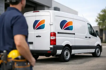
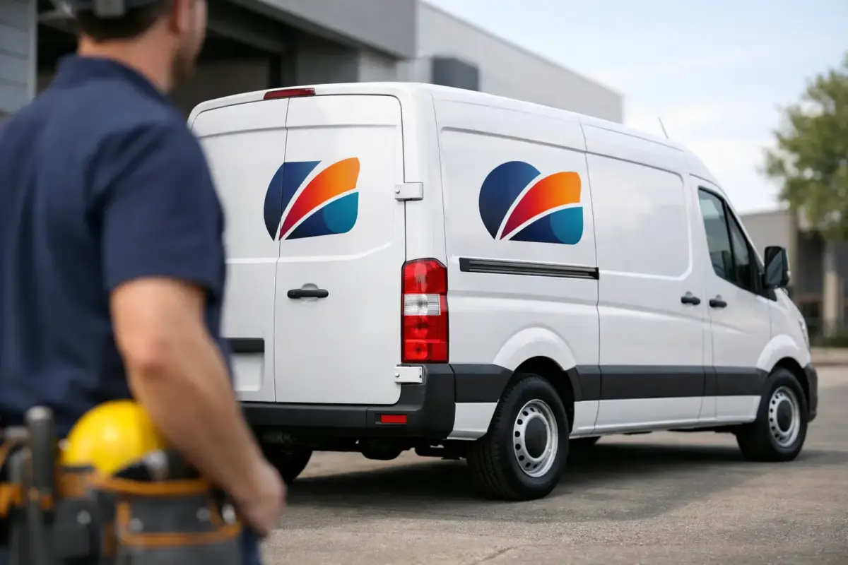
The sides are usually the strongest place for the main logo. They offer a broad, level viewing area and are highly visible when the van is parked outside a job. On a standard panel van, position the logo centrally within the largest uninterrupted section of the side panel, rather than pushing it too low near the sill or too high into curved bodywork.
A large logo on each side gives the brand immediate recognition. Place a concise line underneath or alongside it explaining what you do, such as “Electrical Services”, “Property Maintenance” or “Commercial Cleaning”. This is particularly useful for newer businesses whose name alone does not make their trade obvious.
Keep key information away from the sliding-door join where possible. A logo split across a seam can still look effective if planned carefully, but a phone number or website broken by the door line is harder to read and more likely to look untidy.
Rear doors: make the most of traffic time
Rear doors are valuable because they face following vehicles. This is the right place for contact details that can be read while stationary in traffic, but restraint is essential. The rear of a van has number plates, lights, hinges and often a narrow usable area on each door.
A practical rear layout commonly includes a smaller version of the logo at the top, a clear service description and one primary contact method below. Use a phone number if calls are your main source of enquiries. Use a short, easy-to-read website address if customers usually want to check services, reviews or locations first.
Do not rely on a QR code as the only call to action. It may be useful on a side panel for people viewing the van when parked, but it is not suitable for someone driving behind you. Contact information should always work without scanning anything.
Bonnet and cab doors: useful but secondary
Cab doors can carry a compact logo or service line, especially on vehicles with limited side-panel space. They are also useful where branding needs to be visible while the van is parked nose-in on a driveway. Keep the design simple because door handles, mirrors and contours quickly reduce the available area.
The bonnet can provide strong visibility on site, at events or in depot settings. It is less useful for day-to-day roadside reading, so it should support the main design rather than carry vital contact details. A centred logo often works best, provided it suits the shape of the bonnet and does not sit across sharp contours.
Build the design around a clear reading order
A van graphic should guide the eye in a sensible sequence: business name first, what you do second, then how to contact you. When all elements compete for attention, none of them do their job properly.
Your logo needs enough clear space around it to remain distinct. Avoid placing it against detailed photographs, patterned backgrounds or long lists of services. If your existing logo contains fine lines or small text, it may need simplifying or enlarging for vehicle use. What looks sharp on a business card is not always visible from across the road.
Service wording should be brief. Listing every job you undertake may feel comprehensive, but it is rarely readable at speed. Choose the work customers most often search for, or use a broader category that covers your offer. “Roofing and Building Services” is easier to absorb than six separate services in small lettering.
For contact details, one phone number and one website address are usually enough. Social media handles can be useful for certain customer-facing businesses, but only include them if they are short and actively maintained. A neglected account creates the wrong impression.
Choose colours for visibility, not just brand consistency
Your established brand colours should lead the design, but contrast decides whether the message can be read. Dark lettering on a light van, or light lettering on a dark van, generally gives the clearest result. Colour combinations that look attractive on screen can become weak outdoors, especially in rain, low winter light or strong sunlight.
White vans offer a flexible base, although pale yellow, silver or mid-grey text can disappear against them. Dark vans need light lettering with sufficient thickness. If your brand uses several colours, choose one dominant colour for the logo and keep supporting information in a high-contrast shade.
Reflective vehicle graphics can be a sensible option for businesses working early mornings, evenings or around highways and sites. They can improve visibility in headlights, but they do not replace any required safety markings or site-specific vehicle requirements. The right choice depends on the work you carry out and the conditions your vehicle regularly faces.
Size text for real viewing distances
The most common mistake in trade van branding is trying to fit too much into too little space. Text that looks readable on a computer monitor may be impossible to read from a passing car.
Make the company name the largest element. Your core trade or service line should be the next most prominent. Phone numbers and website addresses need clear, simple typefaces with generous spacing. Decorative scripts, thin fonts and tightly packed capitals may suit a brochure, but they make vehicle graphics harder to read.
Before committing, view the artwork at reduced size or step back from a printed proof. Ask a straightforward question: can someone understand the business name and service in three seconds? If not, remove elements, increase contrast or enlarge the key text.
Plan for the practical details
A well-designed van still needs to function as a working vehicle. Avoid obstructing windows, lights, registration plates, cameras, sensors and mandatory markings. Do not place essential wording where it will be obscured when doors open, ladders are carried or tool storage is fitted.
Consider future changes too. A permanent service line may be ideal for a specialist trade, while a business offering seasonal or changing services may be better with a core logo layout and separate, replaceable promotional graphics. Magnetic signs can suit occasional use or temporary vehicle branding, although they need clean, suitable panels and should be removed for cleaning and checked regularly.
For a fleet, create a consistent template rather than treating every vehicle as a separate design. Logo position, colours, service wording and contact details should remain familiar even when van models differ. This makes the business look organised and helps local recognition build over time.
Check artwork before production
Good production starts with suitable artwork. Vector files are generally best for logos because they can be scaled cleanly to vehicle size. High-resolution print files may also be suitable, but screenshots, low-resolution images and logos copied from social media often produce soft edges or pixelation when enlarged.
If you do not have print-ready artwork, it is worth getting the layout checked before ordering. Confirm the exact vehicle model, wheelbase and door configuration, as small differences can alter panel dimensions. Also check spelling, phone numbers and website addresses carefully. A typo on a van is more expensive to correct than a typo on a leaflet.
The SignBuilder can help businesses move from an idea or supplied logo to practical vehicle graphics, whether you prefer to design online, upload artwork or request design support.
A trade van is already travelling to the areas where your customers live and work. Give it a clear message, place that message where people naturally look, and let every parked job become a professional introduction to your business.