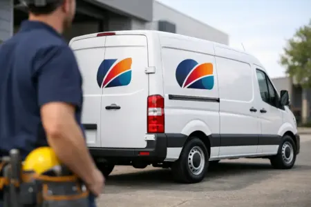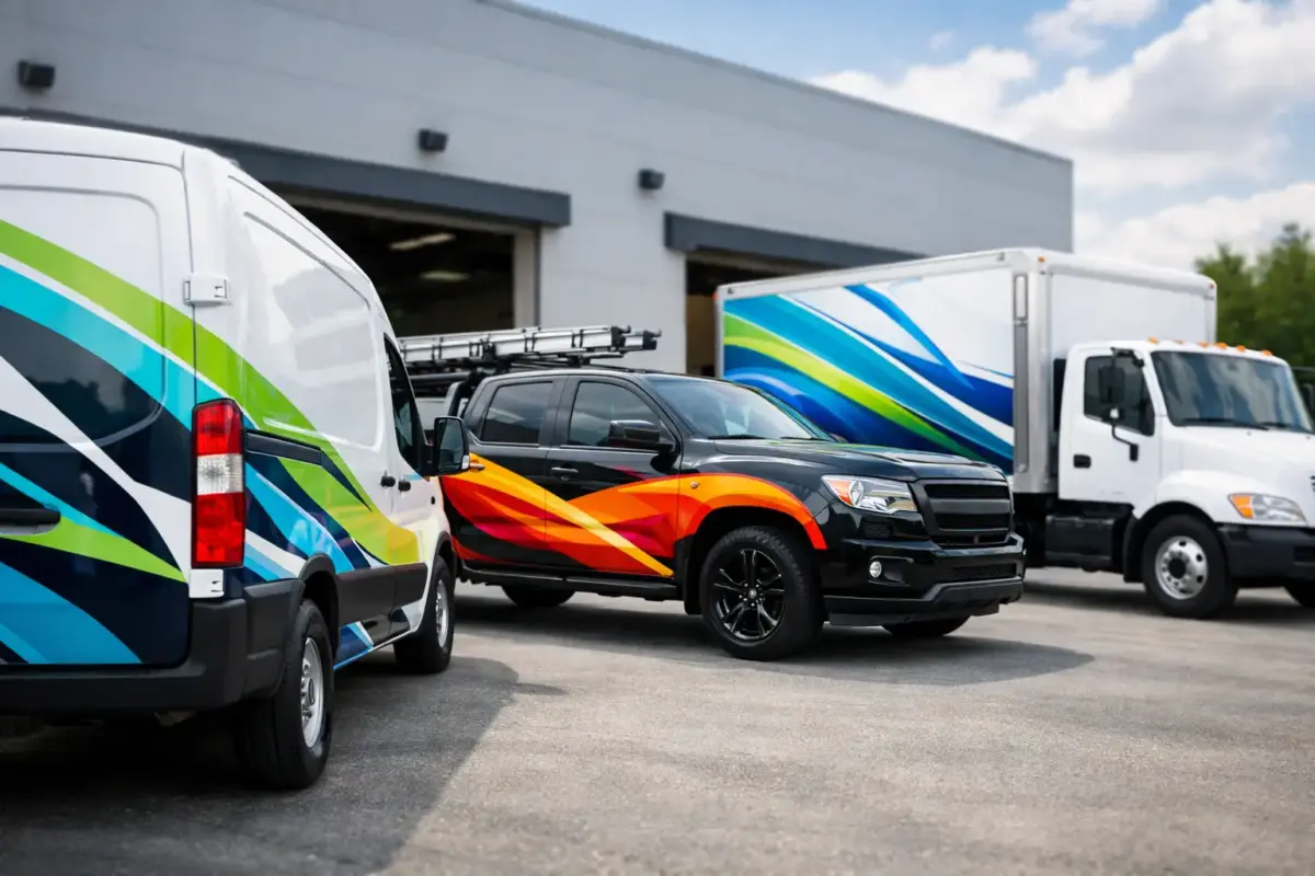
A signwritten van is often seen more times in a week than a printed advert is read. Vehicle graphics put your business name, service and contact details in front of local customers while you are travelling, parked at a job or making deliveries. For tradespeople, fleets and mobile services, they turn an existing business asset into practical, day-to-day advertising.
The best results are not always the busiest. Clear information, the right material and a layout designed for the vehicle itself matter far more than trying to fill every available panel. A professional finish should be easy to read at a glance and capable of standing up to regular road use.
Start with the job your vehicle graphics need to do
Before choosing colours, logos or images, decide what someone should understand in the few seconds they see your vehicle. A local plumber may need to make their trade and phone number obvious. A catering company may want to show its menu style, event service and social proof. A fleet operator may need a consistent identity across vans, cars and lorries, while leaving room for vehicle numbers or operational markings.
Most business vehicle graphics need to do three things: identify the company, explain the service and provide a way to get in touch. If your design does all three clearly, it is already doing useful work.
Trying to include every service, qualification and sales message can make the design harder to read. Prioritise the information that earns enquiries. A strong business name, short service description, phone number and website or email address will usually outperform a crowded panel of small text.
Design for distance, not for a computer screen
Artwork can look clear on a large monitor and still be difficult to read from the pavement or another vehicle. The main message should be legible from a distance, including when the vehicle is moving. That means using suitably large lettering, clean typefaces and strong contrast between the graphic and the paintwork.
Black lettering on a pale vehicle is often easy to read. White lettering can work well on dark paint, while bright colours can provide impact when used with enough contrast. The exact choice depends on your brand, but visibility should guide the final decision. Pale text over a busy photograph, for example, may look attractive in a proof but disappear at road distance.
Keep the hierarchy simple. Your company name or logo should generally be the first thing a person notices. Your core service comes next, followed by the contact details. On larger vehicles, you may have room for more information, but the order still matters.
Use each panel properly
Side panels are usually the strongest location for your primary message because they offer the largest uninterrupted viewing area. Rear doors work well for a phone number, website and concise service line, especially in traffic. Bonnet graphics can add recognition when vehicles are parked, although they should not carry essential detail.
Doors, handles, fuel caps, panel joins, windows and body contours all affect placement. A design needs to work with these features rather than fight against them. Text split across door gaps or placed too close to handles can look untidy and may be harder to apply accurately.
When ordering for several vehicle types, do not assume one layout will fit them all. A short-wheelbase van, long-wheelbase van, pickup and car may need related but different artwork sizes. Consistent branding does not mean identical dimensions.
Choose materials for the conditions they face
Vehicle graphics are available in cut vinyl lettering, printed vinyl graphics and magnetic signs. Each option suits a different requirement, budget and fitting method.
Cut vinyl is a reliable choice for crisp text, simple logos and solid-colour graphics. It is particularly effective for trade names, phone numbers, service descriptions and bold branding. Because there is no printed background, it gives a clean finish that works well on vehicle paintwork.
Printed vinyl is suitable when your design includes several colours, gradients, detailed logos, photographs or bespoke imagery. It gives more freedom in the artwork, but the design still needs to be planned for visibility. More detail is not automatically better.
Magnetic vehicle signs are useful when branding needs to be removable, such as for personal vehicles used for occasional business travel. They can also help temporary staff or subcontractors display company details. However, they need a clean, flat metal surface and should be removed regularly for cleaning. They are not suitable for all body panels, particularly aluminium, plastic or heavily contoured areas.
For vehicles that work outdoors every day, material quality and surface preparation are essential. Dirt, wax, grease and traffic film can reduce adhesion. Fresh paint may also need time to cure before graphics are fitted. If in doubt, check the vehicle condition and planned application area before ordering.
Get the artwork right before production
A good print result starts with usable artwork. Vector files are generally best for logos and lettering because they can be scaled without losing sharpness. Common formats include AI, EPS, SVG and print-ready PDF files. High-resolution image files can also be suitable for printed graphics, provided they are large enough for the final display size.
Small screenshots, copied images from social media and logos taken from websites often do not have enough resolution for quality printing. They may appear blurred, pixelated or soft when enlarged. Supplying the original logo file can prevent delays and help maintain a professional finish.
If you do not have finished artwork, start with the key information: your logo, business name, services, preferred colours, contact details and vehicle make or model. A design service can turn those elements into a layout that is practical to produce and fit. This is often a better route than trying to adapt a business card design to a large vehicle panel.
Check the proof with real-world questions
Before approving artwork, look beyond whether the logo is correct. Ask whether the phone number is large enough to read from several metres away. Check that the website is spelt correctly, the email address is current and the service description reflects what you want to sell.
It is also worth considering how the graphics will look on the actual vehicle colour. A proof shown against a plain white background may not give a realistic impression if your van is silver, red or dark blue. Accurate vehicle details help create a more useful visual before production begins.
Plan fitting around the vehicle and the weather
Easy-fit graphics can be a practical option for straightforward lettering, logos and individual panels. The vehicle should be clean, dry and fitted in a sheltered area with suitable temperatures. Take time to measure and mark the position before removing the backing. Rushing the alignment is one of the most common causes of disappointing results.
Larger printed pieces, complex contours or multi-panel designs may be better handled by an experienced fitter. This can add cost, but it may be worthwhile for high-visibility vehicles or a fleet that needs a consistent finish. The right option depends on the complexity of the artwork, the condition of the vehicle and your confidence with application.
Do not fit graphics over damaged paint, deep scratches, rust or loose lacquer. The material can only adhere as well as the surface beneath it. Addressing bodywork problems first protects both the vehicle appearance and the finished branding.
Keep branded vehicles looking professional
Once fitted, regular care helps vehicle graphics continue to represent your business well. Wash the vehicle routinely, avoiding aggressive abrasives and taking care around edges. If using a pressure washer, keep the nozzle at a sensible distance and avoid directing high pressure into graphic edges or joins.
Inspect graphics after winter road conditions, long motorway journeys or work on demanding sites. A small lifted edge is easier to deal with than a section left to deteriorate. The same applies to magnetic signs: remove them periodically, clean both surfaces and refit them only when dry.
For fleets, keep a simple record of each vehicle’s artwork, fitting date and approved design version. This makes replacement, reordering and adding new vehicles much easier. It also prevents small changes to logos, colours or phone numbers creating an inconsistent fleet over time.
Make every journey easier to remember
Vehicle branding is most effective when it feels like a natural part of the business, not an afterthought added at the end. Clear messaging, dependable materials and a layout suited to the vehicle give customers a reason to remember who they saw on the road. Whether you need simple vinyl lettering for one van or coordinated graphics across a working fleet, start with the information people need most, then give it the space to be seen.