A fork-lift route, a fire exit and a chemical store all need different messages, but each sign must be understood in seconds. People often ask, “what do health and safety signs mean?” because the colours and symbols can look simple while carrying very specific instructions. Getting them right helps staff, visitors and contractors recognise hazards and take the correct action before an incident occurs.
What do health and safety signs mean?
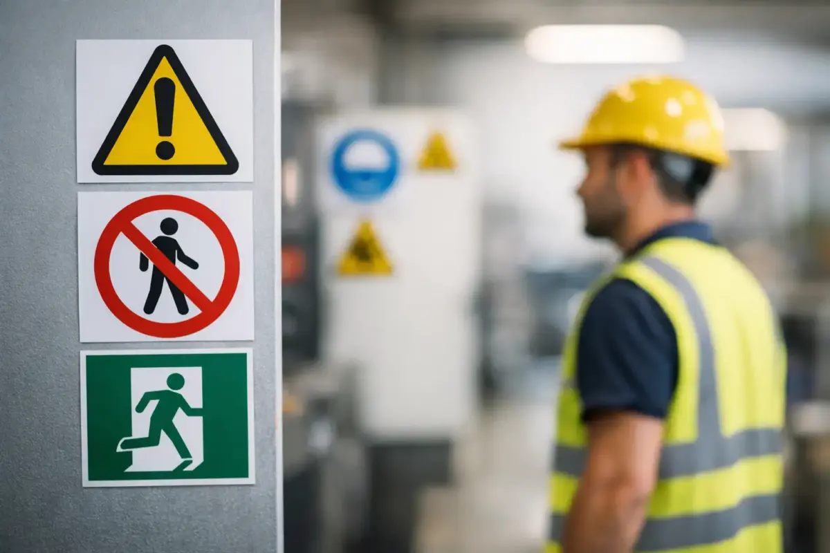
Health and safety signs communicate one of five core messages: do not do something, be aware of a hazard, take a required action, follow a safe route or find safety equipment, or locate fire-fighting equipment. Their colour, shape and pictogram work together so the message can be understood quickly, including in noisy areas or where a written instruction alone may be missed.
In UK workplaces, the Health and Safety (Safety Signs and Signals) Regulations 1996 set out when safety signs should be used. In practical terms, a sign is needed where a risk remains after other sensible controls have been put in place and people need clear information to stay safe. A sign is not a substitute for guarding machinery, improving housekeeping, providing training or controlling access. It supports those measures.
Many familiar symbols follow BS EN ISO 7010, which provides standard safety pictograms. Using recognised symbols gives people a better chance of understanding a sign immediately, particularly if they work across several sites or visit your premises for the first time.
The five main types of safety sign
Prohibition signs: red circle with a diagonal line
A prohibition sign tells people what they must not do. It normally has a black symbol inside a red circle with a red diagonal bar. “No smoking”, “No unauthorised access” and “No mobile phones” are common examples.
Use prohibition signs where an action could create or increase a risk. A no-entry sign on a plant room door, for instance, makes the restriction clear before someone enters an area they are not authorised or equipped to use. The sign should sit at the point where the decision is made, not halfway through the restricted area.
Warning signs: yellow triangle
Warning signs identify a hazard that people need to notice and avoid. They use a black pictogram on a yellow triangular background, such as high voltage, slippery surface, fork-lift lorries or corrosive substances.
A warning sign does not mean the area is automatically off limits. It means people should proceed with care and follow any site controls in place. For example, a warning sign for moving vehicles is useful at warehouse crossings, but it should be supported by marked walkways, good visibility and sensible traffic management.
Mandatory signs: blue circle
Mandatory signs tell people what they must do. The white symbol appears on a solid blue circle. Typical examples include “Wear eye protection”, “Safety helmets must be worn” and “Keep clear”.
These signs are particularly useful at the entrance to task-specific zones. A mandatory PPE sign at the gate to a construction area or beside a cutting machine tells users the expected standard before work begins. Be precise: if hearing protection is required only in a defined area, place the sign at that boundary rather than displaying it throughout the site.
Safe condition signs: green rectangle or square
Green signs point people towards safety. They identify first-aid points, emergency exits, escape routes, assembly points and emergency showers. The message is generally a white pictogram on a green background.
These are among the most important signs to keep visible at all times. A fire exit sign hidden by stock, a display stand or an open door is of little use in an emergency. Directional signs should lead consistently towards the nearest suitable exit, and the route should remain clear, illuminated and usable.
Fire equipment signs: red rectangle or square
Fire equipment signs identify the location of fire extinguishers, fire alarm call points, fire blankets and fire hoses. They use a white pictogram on a red background.
They should not be confused with prohibition signs, which also use red. The shape and purpose make the difference: a red circle tells people not to take an action, while a red rectangular sign shows where emergency fire equipment can be found. Position these signs above or directly beside equipment so it can be located quickly if sightlines are poor.
Why shape and colour matter
A safety sign needs to work before someone has time to read a paragraph of text. That is why standard shapes and colours are so useful. Red attracts attention and signals prohibition or fire equipment; yellow prompts caution; blue gives an instruction; green directs people to safety.
The pictogram adds a second layer of clarity. A hand under running water is more immediate than words alone when marking an emergency eyewash point. Text can still be helpful, especially for site-specific instructions, but it should support the symbol rather than make the sign overly complicated.
Colour alone should never carry the whole message. People may be colour-blind, viewing the sign at a distance, or encountering it in poor lighting. A clear symbol, correct shape, sensible positioning and adequate size all matter.
Choosing the right sign for your premises
Start with the risk assessment and walk through the site as a new employee, delivery driver or visitor would. Look for points where someone could take a wrong turn, miss a hazard or need to find equipment quickly. This often reveals missing signs around vehicle routes, storage areas, staff-only doors, loading bays, stairwells and emergency exits.
The correct sign depends on the specific risk and the action required. A yellow warning sign may be right for a low beam, while a blue mandatory sign is required where hard hats must be worn. Combining several unrelated messages on one board can reduce clarity. If people need to take different actions at different points, use separate signs in the right locations.
Size is equally practical. A small sign can work on a cupboard door or beside a piece of equipment. A sign viewed across a warehouse, car park or yard needs to be substantially larger. Consider viewing distance, lighting, traffic speed and whether stock, vehicles or people may obstruct it.
Material should suit the environment. Indoor offices, retail spaces and staff areas may need lightweight rigid signs or self-adhesive labels. Wet rooms, production areas and outdoor entrances need a more durable option that can cope with moisture, cleaning and changing weather. Where emergency route markings must remain visible during a power failure, photoluminescent signs may be appropriate, subject to the building’s fire safety arrangements.
Common mistakes that weaken safety signage
The most common problem is using a sign to manage a risk that needs a physical control. A “Beware of fork-lift lorries” sign does not make a mixed pedestrian and vehicle route safe by itself. It should sit alongside planned routes, barriers, mirrors, speed controls and staff procedures.
Another issue is sign overload. A wall covered in notices encourages people to stop looking. Keep mandatory and warning messages relevant to the immediate area, remove outdated notices, and replace signs that are faded, damaged or hidden. Temporary hazards also need prompt attention: a temporary wet-floor sign should be removed once the floor is dry, while a recurring hazard may need a permanent solution.
Finally, check that signs match your actual procedures. Do not display a first-aid sign where there is no accessible first-aid provision, or mark an emergency exit route that has been changed by a refurbishment. Site layouts, equipment and working practices change, so signage should be reviewed as part of routine safety checks.
Make safety information easy to act on
The best safety signage is visible, specific and supported by the way your site operates. It gives a person the right instruction at the point they need it, without leaving them to interpret a vague message. When ordering signs, confirm the symbol, wording, size, material and fixing method against the location where it will be used.
A quick walkaround with fresh eyes can be enough to spot the sign that is missing, obscured or no longer accurate. Put that right before it becomes the instruction someone needed but could not find.