A building site can change by the hour. New deliveries arrive, work areas move, visitors need checking in and hazards appear as each stage progresses. The best signs for building sites give people clear instructions before they reach the wrong place, enter a restricted area or put themselves at risk. They also help the site look organised to clients, neighbours, inspectors and prospective customers.
The right selection depends on the work being carried out, the size of the site and who needs to use it. A small refurbishment may need a visible site board, PPE notices and a few temporary directional signs. A larger development needs a coordinated system covering access, vehicle movement, welfare, emergency information, security and public-facing project details.
Start at the site entrance
The entrance is where visitors, contractors, delivery drivers and members of the public first need direction. A clear site entrance sign should identify the project or contractor, explain where to report and show the key rules that apply before anyone goes further.
A combined site board is often the most efficient option. It can display the principal contractor’s details, emergency contact numbers, working hours, visitor requirements and any relevant safety information in one fixed location. If the project is close to homes, shops or a public footpath, this board can also provide a professional point of contact for enquiries.
Keep the layout practical. Contact details and reporting instructions need to be readable from a sensible standing distance, rather than squeezed beneath logos and project imagery. A branded board is useful, but it should never make essential information harder to find.
The best signs for building sites cover safety first
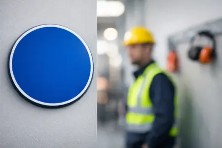
Safety signs are not simply a box-ticking exercise. They set expectations consistently, including when the site manager is busy or a new subcontractor arrives outside normal hours. Use recognised safety colours and symbols so messages are understood quickly: red for prohibition and fire equipment, blue for mandatory actions, yellow for warnings and green for safe conditions or emergency information.
Mandatory PPE and site rules
PPE signs belong at entry points and before the specific risk area they relate to. Hard hats, safety footwear, eye protection, hearing protection and high-visibility clothing should only be displayed where they are genuinely required. Overloading one board with every possible symbol can make the important rules less noticeable.
Site rules boards work well near the signing-in point, welfare unit or main gate. They can cover visitor procedures, mobile phone restrictions, speed limits, smoking policy and the requirement to follow site induction instructions. For a long-running project, a durable rigid sign is usually better value than repeatedly replacing paper notices.
Hazard, prohibition and restricted-access signs
Use warning signs at the point of risk, not only at the entrance. Excavations, overhead loads, live services, uneven surfaces, plant movements and hazardous substances all need clear, relevant communication. Where an area is off limits, a prohibition or restricted-access sign should be placed on the barrier, gate or route people are most likely to use.
Position matters as much as wording. A sign hidden behind stacked materials or installed after the decision point has been missed will not do its job. Check signs during regular site walkarounds, particularly after fencing is moved or new work phases begin.
Manage vehicles, pedestrians and deliveries
Construction traffic is one of the areas where simple signage can prevent confusion. Delivery drivers may not know the layout, and employees on foot may assume a route is safe when plant is operating nearby. Separate pedestrian and vehicle routes wherever the site layout allows, then support them with clear signs at junctions, crossings and access points.
Directional boards can identify the delivery gate, unloading area, turning point, site office, welfare facilities and visitor parking. Speed limit signs, one-way arrows, stop signs and ‘banksman required’ notices give drivers instruction without relying on verbal guidance alone.
For temporary routes, lightweight boards on secure stakes or frames can be moved as the project develops. For fixed roads, gates and permanent boundaries, choose a tougher rigid material and a fixing method suited to the surface. Signs must stay legible in poor weather and remain securely mounted when exposed to wind from passing vehicles.
Choose materials to match the job
There is no single best material for every building site sign. The useful choice is the one that remains readable for the expected life of the project, in the location where it will be fitted.
Correx signs are a practical choice for short-term notices, changing directions and temporary site instructions. They are lightweight, cost-effective and easy to fix to fencing, provided they are supported properly. For short projects or signs likely to change, this can avoid spending more than necessary.
Foamex gives a more substantial, professional finish for site boards, office signs and internal notices. It is suitable where a flat, rigid panel is needed but the sign will not face severe impact or constant exposure.
For longer-term external signs, dibond aluminium composite offers a durable option. It is commonly used for entrance boards, perimeter branding, permanent direction signs and project information. It costs more than a temporary board, but it holds up better on developments running for many months.
Banner material is useful for perimeter messaging, contractor branding and large-format warnings where a rigid panel would be difficult to install. Make sure banners are correctly tensioned and fixed through reinforced eyelets. A loose banner can quickly become hard to read and potentially unsafe in high winds.
Make every message easy to read
A sign can contain the right information and still fail if the text is too small, the contrast is poor or the message is buried in clutter. Use a short instruction first, then add supporting detail only where needed. ‘Report to Site Office’ is more effective at a junction than a paragraph explaining the visitor process.
Think about viewing distance before choosing the sign size. A small notice may be appropriate on a gate at arm’s length, while a delivery direction sign needs to be seen from a vehicle before the driver reaches the turn. Larger type, strong contrast and simple arrows improve decision-making at speed.
Photographs, logos and project visuals have a place on client-facing boards, but safety and wayfinding signs should stay functional. Avoid reflective surfaces where glare could affect visibility. If signs are needed for early starts, winter afternoons or enclosed areas, assess whether lighting or reflective material is necessary.
Do not overlook emergency and welfare information
Emergency signs need to be available when people are under pressure. Mark fire points, emergency exits, assembly points, first-aid facilities and eyewash stations clearly. If the assembly point changes as the site develops, replace or relocate the sign immediately rather than assuming everyone has been told.
Welfare signs also improve day-to-day site operation. Clear labels for toilets, drying rooms, canteens, offices and smoking areas reduce unnecessary foot traffic through work zones. On larger sites, directional signs to welfare facilities can be particularly helpful for visitors and new starters.
Security notices should be direct and truthful. Signs warning of monitored premises, unauthorised access or restricted areas can support your wider security arrangements, but they should not make claims that do not reflect the measures actually in place.
Build in checks and replacements
Signage needs maintenance like any other part of the site setup. Rain, dust, UV exposure, accidental knocks and changing layouts all affect performance. Set a simple inspection routine so damaged, faded, missing or out-of-date signs are identified early.
It helps to keep a small stock of common temporary signs ready for use, especially PPE notices, directional arrows, warning signs and no-entry messages. For repeat work across multiple sites, standardising sizes, colours and wording makes ordering quicker and creates a consistent professional appearance.
When preparing artwork, supply clear logos and high-resolution graphics, but do not worry if you only have a basic brief. The key information is the sign’s purpose, intended location, approximate viewing distance and how long it needs to last. From there, the right format and material are easier to specify.
Good site signage is most effective when it is treated as part of the working plan, not an item added at the end. Choose signs that people can spot, understand and act on, then update them as the work changes. The SignBuilder can help turn that requirement into practical printed signs, whether you are using ready-made safety messages, uploading artwork or arranging a custom site board.