A banner can be perfectly printed and still fail at an event. If visitors cannot read it from the entrance, understand the offer in a few seconds or find the stand it points towards, the design has not done its job. Knowing how to design event banners starts with the real viewing conditions: distance, footfall, lighting, weather and the message people need to take away.
For a trade stand, school fete, charity day, sports fixture or retail launch, the aim is not to fit every detail onto one banner. It is to make the right information visible at the right moment. A clear banner helps people recognise your business, locate an activity or act on an offer without stopping to work out what they are looking at.
Start with one clear purpose
Before choosing colours, images or a banner size, decide what the banner must achieve. A sponsor banner may need to build recognition. A directional banner needs to point people to registration, parking or refreshments. A promotional banner may need to highlight a product, a price or a time-limited offer.
Trying to make one banner do all three usually leads to a crowded layout. If the event has several messages to communicate, use separate banners in the places where each message is most useful. For example, use a large branded banner at the entrance, simple directional signs around the venue and a product-led banner at the point of sale.
Write the main message as one short sentence before beginning the layout. If it cannot be understood at a glance, shorten it. “Freshly prepared food this way” is more useful on a busy site than a paragraph about the menu.
Design event banners for viewing distance
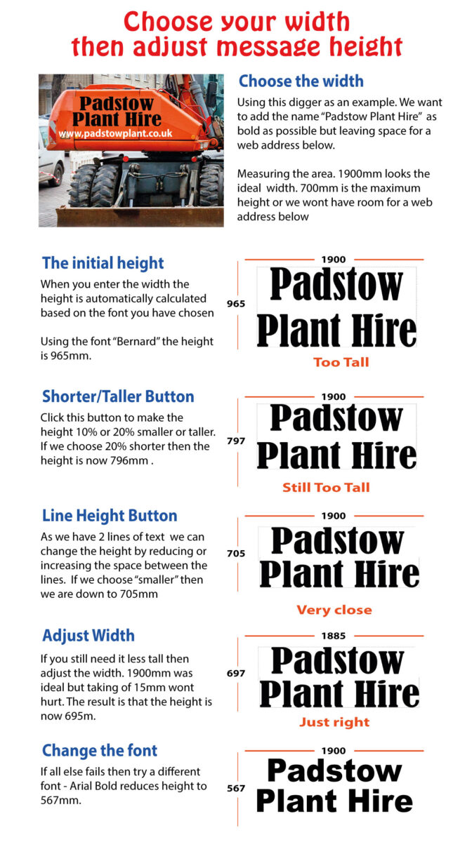
Text size should be based on where the banner will be seen, not on how it looks on a computer screen. A heading that seems oversized in an artwork file can be exactly right when viewed from across a hall or car park.
As a working rule, keep the largest message large enough to read from the furthest realistic viewing point. A banner above a stall may only need to work from a few metres away. An outdoor banner facing an approach road needs much larger lettering and far less copy.
Use a clear order of information. Most viewers should see the business name, event message or offer first. The supporting detail comes second, followed by practical information such as a stand number, website address or contact details. If every line uses the same size and weight, nothing stands out.
Avoid condensed fonts, decorative scripts and thin typefaces for essential wording. They can look stylish close up but lose clarity at distance, especially in rain, low light or a busy venue. Straightforward sans-serif typefaces are often the safest choice for event signage because they remain legible when people are moving past.
Keep wording brief
A good event banner is not a leaflet. Include the words that help someone decide where to go or what to do, then remove the rest. Names, short taglines, dates, directions and key offers all have a place, but only when they support the main purpose.
Phone numbers and long social media handles are rarely useful on a banner viewed from a distance. A short web address or a simple call to action is normally easier to absorb. If visitors need detailed information, provide it on a counter display, flyer or smaller sign where they can read it at close range.
Use contrast before brand colour
Strong branding matters, but readability comes first. Your usual colours may work well on clothing, stationery or online graphics, yet become difficult to read when printed large and placed outdoors. Pale text on a bright background, or dark text over a detailed photograph, can disappear surprisingly quickly.
Create contrast between the background and the main message. Dark lettering on a pale solid field, or pale lettering on a dark solid field, is generally dependable. If a photograph is essential, place text over a plain colour panel rather than directly over the image.
Use brand colours to frame the design, identify the business and create consistency across banners, workwear, vehicle graphics and other printed materials. However, do not use every brand colour simply because it is available. Two or three well-controlled colours will usually look more professional than a full palette competing for attention.
Choose images that work at banner size
Images can add impact, particularly for food, hospitality, community events and product displays. They also take up valuable room. Use one strong image with a clear subject rather than several small photographs that lose detail when viewed from a distance.
Image quality is critical. A low-resolution file may look acceptable in a small preview but become soft or pixelated when enlarged for print. Supply original photography where possible, rather than screenshots, images copied from social media or pictures downloaded from a website.
Logos need the same care. Use a high-quality vector file where available, such as PDF, EPS or AI, because it can be scaled cleanly. If you only have a raster logo, provide the largest original version. Do not stretch a logo to fill space, and leave enough clear area around it so it remains recognisable.
Match the banner to its location
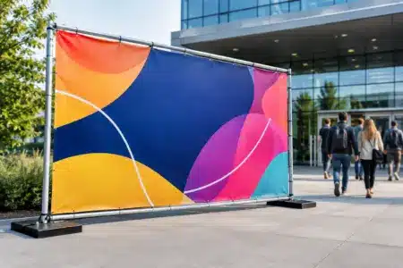
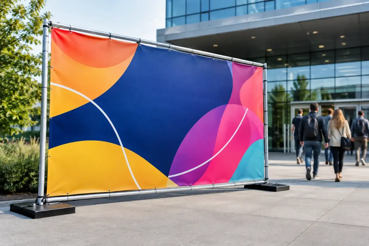
The best format depends on how and where the banner will be used. An indoor exhibition stand may suit a portable pull-up banner that is quick to position and store. A fence, barrier or outdoor event perimeter may need a larger banner with reinforced edges and eyelets for secure fixing. A short-term indoor promotion may only need a lightweight option.
Consider wind exposure, fixing points and the time the banner will remain in place. Outdoor banners need suitable material and secure installation. A large solid banner in an exposed area can catch the wind, so the fixing method and site conditions matter as much as the artwork. Check venue rules before ordering, particularly where banners will be attached to railings, fencing or temporary structures.
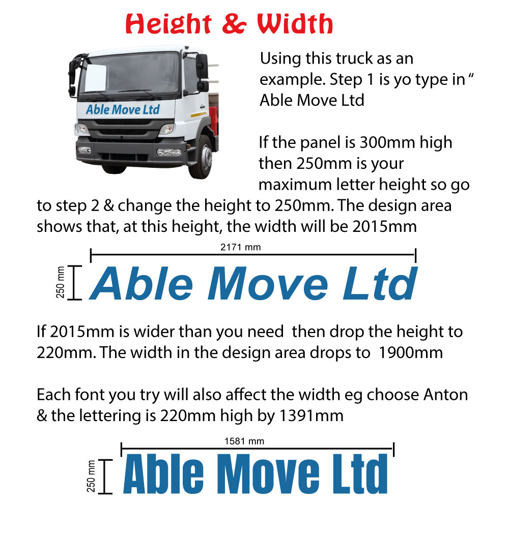
Banner dimensions should follow the available space. Measure the area rather than estimating from memory, then allow room for eyelets, poles, cable ties or other fittings. A banner that is too large for the frame or too small for a wide frontage will look like an afterthought.
Build a layout that is easy to scan
Leave breathing space around the main message. Empty space is not wasted space – it gives the viewer a clear route through the design. Start with the headline, place the logo where it can be recognised and add only the supporting information needed to prompt action.
A simple layout often works best: logo at the top, large message in the centre and a short instruction or contact detail below. That structure is not compulsory, but it is reliable because it follows the way most people scan a banner.
Before approving the design, shrink the artwork on screen and step back. Can you still identify the headline? Then view it at full size and check alignment, spacing, spelling, dates and contact details. Ask someone unfamiliar with the event what they think the banner is promoting. If they hesitate, revise the message rather than adding more explanation.
Prepare artwork properly for print
Set up the artwork at the final banner dimensions or at a proportional scale agreed for large-format printing. Keep vital text and logos away from the edges, eyelets and any areas that may be obscured by frames or fixings. A safe margin helps prevent important information being lost or looking cramped.
Use high-resolution images and ensure colours are suitable for print. Screen colours can appear brighter than the final printed result, particularly fluorescent or very vivid shades. If a precise brand colour is essential, provide the relevant colour reference and allow for the practical differences between screen display and printed material.
Export a print-ready PDF where possible, with fonts embedded or converted to outlines if required. If you are not confident preparing artwork, use an online design option, upload the best files you have or request artwork assistance. An artwork check is far quicker and less costly than finding a spelling error after the banner is installed.
Plan for the full event set-up
A banner is more effective when it works with the rest of the event presentation. Match the key colours, logo use and messaging across table displays, directional signs, staff clothing and promotional materials. This does not mean every item must look identical. It means visitors should be able to recognise that they belong together.
Think through the visitor journey as well. What do people see from the car park, entrance, queue, aisle or pavement? Place the most important banner where it answers the next likely question. At a busy event, clear information in the right place can be more valuable than a larger banner in the wrong location.
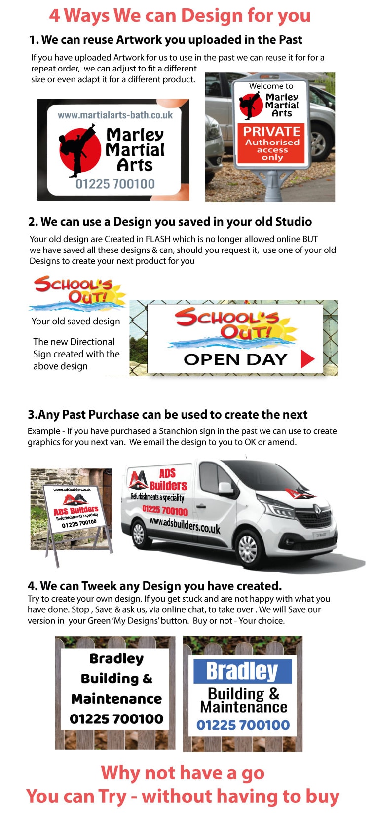
The SignBuilder can help businesses and organisers move from an idea to a print-ready banner through online design, artwork upload or design support. The most useful brief is a simple one: where the banner will go, what it must say, how far away it will be read and when it is needed.
A well-designed event banner does not need clever wording or a crowded page. Give it one job, make the message easy to read and choose a format built for the venue. That is what gets noticed when the event is already busy.