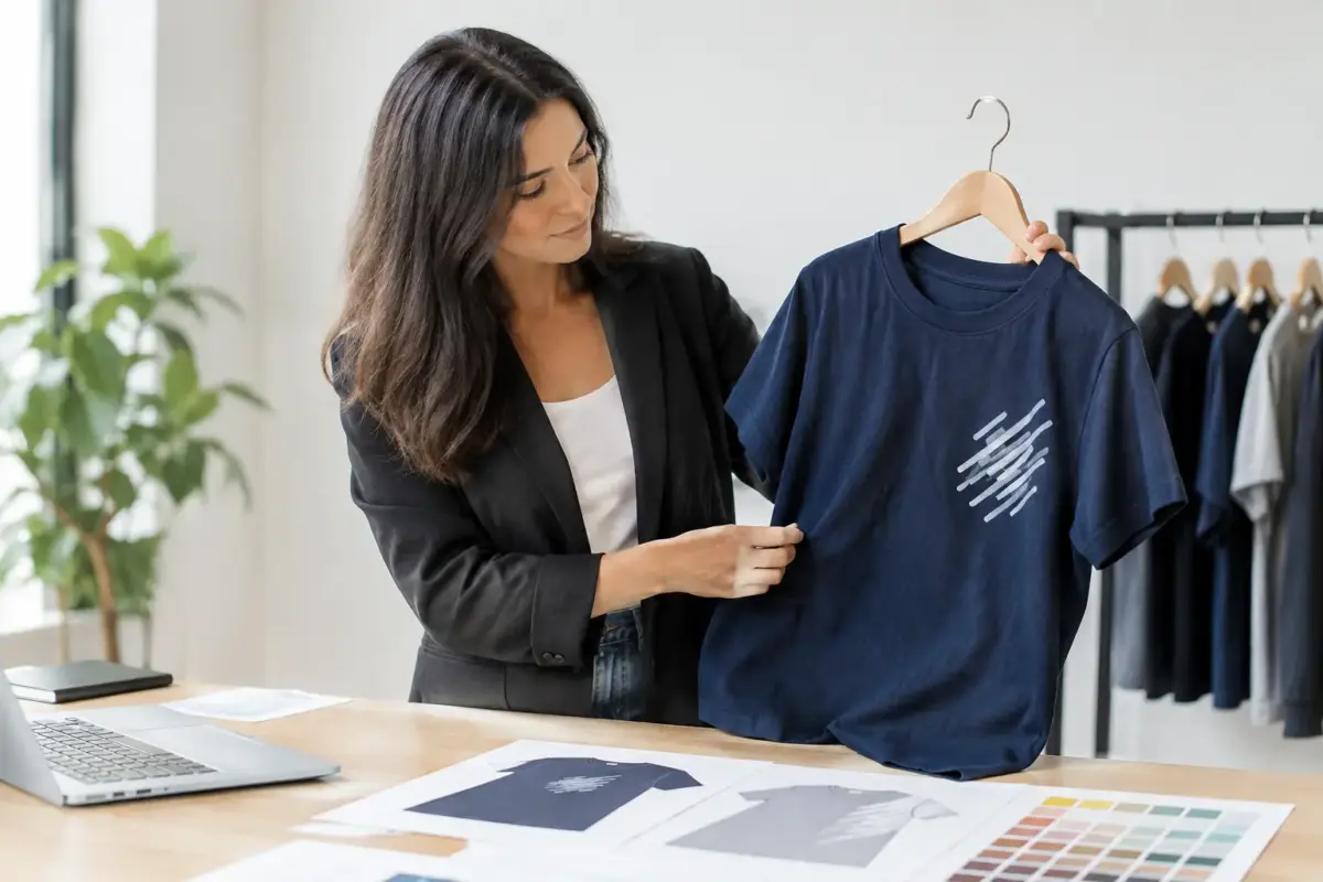
A logo can look right on screen and still disappear once it is on a jacket, polo or hi-vis vest. To choose workwear print placement properly, start with where staff work, how customers see them and what the garment needs to do during a shift. The best position is not always the biggest available area.
Choose workwear print placement by purpose
Workwear has two jobs: it needs to identify your team and stand up to the practical demands of the role. A delivery driver getting in and out of a van, a tradesperson working overhead, and front-of-house staff greeting customers all need different levels of visibility.
Think about the first view people get of the wearer. For customer-facing roles, the front of the garment often does the most work. For teams working on site, at events or around vehicles, the back may be the better place for a company name, service description or contact details. If staff are regularly wearing outer layers, printing only on a T-shirt can leave your branding hidden for much of the day.
A sensible approach is to choose one primary message. This is usually your logo or business name. Then decide whether a second placement adds a genuine benefit, such as a larger rear print for visibility. Adding every available detail can make workwear look crowded and make the information harder to read.
Start with the garment and the job
The same artwork will not suit every garment. Before choosing a position, look at the cut, fabric, fastenings, pockets and features of the item you are ordering. These all affect the usable print area.
Left chest for everyday identification
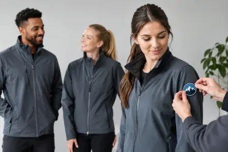
The left chest is the standard choice for a logo on polos, T-shirts, sweatshirts, fleeces and jackets. It is familiar, professional and easy to spot during a conversation. It works particularly well for retail, hospitality, office teams, installers and service businesses where customers meet staff face to face.
Keep the design compact. A wide landscape logo may need resizing or a different position to avoid running too close to the placket, zip or underarm. Fine straplines can also become difficult to read at a small chest size. If your logo contains small text, use a simplified version or consider placing the fuller business name on the back instead.
Centre chest for bold branding
A centre chest print gives a more prominent, casual look and can work well for promotional clothing, event teams and staff T-shirts. It offers more width than a left chest position, so it suits a broader logo or a short, high-impact message.
There are trade-offs. Centre chest designs can be interrupted by a zip on hoodies and jackets, and may sit awkwardly over folds on heavier garments. It is generally more effective on plain-front T-shirts, sweatshirts and polo shirts with enough clear space.
Back prints for distance visibility
The upper back is usually the strongest location for branding that must be seen from a distance. It is useful for trades, construction, maintenance teams, delivery staff, event crews and anyone working with their back to passing customers or site visitors.
Use the space with purpose. A larger logo, business name, service line or telephone number can be effective, but readability should lead the design. Use clear lettering, enough contrast with the garment colour and a size that remains legible several metres away. A wall of small text is unlikely to be read while someone is moving past.
On hi-vis garments, check that the intended print area does not interfere with reflective strips or any garment features. Visibility and safety requirements come before decorative placement.
Sleeves for secondary details
Sleeve printing can add a neat secondary identifier, such as a short web address, team name or small logo. It is best used as a supporting placement rather than the only branding on a work garment, because it is not always visible.
Sleeves are narrower and curve around the arm, so detailed artwork and long text can be difficult to reproduce clearly. Consider whether staff regularly wear gloves, carry equipment or roll up their sleeves. If so, a sleeve print may receive more wear or be hidden during work.
Match the print size to viewing distance
A common ordering mistake is choosing the biggest print area simply because it is available. Size should reflect how the garment will be viewed. A chest logo is read at close range, so it does not need to be oversized. A rear business name intended for passing traffic needs a larger, simpler design.
The garment size range also matters. A design that fills the chest of a small polo can look undersized on a 4XL jacket, while an oversized print may sit too close to seams on smaller garments. For mixed teams, use a proportionate print size that works across the range, or discuss whether separate sizing is appropriate for larger orders.
Colour contrast deserves the same attention. Dark print on a dark garment, or pale print on a pale garment, reduces recognition even when the design is technically correct. Choose a print colour that separates clearly from the fabric. Where a logo has several colours, make sure its smallest elements remain distinct on the chosen garment colour.
Keep clear of seams, pockets and fastenings
Workwear is built for use, not as a flat display surface. Pockets, zips, buttons, reflective bands, reinforced panels and seams can all limit where a print can go.
A print placed over a zip may split visually and become hard to read. A design across a chest pocket can distort when the pocket is used. Printing too close to a seam can make alignment look uneven, especially when the garment is worn rather than laid flat.
This is why it helps to select the garment first, then apply the artwork to a suitable printable area. If you are supplying your own design, provide the clearest available file and state the intended placement. Artwork checking can identify obvious issues before production, but it cannot turn a detailed design into a readable small print without some compromise.
Build a consistent look across your team
Many businesses order a mix of polo shirts, hoodies, softshell jackets, fleeces and hi-vis garments. They do not all have identical printable areas, but they should still look like one team.
Choose a consistent hierarchy. For example, use a small left chest logo wherever practical and a larger upper back business name on garments where rear visibility matters. This gives staff a recognisable look without forcing the exact same artwork size onto every product.
Consider seasonal layers as well. If your crew wear branded T-shirts in summer but plain jackets in winter, your main branding disappears when it matters most. Ordering the same core logo across outerwear keeps your business identifiable throughout the year.
For larger teams, record the agreed positions, print colours and artwork versions after the first order. Re-ordering becomes quicker, and new starters receive garments that match the rest of the workforce. Consistency also helps when your vehicle graphics, site signage and workwear are all seen by the same customer.
Use artwork that suits the chosen position
Placement and artwork are closely linked. A detailed logo may look excellent as a large back print but lose impact when reduced for a chest position. Fine lines, tiny text, gradients and closely packed elements can all create problems at smaller sizes.
Where possible, keep a primary logo for standard workwear and a simplified version for compact placements. This is not about changing your identity. It is about making sure it remains recognisable in real working conditions.
If your logo includes a strapline, ask whether it needs to appear on every item. Often the logo alone is stronger on the front, while the full company name and service detail can sit on the back. For businesses that rely on local recognition, a clear postcode area or telephone number may be more useful than a long list of services.
Check the order before production
Before approving workwear, review the garment, position and artwork together rather than treating them as separate choices. Confirm the garment colour, print colour, placement, approximate size and quantity for each item. Check that left chest means the wearer’s left, not the viewer’s left.
For a team order, also check whether names, job roles or individual initials are required. These are usually best kept smaller and separate from the main company branding, so the garment remains clear and professional.
A final practical check is to picture staff doing the job. Will a tool belt cover the lower front? Will a jacket be worn over the polo? Will customers mainly see the wearer from behind? These simple questions often settle the right placement faster than comparing templates alone.
The right workwear print placement should make identification effortless, not demand attention. Choose the position that stays visible through a normal working day, keep the message clear, and your team will look prepared wherever the job takes them.