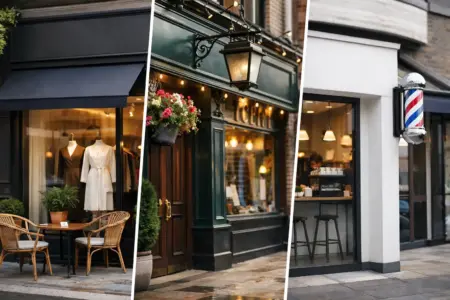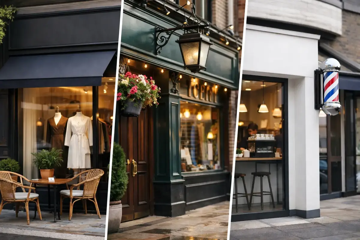
A customer can decide whether to step inside within seconds of reaching your premises. The best shop front signage examples do more than display a name: they make the business easy to find, explain what it offers and look right for the location. For a high-street retailer, café, salon or trade counter, the right sign needs to work through rain, fading daylight and a quick glance from the pavement.
The most effective choice depends on your frontage, planning position, opening hours and brand. A simple cut vinyl logo can be exactly right for one business, while another needs illuminated lettering that remains clear after dark. These practical examples show how different sign types can be used well.
Shop front signage examples by business type
1. Printed aluminium composite panel for a busy retailer
A full-colour printed aluminium composite panel is a dependable option for convenience stores, independent retailers and service businesses. It provides a solid, clean sign face with room for a logo, trading name, key services and opening information.
Keep the main name large enough to read from across the road. Use secondary text for details such as alterations, repairs or specialist stock, rather than trying to make every message equally prominent. Aluminium composite is particularly useful where a flat fascia is already in place and a durable outdoor finish is needed.
2. Raised letters for a professional office or salon
Individual raised letters give a smart, uncluttered appearance. They suit estate agents, accountants, clinics, beauty salons and businesses where the frontage needs to feel considered without becoming overly decorative.
This approach works best when the logo and name are short. Letters can be cut from acrylic, metal-effect materials or other rigid substrates, then fixed directly to the fascia or wall. The trade-off is that raised lettering is less suited to detailed lists of services, so pair it with window graphics if customers need more information before entering.
3. Illuminated lettering for late opening venues
Restaurants, takeaways, bars, gyms and convenience stores often need visibility after daylight fades. Illuminated letters or a sign tray with internal lighting make the business name clear at the times when passing trade matters most.
Good illumination is about legibility, not simply brightness. Choose high contrast between the lettering and background, avoid very thin typefaces, and make sure the sign remains readable from the opposite side of the road. Check landlord requirements and local planning rules before committing to illuminated signage, as consent may be required.
4. Projecting sign for a narrow high street
A projecting sign sits perpendicular to the building, making it visible to people walking along the pavement rather than only those directly opposite the frontage. It is a strong choice for businesses on busy streets where neighbouring shop signs compete for attention.
A double-sided printed panel, hanging sign or shaped sign can all work well. Use a simple logo, icon or short name on both sides. A projecting sign is not the place for a paragraph of text, but it can help customers spot your entrance before they pass it.
5. Frosted window vinyl for privacy with branding
Clinics, salons, offices and treatment rooms often need privacy without blocking natural light. Frosted window vinyl can cover the lower section of glazing, include a cut logo or pattern, and leave the upper area open.
It gives the frontage a more finished look while reducing views into workspaces or waiting areas. Make sure any business name or contact detail remains clear against the frosted finish. If you need maximum visibility, combine frosted vinyl with bold coloured lettering on an adjacent window panel.
6. Full-colour window graphics for offers and services
Window graphics are one of the most flexible shop front signage examples because they can be changed without replacing the whole fascia. They are useful for promoting seasonal ranges, opening offers, menu highlights, finance options or key services.
For a retailer, a large graphic showing a clear product category can quickly tell passers-by what is sold inside. For a trade supplier, it might list essential services such as key cutting, tool repairs or timber collection. Avoid covering every pane with competing messages. Leave some clear glass where possible so the premises still feel open.
7. Cut vinyl lettering for a clean, low-cost frontage
Cut vinyl lettering is a practical choice for shop windows, doors and small fascia panels. It is well suited to opening hours, telephone numbers, website addresses, social media names, service lists and simple logos.
This is often the right solution for a new business working to a tight budget, or for a tenant that cannot make permanent changes to the building. Choose a colour that contrasts strongly with the glass or background. White lettering can look sharp on dark interiors, while darker vinyl is often easier to read on light or reflective windows.
8. Sign tray for large, modern fascias
A folded sign tray creates a deeper, more substantial frontage than a flat panel. It is commonly used on wider retail units, workshops, trade counters and industrial premises where the sign needs to cover a sizeable fascia area.
The tray can be printed directly, fitted with raised lettering or combined with illumination. Its clean edges make it suitable for bold branding and large logos. Measure the available fascia carefully, including any gutters, shutters, lights or fixings that could affect the finished size.
9. Traditional hanging sign for cafés and pubs
A hanging sign can give an independent café, bakery, pub or boutique a more traditional street presence. Timber-effect panels, shaped boards and simple painted-style graphics can all suit heritage locations and older buildings.
The design should still be easy to read at a distance. A recognisable symbol, such as a coffee cup, loaf or simple monogram, can work better than a long business name. In conservation areas, material, size and placement may be restricted, so confirm what is permitted before production.
10. Branded entrance door graphics
The entrance door is often overlooked, yet it is the last sign a customer sees before coming in. A door graphic can carry the logo, opening hours, payment information, accessibility notices or a simple welcome message.
For businesses with shared entrances, door signage also prevents confusion and reduces interruptions. Keep mandatory information separate from marketing copy, and ensure safety markings on glazed doors remain visible. A tidy, consistent door graphic makes even a modest frontage feel more organised.
11. Pavement sign to support the permanent fascia
A pavement sign is not a replacement for a shop sign, but it can draw attention to a business that sits back from the road or has a partially hidden entrance. Cafés can display the day’s menu, salons can promote available appointments, and retailers can highlight a limited offer.
Use a weighted or water-based sign suitable for outdoor conditions, and position it without obstructing pedestrians, prams or wheelchair users. The message should be changed often enough to stay useful. A faded poster from three months ago can undermine an otherwise professional frontage.
12. Temporary banner for opening days and promotions
When a business is opening, relocating or running a short campaign, a printed banner offers fast, high-impact visibility. It can announce an opening date, promote a launch offer or direct customers to a temporary entrance.
Banners are best used for a clear, time-sensitive message. Include one main action, such as Open Now, Sale Ends Sunday or Entrance Round the Side. Use reinforced eyelets and suitable fixings for outdoor use, and remove the banner once the promotion has ended rather than allowing it to become part of the permanent frontage.
Choosing the right material and finish
Your sign material should match where and how it will be used. Aluminium composite is a reliable choice for permanent exterior panels because it is rigid and weather-resistant. Foamex can suit shorter-term displays or sheltered locations, while acrylic lettering gives a more premium raised finish. Printed vinyl is particularly useful for glazing, doors and smooth panels where detailed graphics are required.
Think about viewing distance before finalising artwork. A fascia seen from a passing car needs larger text than a window message aimed at pedestrians. In most cases, the business name and logo should do the first job, with services, telephone numbers and promotions kept secondary.
Colour choice also affects performance. Brand colours matter, but contrast matters more when readability is the priority. Dark lettering on a pale background, or pale lettering on a dark background, is usually easier to see than colours with a similar tone. If your logo has intricate details, simplify it for the sign rather than shrinking it until it disappears.
Get the artwork and fitting details right
Before ordering, measure the available area twice and take a straight-on photograph of the frontage. Note brickwork, window frames, shutters, cables, lights and existing holes. These details help determine whether a panel, tray, lettering or window graphic will fit properly.
If your artwork is ready, upload the highest-quality version available, ideally in a print-ready format. If it is not, start with the essentials: your logo, exact wording, preferred colours, sign dimensions and a clear photograph of the premises. The SignBuilder can help turn these requirements into a practical production-ready sign.
A good shop sign should make your premises recognisable before customers have to search for it. Choose the format that suits the building, keep the message focused, and give the main name enough space to do its job.