A driver should be able to identify your premises before they have to slow down, turn around or call for directions. Site entrance signage does that practical job while also setting the standard for how visitors, deliveries, staff and contractors experience the site. If the sign is difficult to read, poorly positioned or missing key information, the entrance quickly becomes a bottleneck.
For a trade yard, industrial unit, school, retail park, office or event venue, the right entrance sign needs to work in real conditions. That means changing light, passing traffic, wet weather, large vehicles and people arriving for the first time. A clear sign can reduce confusion, support site safety and make the business look properly organised from the kerbside.
Start with what people need to know
The most effective site entrance signage is built around the decision a person needs to make at that exact point. They may need to confirm they are in the right place, find the visitor parking area, follow a delivery route or report to reception. Trying to include every detail on one panel usually makes the important message harder to see.
Start with the site or business name, then add the information that directs the next action. For example, a main entrance sign may show the company name, unit number, reception arrow and opening hours. A yard entrance may need separate instructions for deliveries, lorries, pedestrian access and site speed limits.
Use familiar wording and keep it short. “Visitors report to reception” is quicker to process than a longer policy statement. If the site has several occupiers, make the hierarchy clear: name the building or estate first where appropriate, then give each business enough space to be found easily.
Make the sign readable before people reach it
A sign can be technically correct and still fail because its text is too small. Viewing distance should drive the size of the panel, lettering and symbols. A sign intended for drivers on a busy road needs larger lettering and fewer words than one placed beside a pedestrian gate.
Think about approach speed as well as distance. Someone walking from a car park has time to read more detail. A driver approaching a junction does not. Keep the largest text for the business name, entrance direction or essential instruction, with secondary details such as telephone numbers and opening times below it.
Contrast is equally important. Dark text on a pale background, or pale text on a dark background, is generally easier to read than colours with a similar tone. Brand colours should be used, but not at the expense of legibility. A logo that looks sharp on a screen may need a simplified layout when reproduced at entrance-sign scale.
Where directions matter, arrows and recognised symbols help people understand the message more quickly. They are particularly useful on multi-occupancy sites, distribution yards and public venues where visitors may not share the same first language.
Choose materials for the location
There is no single best material for every entrance. The right choice depends on the location, expected lifespan, mounting method, budget and how often the information is likely to change.
Rigid aluminium composite signs are a practical option for many permanent outdoor installations. They provide a clean, professional finish and are suited to printed branding, directional information and safety messages. Foamex can be a cost-effective choice for sheltered or shorter-term use, while corrugated plastic is useful where a lightweight temporary sign is needed.
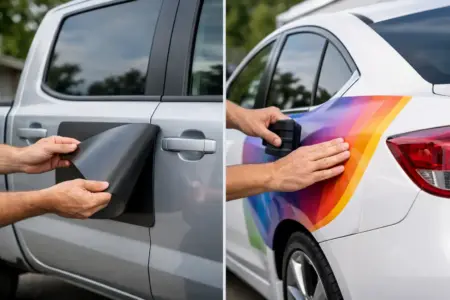
For signs fixed to walls, gates, fencing or existing boards, printed vinyl can provide a neat solution. Vinyl lettering is particularly useful where you want names, directions or operating information applied directly to a smooth surface. It can look less intrusive than a full panel, although it relies on a clean, suitable substrate and may not be the best choice for heavily textured or damaged surfaces.
Freestanding signs are often needed where there is no suitable wall or fence at the entrance. A post-mounted sign, pavement sign or weighted display can direct visitors at the point they need it. Consider wind exposure, ground conditions and vehicle movements before selecting one. A sign that is easy to move may be useful for events, but it is not the right answer for a permanent roadside entrance.
Separate welcome, direction and safety messages
One oversized sign full of mixed messages is rarely the best solution. A clearer approach is to create a small sign system, with each panel doing one job. The entrance identification sign confirms the location. A directional sign shows where to go next. Safety signs give instructions at the point where those instructions apply.
This approach is especially useful on active commercial sites. A visitor may need to follow one route, while delivery drivers need another. Pedestrians should not be expected to interpret vehicle movement instructions, and drivers should not have to search through a long list of visitor rules before finding the delivery bay.
Place mandatory safety notices where they can be seen before someone enters the relevant area. Depending on the site, this could include PPE requirements, speed limits, restricted access, no smoking rules, CCTV notices or a requirement to report to the office. Standard safety symbols can support quick recognition, but the wording must remain specific enough to be useful.
Positioning is part of the design
Even the best printed sign will not perform if a hedge, parked van, open gate or street furniture hides it. Walk or drive the route as a first-time visitor would. Check the view from both directions, particularly if the entrance is close to a roundabout, junction or shared access road.
Mount the sign high enough to remain visible over parked cars, but not so high that smaller lettering becomes difficult to read. Avoid placing key information behind a gate that may be left open. If people tend to stop before the entrance to check where they are, put the main identification sign before the turning point rather than inside the site.
Lighting also needs consideration. A sign that reads well in daylight may disappear at dusk. Reflective materials, external lighting or a carefully positioned illuminated sign may be appropriate where arrivals take place early in the morning, late at night or throughout winter. The extra cost is worthwhile only if the site genuinely needs round-the-clock visibility.
Keep branding consistent without crowding the sign
Your entrance is one of the few places where customers, suppliers and prospective staff see the business before they meet anyone. A consistent logo, colour palette and typeface can make the premises easier to recognise and help the operation look established.
Consistency should extend to car park signs, reception graphics, vehicle graphics and branded workwear where relevant. However, entrance signage is not a brochure. Prioritise the information people need to act on, then use branding to support it. A clear name and well-presented logo will usually do more than a panel crowded with service lists, social media details and promotional messages.
If you operate from a shared building or rented unit, check any landlord, estate management or planning requirements before ordering. There may be rules on panel sizes, locations, colours, illumination or signs facing a public highway. Planning consent may be required for certain external signs, particularly illuminated displays or larger roadside installations. It is better to confirm this early than replace a finished sign later.
Prepare artwork that prints cleanly
Good source artwork saves time and prevents disappointing results. Supply logos as high-resolution files wherever possible, and avoid screenshots, copied web images or small files enlarged beyond their intended use. Vector artwork is ideal for logos and lettering because it stays sharp at different sizes.
Before production, check every practical detail: unit numbers, postcodes, phone numbers, arrows, opening hours and spelling. Ask someone unfamiliar with the site to read the layout. If they cannot tell where to go within a few seconds, simplify it.
If you do not have finished artwork, the important information is still enough to begin. Provide your logo, required wording, preferred colours, sign size and a photo of the intended location. The SignBuilder can help prepare a design that is suitable for the product and the way it will be used.
Order for the job, not just the first day
A temporary event entrance, a construction project and a permanent business park require different levels of durability. Consider how long the sign needs to last, whether details will change, how it will be fixed and whether you need matching panels elsewhere on site. Ordering a coordinated set at the outset is often more efficient than adding mismatched signs as problems arise.
A well-planned entrance sign does more than display a name. It helps the right people arrive at the right place, reduces avoidable interruptions and gives your site a more professional working face from the moment someone turns in.