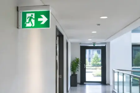
A visitor should not need to stop at every junction, call reception or follow another vehicle to find the right entrance. Effective directional signage systems give people the information they need at the point they need it, whether they are walking through a reception area, driving around an industrial estate or arriving at a temporary event.
For businesses, clear direction signs do more than prevent confusion. They reduce interruptions for staff, make sites feel organised and help visitors, deliveries and contractors move safely. The right system is rarely one large sign at the gate. It is a connected set of signs that starts before the decision point and continues until someone has reached the correct door, bay, department or parking area.
Start with the routes people actually take
The best place to begin is not with sign sizes or colours. Start by looking at the journey from the visitor’s point of view. Where do people enter the site? Which turns create hesitation? Where do pedestrians and vehicles cross? What destinations are regularly requested at reception?
A small business premises may only need signs for customer parking, reception and collections. A larger site might need separate routes for staff, visitors, HGVs, suppliers, accessible access, welfare facilities and emergency assembly points. Each route has different priorities, so trying to direct everybody with one sign often creates more clutter than clarity.
Walk the route in the same conditions your users will experience. Check it from a car, on foot and, where relevant, from a delivery vehicle. A sign that looks clear when standing directly beneath it may be missed from a vehicle approach. Similarly, a sign placed at the entrance to a corridor is too late if the decision to turn needed to be made several metres earlier.
Make a simple list of destinations, then put them in order of importance. This gives every sign a job. If a destination is not relevant at a particular junction, leave it off rather than adding more text.
What makes directional signage systems easy to follow?
Consistency is what turns individual boards into a useful wayfinding system. Use the same destination names throughout the site. If the first sign says “Goods In”, do not call the same place “Deliveries” on the next one unless both terms are deliberately shown together. Familiar wording helps drivers and visitors act quickly without second guessing their route.
Arrows also need a consistent approach. Keep their position, style and direction clear, particularly on signs viewed from a moving vehicle. Avoid placing a left arrow at the far right of a crowded layout or mixing arrow styles across the site. The reader should recognise the direction before they have read every word.
Text needs enough contrast against its background to be seen in changing light. Dark text on a light background, or light text on a dark background, will usually give a cleaner result than similar shades. Brand colours can work well, but they should not reduce legibility. A pale logo colour may look good on a screen while becoming difficult to read outdoors or at distance.
Type size depends on viewing distance and speed. A pedestrian can read more detail than a driver, while a sign at a roundabout needs short wording and larger lettering. This is one of the main trade-offs in sign planning: more information feels helpful, but too much information cannot be read in time. For vehicle routes, keep the message brief and use a sequence of signs instead of one overloaded board.
Choose signs for the location and job
Different areas call for different sign formats. At the entrance, a large site map or directory can explain the overall layout, but it should be supported by follow-on signs at every key turn. A map alone assumes people will remember the route, which is not realistic on an unfamiliar or busy site.
Wall-mounted rigid signs are a practical choice for buildings, corridors, gates and fixed outdoor locations. They can identify departments, entrances, toilets, meeting rooms and collection points without taking up ground space. Where there is no suitable wall, freestanding signs can direct traffic through car parks, along driveways or across open event areas.
Vinyl lettering is useful for glass doors, internal walls and smooth surfaces where a full panel is unnecessary. It can clearly identify reception, staff-only areas, exits or queue routes while keeping the space tidy. Floor graphics can also support short pedestrian routes, although they need careful material selection and placement for the surface and level of foot traffic.
For temporary works, open days or seasonal events, banners and portable displays can provide quick direction at entrances and high-footfall areas. They are useful where routes change, but they should not be treated as a substitute for permanent signs where a route is used every day. Outdoor temporary signage must also be fixed securely and positioned so it does not create an obstruction.
Vehicle direction needs particular care. Use clear route signs to separate cars, vans, lorries and pedestrians where possible. Signs for speed limits, one-way systems, height restrictions and loading areas may need to sit alongside directional messages, but do not bury a key safety instruction in a general destination board. Give critical information its own space and make it easy to spot.
Plan the sign sequence, not just individual boards
A good sign answers one question at a time: where do I go now? The next sign confirms the choice and presents the next decision. This reassurance is especially useful on hospital, school, warehouse, business park and event sites where people may be unfamiliar with the layout.
Think of the route in stages. The first sign confirms arrival and directs people to the correct entrance. The next sign separates visitor, staff and delivery traffic. Further signs identify parking, reception, loading bays or named units. At the destination, an identification sign tells the visitor they have arrived.
This sequence prevents a common problem: signs that direct people towards a place but never confirm they have found it. Without a clear destination marker, visitors continue looking, turn around or park in the wrong area.
Sign height and positioning matter as much as the printed design. Keep signs out of sightline obstructions such as parked vehicles, open gates, planting and stacked stock. Consider seasonal changes too. A sign that is visible in winter may be hidden by summer growth. On shared routes, avoid placing boards where pedestrians must step into a carriageway to read them.
Build in flexibility without losing control
Businesses change. Departments move, tenants change, collections expand and temporary projects affect traffic flow. A fully fixed system can look smart at installation but become expensive to update if every amendment requires a replacement board.
Where change is likely, allow for updateable elements. A main directory may use a permanent header with replaceable destination panels. Internal door signs can follow a standard size and layout so they are easy to reorder when rooms change use. For multi-unit sites, a consistent template keeps every new sign aligned with the rest of the system.
That said, flexibility should not mean a patchwork of different materials, colours and handwritten notices. Temporary changes need a clear process and a planned end date. Once a diversion or event route has finished, remove the signs promptly. Outdated directions make people doubt the signs that remain.
Get artwork and production details right first time
Directional signs are working products, not just branded graphics. Before ordering, check destination wording, arrow direction, quantities, dimensions, fixings and installation locations. A reversed arrow or missed junction sign can affect the entire route.
If you have a site plan, mark each sign location with a reference number. This makes it easier to match artwork, proofing, delivery and installation. It also gives you a useful record for future replacements or additions. For signs that must match existing branding, provide the correct logo files, brand colours and typeface details where available.
Material choice depends on whether signs are indoors, outdoors, temporary, fixed to a wall or mounted independently. Consider weather exposure, cleaning requirements, expected lifespan and the surface available for fitting. The lowest-cost option is not always the best value if it needs replacing early or cannot be read in the conditions where it will be used.
If you are unsure how to turn a rough route plan into finished artwork, use the information you already have: destination names, arrows, sign sizes, photos of locations and any existing brand material. The SignBuilder can work from supplied artwork, online designs or a design brief, helping you move from a list of requirements to production-ready signs.
Clear direction is a practical part of running a professional site. Start with the journeys that cause the most questions, make every instruction easy to read, and build a system that still makes sense when somebody arrives for the first time.