A crowded entrance, a busy shop aisle or a shared warehouse walkway can create uncertainty quickly. Floor stickers put clear information where people naturally look as they move, queue, browse and work. Used well, they can guide visitors, reinforce site rules, highlight an offer or separate pedestrian routes without adding another freestanding sign to the space.
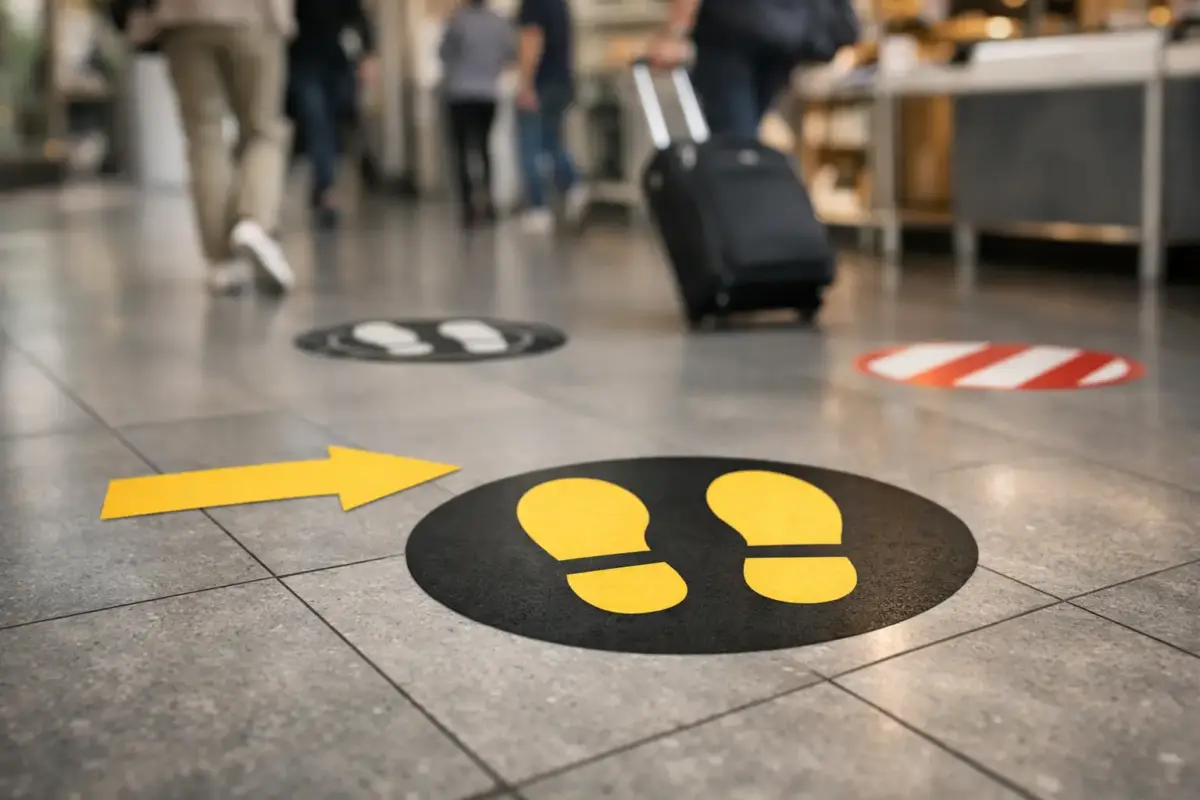
For businesses, venues and site managers, the value is practical. A floor graphic can answer a question before someone needs to ask it: where to stand, which way to go, where an item is located or which route is for staff only. The result is a tidier customer journey and clearer communication in areas where wall space may be limited.
Where floor stickers make the most difference
Floor stickers are most effective at decision points. These are the places where people stop, turn, join a queue or need to choose a route. Positioning matters as much as the message itself. A well-designed marker placed too far from the relevant doorway, till or junction will be overlooked.
In retail settings, floor graphics can lead shoppers towards a promotion, collection point, changing room or checkout. They are particularly useful for short-term campaigns because they create a visible prompt without requiring permanent alterations to fixtures or walls. A simple directional arrow with a brief message often works better than a detailed design that needs several seconds to read.
Hospitality venues can use them to organise queues, direct guests to reception, identify collection points or keep access routes clear. In schools, community centres and event spaces, they can help visitors find registration desks, halls, toilets and exits during busy periods. For exhibitions and temporary events, a branded route from the entrance to a stand can be a straightforward way to draw attention across a larger venue.
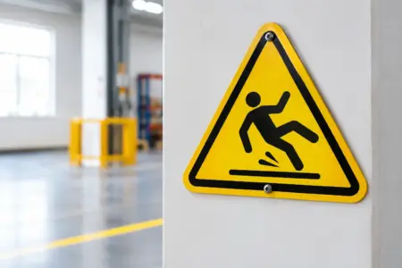
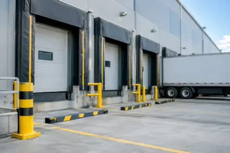
On commercial and industrial sites, the priority is usually safety and movement. Floor stickers can help indicate pedestrian walkways, crossing points, equipment areas, storage bays and restricted zones. They should support a wider site signage plan rather than replace necessary safety notices, line marking or controls. If a hazard needs a durable, permanent solution, assess the environment first and choose a product suited to the traffic and cleaning conditions.
Choosing floor stickers for the surface and traffic
Not every floor is the same. A smooth indoor tile floor, sealed concrete entrance and textured warehouse surface each need different consideration. The best result comes from matching the material, adhesive and finish to the application before placing an order.
Start with the surface. It should be clean, dry and sound, with no loose coating, dust, oil or moisture that could affect adhesion. Vinyl graphics generally perform best on smooth, sealed surfaces. Deeply textured, uneven or damaged flooring may reduce contact with the adhesive, leaving edges more vulnerable to lifting. If there is any doubt, test a small area or ask for advice before committing to a larger run.
Then consider footfall. A small marker in a quiet office corridor has a very different job from a graphic at a supermarket entrance or a busy distribution site. High-traffic areas need a hard-wearing, slip-conscious finish and regular inspection. Wheeled traffic also changes the specification. Trolleys, pallet trucks and cleaning machinery can place more strain on a floor graphic than ordinary shoes, so it is worth being clear about the intended use from the outset.
Cleaning is another practical factor. Frequent mopping, strong chemicals and abrasive cleaning tools can shorten the life of a sticker. Speak with the person responsible for cleaning before installation, especially in food service, healthcare, leisure and public-facing premises. A floor graphic may still be the right choice, but its expected lifespan and maintenance plan should reflect the real conditions.
Temporary campaign or long-term wayfinding?
Temporary floor stickers are ideal for seasonal promotions, open days, sales events, queue systems and one-off directions. They are quick to introduce and easy to refresh when the message changes. This gives retailers and event organisers flexibility without producing more permanent signs than they need.
Longer-term wayfinding needs more planning. The design should remain useful beyond a single campaign, and the finish must suit regular traffic. Consider whether the wording, colours and route layout will still make sense if furniture moves, stock locations change or visitor flows increase. A simple, consistent system is easier to update than a set of unrelated graphics added over time.
Designing floor stickers people can read at a glance
The floor is not the place for small print. People are walking, carrying items, checking their phones or looking ahead. Your message must be clear in a brief glance from a standing position.
Keep the main instruction short. “Queue Here”, “Collect Orders”, “Reception”, “Keep Clear” and “This Way” are all direct examples. Pairing concise wording with a familiar symbol or arrow improves recognition, particularly in spaces used by the public, visitors or staff who may not know the layout.
Colour should create contrast with the floor beneath it. A pale design can disappear against light tiles, while a dark graphic may be lost on charcoal entrance matting or concrete. Brand colours can be included, but readability needs to come first. If the sticker is primarily for safety or direction, prioritise strong contrast and clear visual hierarchy over a heavily branded layout.
Use a sensible size for the viewing distance and the amount of information required. Small round markers can work for queue positions, while larger rectangular graphics suit directional instructions or promotional messaging. Avoid making the design large simply for the sake of it. An oversized graphic in a narrow walkway can look untidy, and too many stickers in one area can create visual clutter.
For brand consistency, use the same typefaces, colours and wording conventions across floor graphics, wall signs, window stickers, counter signs and staff clothing. Customers should not have to work out whether each sign belongs to the same journey. Consistent visual cues make a site easier to navigate and present a more professional operation.
Installing floor stickers properly
Good installation starts before the backing paper is removed. Check that the floor is suitable, then clean it thoroughly using a method that removes grease and residue. Allow the surface to dry completely. Applying graphics over damp flooring or fresh cleaning solution is likely to affect adhesion.
Plan the position using masking tape or a loose placement check first. Stand back and view it from the direction people will approach. Confirm that doors, displays, queue barriers or furniture will not cover the message. For directional floor stickers, make sure the arrow points towards the actual next step, not simply in the general direction.
Apply the graphic steadily from one edge, smoothing it down as you go to reduce air bubbles. Take particular care around the edges, as these are most exposed to wear. Once installed, allow the adhesive to settle according to the product guidance before opening the area to heavy traffic where possible.
It is worth checking newly fitted stickers after the first day of use. This gives you an early opportunity to identify lifting edges, poor placement or a message that is being ignored. A quick adjustment is far easier than leaving a poorly positioned graphic in place for weeks.
Maintaining a clear, professional finish
Floor graphics are working products, not fit-and-forget items. Inspect them as part of normal site checks, particularly at entrances, queue areas and safety-critical locations. Look for scuffing, fading, dirt build-up and lifted edges. Replace damaged stickers promptly, as worn graphics can be harder to read and can make an otherwise well-kept premises look neglected.
Keep cleaning practical. Use the cleaning method recommended for the material, avoid abrasive tools where possible and do not allow water to sit at the edges. If the area receives exceptional wear, plan for replacement rather than expecting a temporary promotional graphic to perform indefinitely.
When ordering custom floor stickers, have the essentials ready: your finished artwork or logo, the required size, quantity, intended surface and whether the use is temporary or ongoing. If you are unsure about the design, a simple brief stating the message, location and purpose is enough to get the process moving. The SignBuilder can support different ordering routes, whether you want to design online, upload your own artwork or request help with a layout.
The most useful floor sticker is rarely the busiest-looking one. Put a clear message in the right place, choose a material that suits the site, and review it as conditions change. That small piece of practical signage can keep people moving in the right direction every day.