A safety sign only does its job when somebody can see it, understand it and act on it before a hazard becomes an incident. On a busy site, in a workshop, shop floor, kitchen or shared car park, safety signs need to cut through movement, noise, poor weather and familiar routines. A faded notice on the wrong wall is not a safety measure.
The right signage helps people make safe decisions without stopping to ask for directions. It supports staff, contractors, visitors and delivery drivers, particularly where they may be unfamiliar with the premises. The practical question is not simply, “Do we have a sign?” It is whether the sign is clear at the point where the decision has to be made.
What safety signs are designed to do
Safety signs communicate a specific instruction, warning, restriction or route to safety. In the UK, they are commonly used to support risk controls under the Health and Safety (Safety Signs and Signals) Regulations 1996. They are not a substitute for removing or controlling a hazard, but they are valuable where a remaining risk needs to be clearly communicated.
For example, a warning sign can alert people to a slippery surface, but it does not remove the need to clean up a spill. A mandatory sign can require eye protection in a work area, but the employer still needs to provide suitable equipment and make sure it is used. Good signage works alongside training, supervision, physical controls and sensible site procedures.
Most workplace safety signs fall into four familiar groups:
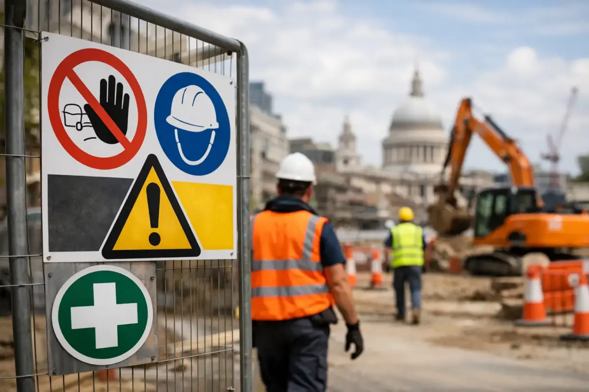
- Prohibition signs use a red circle and diagonal bar to show something is not allowed, such as No Smoking or No Unauthorised Access.
- Mandatory signs are blue and give an instruction, such as Wear Eye Protection or Keep Fire Door Shut.
- Warning signs are yellow triangles that highlight a hazard, including Fork Lift Lorries, High Voltage and Slippery Surface.
- Safe condition and fire equipment signs are generally green or red. They identify emergency exits, first aid points, fire extinguishers and fire alarm call points.
Using recognised symbols, including ISO 7010-style pictograms where appropriate, makes signs quicker to understand across mixed workforces and visitor groups. Words can add useful detail, but a well-known symbol should do the main visual work.
Start with the route people actually take
The best place to plan safety signs is not behind a desk. Walk the site as a visitor, a new starter or a delivery driver would. Look at entrances, pedestrian routes, vehicle areas, stairwells, machinery zones, storage spaces, welfare facilities and fire exit routes.
At each point, ask what someone needs to know before moving forward. A warehouse entrance may need a high-visibility clothing instruction before a pedestrian enters. A loading area may need separate vehicle and pedestrian direction signs. A cleaning cupboard may need chemical hazard information and restricted-access signage. The answer will vary with the activity, layout and risk assessment.
Positioning matters as much as the message. A sign should be visible before the hazard or decision point, not directly beside it when it is too late to respond. Mount it at a sensible viewing height and keep it free from shelving, open doors, stock cages, foliage and temporary displays. In vehicle areas, consider the driver’s line of sight as well as pedestrians approaching on foot.
Avoid creating a wall of notices. Too many messages in one place make each one easier to ignore. If an entrance has ten signs competing for attention, separate the essential safety instruction from general information and place each message where it is needed.
Choosing materials for real working conditions
A safety message can be correct and still fail because the material is unsuitable. Indoor signs in a clean office corridor have different demands from signs at a farm gate, construction entrance or external plant area.
For long-term outdoor use, rigid plastic signs are a practical choice. They are lightweight, weather-resistant and suitable for walls, fencing and gates. Aluminium composite signs offer a more rigid option for exposed locations, repeated handling or installations where a substantial panel is preferred. Where the sign needs to be fixed to uneven surfaces or frequently moved, the mounting method should be considered before ordering.
Self-adhesive vinyl safety labels work well on smooth, clean surfaces such as machinery guards, internal doors, cabinets and equipment. They are useful when space is limited, but they need a properly prepared surface to stay in place. Dust, oil, damp and textured finishes can all affect adhesion.
Temporary risks need temporary signage that is still clear and stable. Freestanding signs can be useful for wet floors, cleaning work, short-term access restrictions and event set-up. For outdoor temporary notices, choose a format that will not blow over or become obscured. A sign that is only present for half the task is unlikely to protect anyone.
Size should be based on viewing distance, not what happens to fit in an available space. A small door sign may be perfectly suitable at arm’s length. A warning at the entrance to a yard, car park or loading area needs to be large enough to read from further away. If people are moving quickly, carrying materials or driving, increase the sign size and simplify the message.
Make the message specific without overcomplicating it
Ready-made safety signs cover many standard workplace requirements, from Fire Exit and First Aid to Beware of the Dog and CCTV in Operation. They are quick to order and often the best option where the recognised wording and symbol are already established.
Custom safety signs are useful when a standard message does not reflect the actual risk or site rule. This could include a named muster point, a one-way system, a particular delivery instruction or a restricted area that applies only during certain operating hours. The goal is clarity, not clever wording.
Keep the main instruction short. “Pedestrians Use Marked Walkway” is clearer than a long paragraph explaining the risks of vehicle movement. If further information is genuinely needed, place it below the key symbol and instruction in a clear hierarchy. Use a readable typeface, adequate contrast and enough empty space around the message.
It is also worth checking that the language is appropriate for everyone using the site. Symbols help, but where there are workers or visitors with limited English, translated supporting text or additional visual direction may be needed. The same applies to signs designed for people with reduced vision or where lighting is poor.
Check safety signs as part of routine site maintenance
Safety signage needs inspection, especially in active environments. Sunlight can fade colours, rain can affect poorly fixed panels, and day-to-day knocks can crack, bend or dislodge signs. Internal labels can become covered by stock, residue or equipment changes.
Build a simple sign check into regular workplace inspections. Look for damaged panels, missing signs, out-of-date instructions, blocked fire action notices and changes to the layout that make a sign irrelevant. A new partition wall, relocated machine or altered traffic route can leave an existing sign pointing to the wrong place.
Review signage after an incident, near miss or process change. If somebody entered the wrong area, did not wear the required protection or could not find an emergency route, the issue may be training or supervision, but the sign location and wording should be checked as well. The people who work in the area every day often know which notices get missed.
Ordering safety signs without slowing the job down
Before placing an order, confirm the message, quantity, material, size and fixing location. Taking a quick photograph of the installation area can help prevent choosing a sign that is too small or unsuitable for the surface. For multiple locations, create a simple schedule showing each sign, its position and how many are required.
For standard requirements, selecting a ready-made product keeps ordering straightforward. Where site-specific details are needed, use a design tool, upload print-ready artwork or request artwork support. Keep logos, contact details and non-essential information away from the main safety instruction, particularly where the sign will be read at a distance.
The SignBuilder can produce standard and custom signage in formats suited to everyday business premises, sites and vehicles. The most effective order is the one based on a clear check of the risk, the viewing distance and the conditions the sign will face.
A good safety sign should feel almost unremarkable: visible when it is needed, easy to understand and durable enough to remain useful. Put it where the choice is made, keep the message direct, and review it whenever the way people use the space changes.