A red sign on a wall, gate or piece of equipment is not simply there to attract attention. The question, “what is a red health and safety sign?”, has two common answers in a UK workplace: it may prohibit an action that could cause harm, or it may identify fire-fighting equipment. The symbol, shape and position tell people which meaning applies.
Getting this right matters on busy sites. A clear sign can stop someone smoking near flammable materials, prevent unauthorised access or help staff and visitors locate a fire extinguisher without delay. A vague, faded or incorrectly coloured sign can do the opposite.
What is a red health and safety sign in practice?
Red is a recognised safety colour, but it is not used for every kind of safety instruction. In most cases, red health and safety signs fall into one of two categories: prohibition signs and fire equipment signs.
A prohibition sign tells people not to do something. It is normally round, with a black pictogram on a white background, a red border and a red diagonal bar running from top left to bottom right. Common examples include No Smoking, No Entry, No Pedestrians, Do Not Use Mobile Phones and No Unauthorised Access.
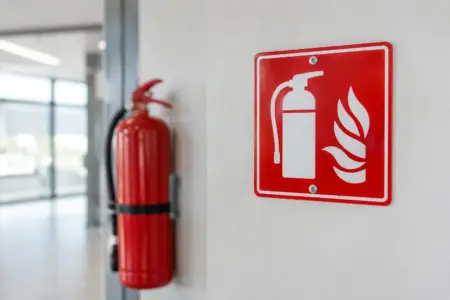
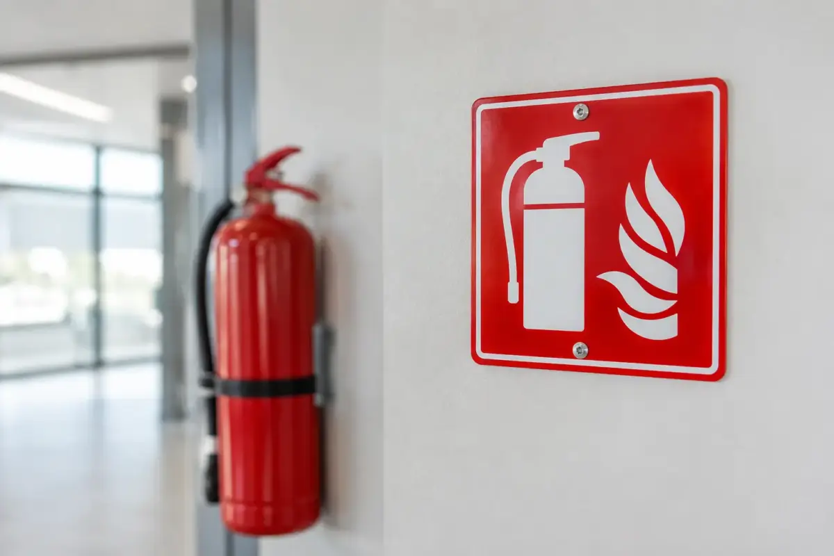
A fire equipment sign identifies the location of equipment used to tackle a fire. These signs are usually red and rectangular or square, with a white pictogram or wording. You may see them above or beside fire extinguishers, fire hose reels, fire alarm call points, fire blankets and fire telephones.
The difference is straightforward once you know what to look for. A red circle with a diagonal line means “do not”. A red rectangular sign with a white fire-related symbol means “fire equipment is here”. Colour alone is not enough to interpret the message.
Why red is used for safety signs
Safety signs need to work quickly, often at a distance and sometimes in poor conditions. Red has strong visual impact and has long been associated with stopping, danger and fire. Used consistently alongside recognised pictograms, it gives people a familiar visual cue before they have read a single word.
That consistency is particularly useful where staff, contractors, delivery drivers and visitors may have different levels of site knowledge. A standard No Smoking symbol is easier to understand at a glance than a text-only notice, especially in noisy environments or where English is not a person’s first language.
In the UK, workplace safety signage is commonly based on the Health and Safety (Safety Signs and Signals) Regulations 1996 and recognised sign standards such as BS EN ISO 7010. The practical aim is clear communication. Signs should use an appropriate safety colour, recognised symbol and enough contrast to be seen and understood.
Where red safety signs are most useful
Red signs are often needed where a prohibited activity could create a direct risk, or where fire equipment must be found immediately. Their location should follow the risk, not just the available wall space.
For example, a No Smoking sign belongs at entrances to fuel stores, gas cylinder cages, chemical storage areas and other locations where ignition is a concern. A No Entry sign may be required on electrical rooms, plant areas, construction zones or restricted service corridors. If access is limited to authorised staff, use wording or a pictogram that makes that restriction clear.
Fire equipment signs should be positioned so that they identify the equipment even when it is partly obscured by people, open doors or stored items. Placing a sign directly above an extinguisher is common, but a projecting or higher-level sign may be more effective in a warehouse, workshop or large public venue. It depends on the sightlines, ceiling height and how busy the area becomes.
Outdoor applications need extra consideration. A sign beside a loading bay, vehicle gate or external fuel tank must remain legible in rain, sunlight and changing temperatures. Select a material suited to the surface and exposure, then fix it securely. A sign that curls, fades or comes loose quickly is not a cost saving.
Prohibition signs: preventing unsafe actions
Prohibition signage is most effective when it supports a rule that people can reasonably follow. “No Entry” at a locked gate is clear. The same sign on an unmarked route used every day by contractors creates confusion and may be ignored.
Use the sign that matches the actual hazard. A No Smoking sign controls ignition sources but does not communicate a restricted area by itself. A No Naked Flames sign may be the better choice where smoking is not the only concern. In areas with moving vehicles, No Pedestrians can reinforce the need to use a separate marked walkway.
Avoid trying to make one sign do every job. Where several risks apply, a combination of well-positioned signs is usually clearer than a single crowded notice. You may need a prohibition sign at the entrance, a warning sign near the hazard and a mandatory instruction explaining the required protective equipment. Each colour and shape has a different purpose.
Fire equipment signs: helping people find what they need
During a fire, every second spent searching for equipment is time lost. Red fire equipment signs make extinguishers, alarms and other key items easier to identify, particularly in unfamiliar premises.
The sign must match what is actually in place. Do not fit a Fire Extinguisher sign where the extinguisher has been removed, or label a cabinet as a fire hose reel if it contains something else. Check signs as part of routine site inspections, especially after a refurbishment, layout change or equipment replacement.
There is also a balance to strike. Too many signs clustered in one area can reduce visibility. If a wall holds several extinguishers, a clear main fire point sign may be more useful than competing messages, provided the equipment is correctly arranged and identifiable. In larger buildings, direction signs can help guide people towards a fire point where equipment is not visible from the approach.
Choosing the right material and format
The best red health and safety sign is one people can see, understand and rely on in its actual working environment. Start with the location. Indoor offices, retail spaces and communal areas may suit rigid plastic signs, self-adhesive vinyl or wall-mounted boards. Workshops, yards and building sites often need tougher rigid signs that stand up to knocks, dirt and weather.
Size should be based on viewing distance. A small sign may work on a cupboard door or beside a single extinguisher. It will not work at the end of a warehouse aisle or across a vehicle yard. If the message must be read from further away, increase the sign size rather than relying on oversized wording.
Think about fixing too. Self-adhesive signs are useful on clean, smooth surfaces, but may not hold well on dusty blockwork, textured cladding or surfaces exposed to moisture. Pre-drilled rigid signs can be a better option for fences, gates and exterior walls. Magnetic signs can be useful on suitable metal surfaces where the message needs to move with equipment, but they should not be treated as a permanent substitute where a fixed sign is required.
For sites with particular wording, branding or layout needs, a custom sign can make the instruction more relevant. Keep the recognised pictogram prominent and make additional text short. “No Entry – Authorised Maintenance Staff Only” is clearer than a paragraph explaining site rules.
Common mistakes that weaken a red sign
The most frequent problem is using the wrong sign type. A red warning-style notice may look serious but fail to communicate a recognised instruction. Red is not the standard colour for warning signs about hazards such as forklifts, high voltage or slippery surfaces. Those messages use different colours and shapes.
Poor placement is another issue. Signs hidden behind stacked stock, fitted too low, placed on opening doors or mounted where glare makes them difficult to read will not perform as intended. Check the view from the direction people approach, not just from directly in front of the sign.
Finally, do not let signage become background noise. Review it when the workplace changes, replace damaged items promptly and remove signs that no longer apply. Out-of-date notices undermine confidence in the signs that genuinely matter.
Make the message easy to act on
A red health and safety sign should give a quick, practical instruction: stop an unsafe action or show where fire equipment can be found. Choose the correct symbol, use a format that suits the environment and place it where people need the information. When a sign is clear at the point of decision, it does its job before an incident has the chance to develop.