A passer-by will not stop to decode a crowded sign. They need to see what you offer, where to go or what is changing in a matter of seconds. Freestanding pavement signs put that message at eye level, directly outside your premises or at the point where customers make a decision.
For shops, cafés, salons, pubs, trades counters, schools and event venues, they are one of the most practical ways to turn nearby footfall into enquiries and visits. The right sign is visible, stable and easy to update. The wrong one can be overlooked, damaged by poor weather or become an obstruction rather than a useful prompt.
Why freestanding pavement signs work
Fixed fascia signage identifies a building, but it does not always catch someone walking along the pavement. A freestanding sign sits closer to the customer journey. It can direct visitors through an entrance, advertise a daily offer, display opening information or make a temporary service change clear before somebody reaches the door.
This flexibility matters for businesses whose message changes regularly. A restaurant may need to promote lunch, then evening service. A retailer can call out a seasonal range or sale. A construction supplier can guide collection drivers and visitors to the correct entrance. At an event, the same format can point people towards registration, parking, toilets or a particular activity.
They also offer a sensible balance between visibility and cost. You can place them where the message has the best chance of being seen, then bring them in at closing time or move them for a one-off promotion. That is particularly useful where permanent external signage is limited by the site, landlord requirements or planning considerations.
Choose the sign format around the job
There is no single best pavement sign. The right choice depends on where it will stand, how often the graphic needs to change and the conditions it will face.
A-boards for everyday offers and directions
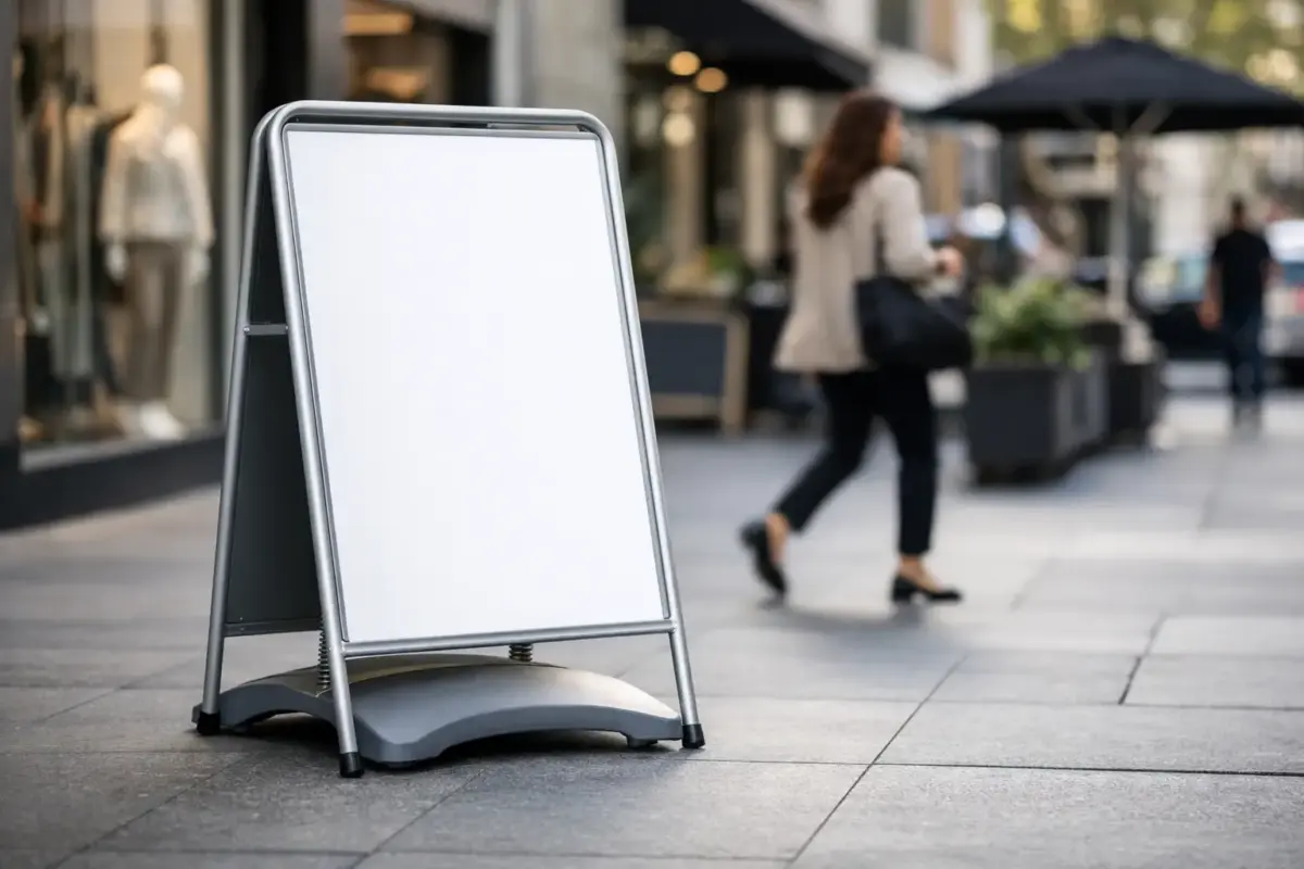
A-boards are familiar, quick to position and suitable for many customer-facing settings. Their two-sided format gives you visibility from both directions, which is useful on high streets, retail parks and pedestrian approaches. They work well for simple messages such as menus, appointments available, special offers, wayfinding and welcome notices.
A printed panel A-board is a good fit when the message will stay in place for a season or longer. If you need frequent changes, a chalkboard or poster-style option may be more practical. Think carefully about who will update it. Handwritten messaging has character, but only if it remains clear, tidy and readable in changing light.
Swing signs for exposed locations
Swing signs use a suspended panel within a sturdy frame. The panel moves in the breeze, which can catch attention without relying on flashing graphics or oversized wording. Their weighted base also makes them a practical option for windier positions, provided the model is suited to the conditions and positioned sensibly.
They are often chosen by hospitality venues, independent retailers and service businesses that need a permanent-looking sign which can still be taken in overnight. A double-sided printed panel provides a clean, consistent brand presentation from either direction.
Water-base signs for high-footfall areas
Water-base pavement signs have a wide fillable base and a tall graphic panel. They are designed for locations where stability is a priority, such as forecourts, outside retail units and busy approaches. The base provides weight without making the sign impossible to move when empty.
This style gives more room for a bold visual, a large logo or a short promotional message. It is less suitable where pavement space is tight or where a lower-profile display is needed. Measure the available area before ordering, including the clearance needed for people passing either side.
Forecourt and directional signs for operational sites
Some messages are about safety and flow rather than promotion. Car parks, warehouses, depots, schools and event sites often need temporary or moveable signs to direct vehicles and pedestrians. Clear wording, large arrows and strong contrast matter more here than decorative design.
If the sign will be used around moving vehicles, do not rely on small text or complicated instructions. Use a direct instruction such as “Visitor Parking”, “Report to Reception” or “Collections This Way”, supported by an arrow where needed. A freestanding format is helpful when routes change during deliveries, building work or events.
Design for a glance, not a close read
The strongest pavement sign artwork usually contains less information than customers expect. A logo, a short headline, one clear offer or instruction, and a way to act is often enough. Trying to include full service lists, opening hours, phone numbers and multiple images can reduce the impact of everything on the panel.
Start with the viewing distance. If a customer should understand the sign from several metres away, the main message needs large lettering and strong contrast. Dark text on a light background, or light text on a dark background, is usually easier to read than similar tones. Avoid placing fine lettering over busy photographs or patterned backgrounds.
Use your brand colours, but do not let them compromise legibility. A recognisable colour can frame the message, while the central offer or direction should remain immediately clear. If you use images, choose one relevant, high-quality image rather than several small ones competing for attention.
Artwork should be supplied at the correct size and quality for print. A logo copied from a website or sent as a small screenshot may look acceptable on screen but appear soft when enlarged. If you are unsure, use an artwork check or request design support before production. It is quicker to correct files at that stage than replace a finished panel.
Position the sign without creating a problem
A pavement sign has to work for customers, but it must also respect the space around it. Keep clear access for pedestrians, wheelchair users, pushchairs, deliveries and emergency routes. Do not place a sign where it blocks a doorway, hides a step, narrows a busy path or forces people into the road.
Before making it part of your daily setup, check local council guidance and any rules set by the property owner, shopping centre or business park. Permission requirements can vary by location, and some areas set conditions on placement, dimensions or the times signs can be displayed.
The best position is not always directly outside the entrance. Stand at the points where people naturally approach from either direction and consider sightlines. A sign hidden behind parked vehicles, street furniture or outdoor seating will not do its job. On a corner site, a double-sided sign can communicate with two streams of footfall at once.
Bring signs in when the premises are closed unless the site has a secure, agreed position for them. This reduces the risk of damage, theft and obstruction after hours. It also keeps the display looking cared for rather than left out by default.
Plan for weather, handling and repeat use
British weather is demanding on outdoor signage. Rain, wind, dirt and repeated movement all affect how a pavement sign performs over time. Choose a frame and base suited to the exposure of the location, rather than selecting on price alone. A lightweight sign may be perfectly adequate in a sheltered indoor mall, but it may not be the right choice for an open frontage.
Check the panel material, frame finish and fixings as part of the specification. For frequently handled signs, durable components and easy-clean surfaces save time. A sign that can be wiped down quickly will continue to represent the business properly through a busy week.
Consider how the unit will be stored and moved. Staff should be able to set it up safely without awkward lifting, and there should be a dry storage point when it is not in use. If several people are responsible for putting it out, agree the correct location so it remains consistent and does not migrate into a poor position.
Make one sign part of a clearer customer journey
A pavement sign performs best when it supports the rest of your visible branding. The offer outside should match the message on the window, at reception or at the counter. If you are directing visitors, make sure the route remains clearly marked once they follow the first arrow.
For repeat promotions, create a simple design system: the same logo position, headline style, colours and contact details, with room to change the central message. This keeps ordering efficient and makes your signage easier to recognise over time. It also means a replacement panel or additional sign can be prepared without starting from scratch.
The SignBuilder can help businesses choose a practical sign format and prepare print-ready artwork for the message that matters. Start with the decision you want a passer-by to make, then give them one clear reason and direction to act.