A customer can decide whether to walk through your door in a few seconds. Clear, well-positioned shop signs UK businesses use every day do more than show a name: they make premises easier to find, explain what is on offer and give people confidence that they are in the right place.
For an independent retailer, that may mean a smart fascia sign and a window promotion. For a trade counter, it may be bold external lettering, parking instructions and directional signs that keep collections moving. The right choice depends on where the sign will be seen, how long it needs to last and what job it must do.
Start with the job your sign needs to do
The most effective signage is designed around a practical purpose, not just a logo. A sign outside a high street shop needs to be readable from across the road. A notice at a building entrance needs to give information quickly. A temporary event sign needs to be light enough to install and remove without complication.
Think about the customer journey from the street to the counter. Can people spot your premises? Can they tell what you sell or provide? Do they know where to park, enter, collect goods or report to reception? Each point may need a different sign product, but the colours, typefaces and overall presentation should still feel connected.
It is also worth separating permanent branding from short-term messages. Your main business name, opening information and directions should use durable materials suited to regular exposure. Seasonal offers, one-day events, recruitment drives and changes to trading hours can be handled with banners, posters, window graphics or pavement signs that are easier to update.
Shop signs UK businesses choose by location
A good sign begins with its position. Viewing distance, available fixing space, lighting and weather all affect what will work best.
Fascia signs for the front of your premises
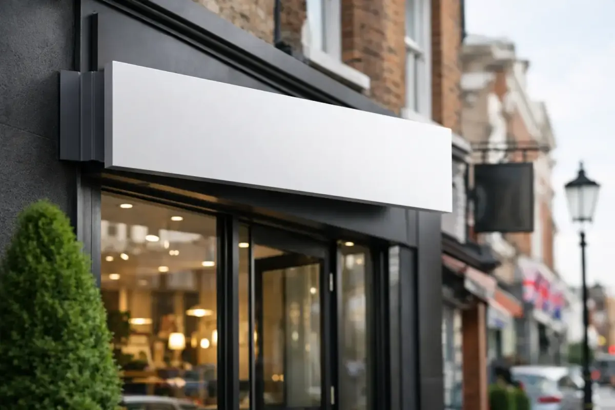
A fascia sign is often the main identifier for a shop, salon, café, showroom or trade premises. It should carry the business name clearly, with enough contrast between the lettering and background to remain legible in changing light.
Rigid sign boards are a practical option for many exterior applications. They can be produced to suit the available space and printed with a full-colour design, logo, contact details or trading message. If the sign will sit high above the pavement, keep the wording brief. A passing customer will read a name and a short description far more easily than a detailed list of services.
Before ordering, measure the visible area rather than guessing from the full width of the building. Check for drainpipes, lights, shutters and uneven surfaces that may affect fitting. If your artwork includes small text, consider whether it will still be readable from the other side of the road.
Window vinyl for information and promotion
Shop windows are valuable sign space. Vinyl lettering can display opening hours, telephone numbers, website details, payment options and key services without blocking the view inside. Printed window graphics can also support a sale, launch or brand message across a larger area.
The trade-off is visibility. Covering every pane with graphics can make a premises feel closed off, particularly for hospitality venues and retailers that rely on people seeing products or activity inside. Use the most prominent glass for the message that matters first, then leave enough clear space for natural light and sightlines.
Window signage is also useful when a business shares a building. A clear name, suite number and directional arrow can prevent missed deliveries, confused visitors and unnecessary calls asking where to go.
Pavement signs for passing footfall
When people are already near your door, an A-board or pavement sign can turn passing interest into a visit. They work well for daily specials, walk-in availability, menus, appointments, offers and simple directions.
Keep the message changeable where possible. A pavement sign is most useful when it can respond to the day’s trading rather than repeating what is already displayed on the fascia. Check local requirements before placing any sign on a public pavement, and position it so it does not obstruct pedestrians, pushchairs or wheelchair users.
Banners for temporary and large-format messages
Banners are a straightforward answer when you need visibility at a distance or for a limited period. They suit building frontages, fencing, sports events, open days, market stalls, charity days and construction projects. Their strength is scale: a short message in large type can be seen where smaller rigid signs cannot.
For outdoor use, plan the fixing points before choosing the final size. A banner needs secure support and enough tension to stay readable in wind. Avoid packing it with every possible detail. A business name, a main offer and a way to get in touch will usually do the job better.
Make your sign readable before making it decorative
Branding matters, but legibility comes first. A sign can use excellent colours and a professionally prepared logo yet still fail if the information is too small, too crowded or too low-contrast.
Use a clear typeface for essential wording and give letters room to breathe. Dark text on a light background, or light text on a dark background, is generally easier to read than colours with similar tones. If your brand palette includes subtle shades, reserve them for supporting elements and use stronger contrast for the business name, direction or safety instruction.
Distance should guide the size of the lettering. Words intended for drivers need to be much larger than wording read at arm’s length. A reception notice can carry more detail than a roadside sign. If several messages compete for attention, establish an order: business name first, main instruction or offer second, supporting details last.
Artwork quality matters as well. Low-resolution images, screenshots and copied social media graphics can look blurred when enlarged. Supply original logo files where available, and allow time for artwork checking before production. This is particularly important when colours, phone numbers, opening times or legal wording must be accurate.
Do not overlook operational signs
The signs customers notice first are only one part of a well-run premises. Clear operational signage helps staff, visitors, contractors and delivery drivers move safely and efficiently.
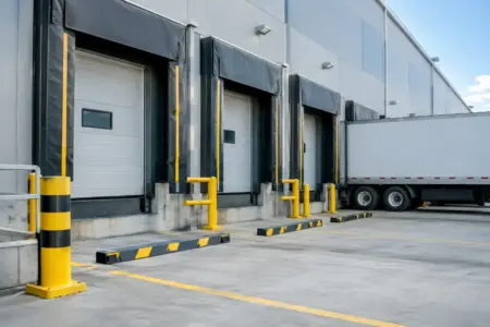
Parking signs can identify customer bays, loading areas, restricted spaces and collection points. Directional signs can separate entrances, exits, toilets, reception desks and stock areas. Health and safety notices can communicate site rules, mandatory protective equipment, fire action and hazard warnings. For sites with regular vehicle movement, visible instructions around gates, speed limits and pedestrian routes are especially useful.
These signs do not need to look disconnected from your branding. A consistent approach to colour, layout and mounting can make a warehouse, office, retail unit or yard feel more organised while keeping essential safety information clear. Where compliance wording or recognised symbols are required, clarity must take priority over a decorative design.
Choose materials for real conditions
There is no single best material for every sign. The right option depends on whether it is going indoors or outdoors, how it will be fixed and how likely it is to be knocked, handled or exposed to weather.
Rigid boards suit many wall-mounted signs, notices and display panels. Vinyl lettering is useful for windows, doors, internal walls and vehicle graphics. Magnetic signs offer a removable option for suitable vehicle panels, while banners are designed for prominent temporary messaging. Freestanding signs are useful where there is no wall space or where information needs to be placed directly in the customer’s path.
Consider maintenance at the ordering stage. A sign beside a busy road may collect dirt more quickly than one under cover. A sign in a yard may need to withstand regular contact. A promotion that changes every month should not be produced in the same way as a permanent site identifier. Spending appropriately on the sign’s intended lifespan prevents repeated replacements and keeps your presentation consistent.
Order with a clear brief
The quickest route to the right sign is to prepare the essentials before you begin. Have your final wording, measurements, logo, preferred colours and any required dates ready. Decide whether you will Design Online, Upload your own Design or ask for help preparing the artwork.
For a multi-site business or a growing team, keep approved artwork and standard sign sizes on file. Re-ordering parking notices, door signs, branded workwear and vehicle graphics is simpler when the main design has already been agreed. It also reduces the risk of inconsistent colours, old contact details or slightly different logos appearing across your business.
The SignBuilder can help bring these products together, whether the need is a single replacement sign or a coordinated set for a new premises. Start with the message people need to see first, choose a product built for its location, and make every sign earn its space.